MAS Apartment by Vic Calil Arquitetura
MAS Apartment is a modern home located in São Paulo, Brazil, designed in 2021 by Vic Calil Arquitetura.

Description
The young client was looking to integrate her old 90sqm apartment very well located in Pinheiros with light solutions that would bring her identity and freshness to her new home.
Many interventions were then made in the original plan in order to integrate the main rooms, which changed its appearance completely.
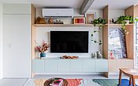
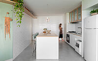
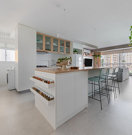
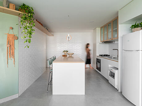
The entire plan was designed to optimize the space and create a single large environment: fluid, harmonious and comfortable for the social area.
A cool apartment was her request, an advertiser who loves to receive friends and spends most of her time at home, enjoying or working at home office.
We demolished the whole social area: kitchen, pantry, service area, bathroom, living room and balcony, integrating everything in one big block with a view to the canopy of trees of the West Zone of São Paulo.
We leveled the floor, the plaster ceiling and some walls and there is no one who didn’t know the old apartment, who now doesn’t have the sensation that it has doubled in size.
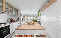
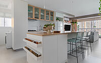
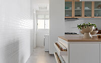
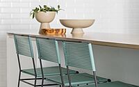
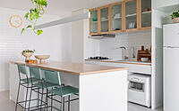
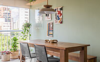
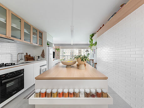
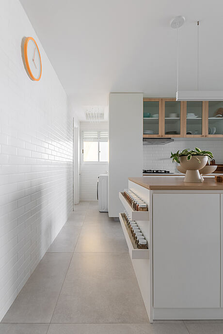
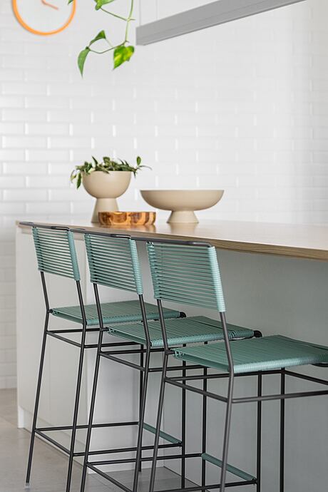
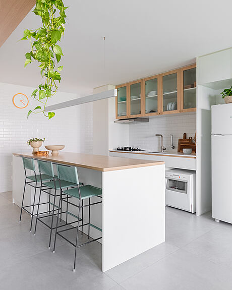
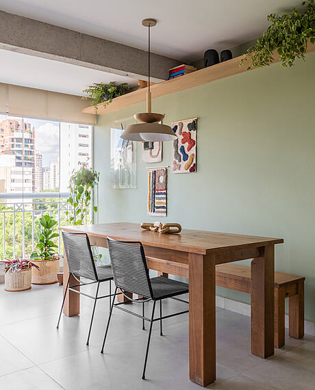
The protagonist was the 3m table that received a beautiful sconce with direct and indirect light and is strategically positioned in the center of the kitchen, everyone’s favorite place, designed in carpentry, it is 90cm high, has 3 stools for quick meals, and also serves as a support and storage island inside.
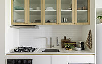
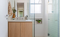
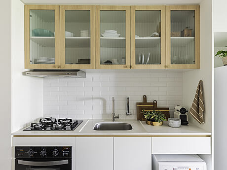
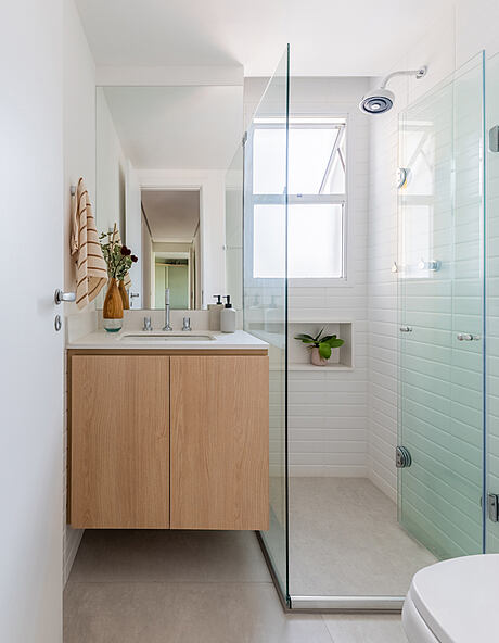
The walls of the kitchen, laundry room and bathroom were covered with the famous white vintage ceramic that refers to the London Underground. The inspiration set the tone and texture that contrasted in perfect harmony with the concrete, fluted glass and light wood.
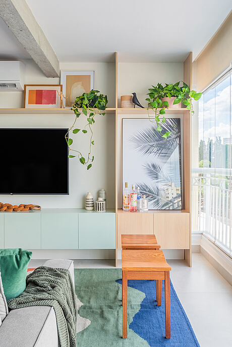
The concrete beam that we found during demolition, divided the living room to the balcony and was there as a gift, peeled and full of style composing the decoration of the ape with all its elegance and materiality, fitted in the bookcase that we designed in the smallest detail made in macenaria and green lacquer.
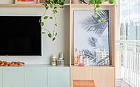
In order to make the most of the spaces, we designed a large shelf that goes around the main wall of the apartment, going from the kitchen to the dining room, allowing a higher level to support decoration, plants and books.
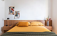
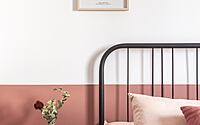
With few and good elements, spot colors, and a low budget, we were able to create a beautiful, light and inviting home! From the colors chosen to each decoration object, the wishes were fulfilled: Home face with personality and joy.
Translated with www.DeepL.com/Translator (free version)
Photography by Pucci Fotografia
Visit Vic Calil Arquitetura
- by Matt Watts