American Style in Israel by Karen Maimon
Introducing “American Style in Israel“, a stunning house located in central Israel designed by Karen Maimon.
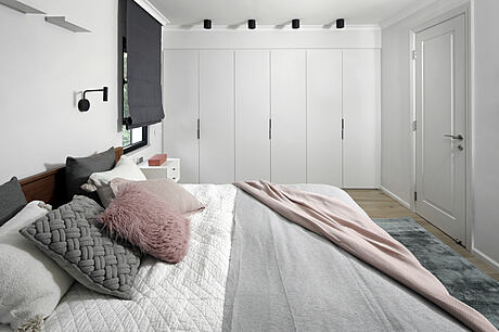
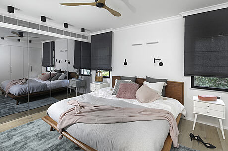
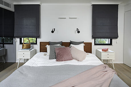
The property was completely renovated to reflect the American style the clients wanted – cozy and inviting spaces with plenty of storage and modern touches.
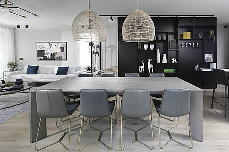
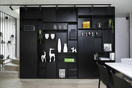
Light oak parquet, plaster walls concealing air conditioning units, black library running across two levels, granite gray kitchen, white parquet floors for the home office, 3-meter black stone slabs for an en-suite bathroom, Bauhaus windows opening up to an outdoor space with wooden shower and treehouse – all these features create a unique boutique feel that reminds the owners of their life in America.


About American Style in an Israeli Location
After purchasing a house in a central Israeli city, a hi-tech professional and a shoe designer, who had been living in America for many years, decided to design the property in true American style. The results exceeded all expectations.
Interior Designer Karen Maimon on the Clients’ Vision
Karen Maimon, the interior designer, explains that the clients wanted a property that would remind them of their life in America. The aim was to create a cozy and inviting home that was practical yet unique with plenty of American-style storage.
Gutting and Replacing the Interior
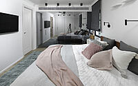
The property was stripped down to the wall studs and completely renovated. The interior was gutted and replaced, and a loft was added. The basement was upgraded and now serves as an office and a guest room.
American-Style Flooring and Decor
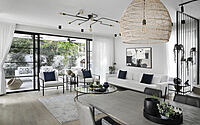
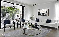
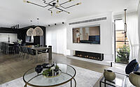
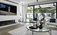
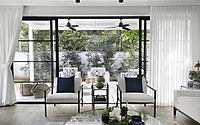
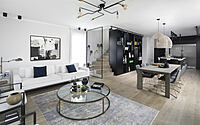
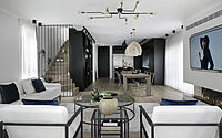
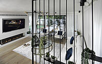
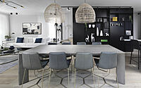
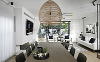
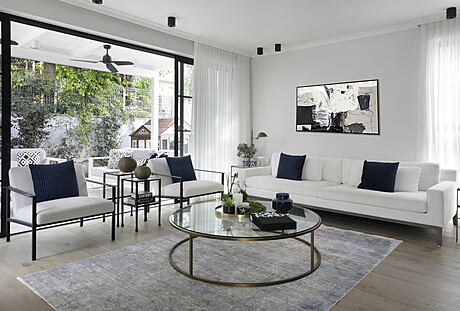
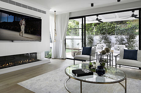
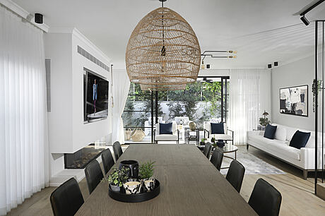
The flooring that was used in the property is light oak parquet, which is a common style in America. A plaster wall that conceals an air conditioning unit was erected in the lounge. It is home to a gas fireplace and a large mounted TV. The seating corner consists of a white sofa and an armchair dotted with deep blue scatter cushions, creating a serene atmosphere. The ceiling was fitted with a custom-made light fixture that fans out like octopus tentacles and adds a captivating touch to the living space.
The Black Library
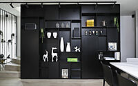
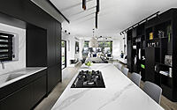
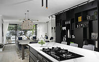
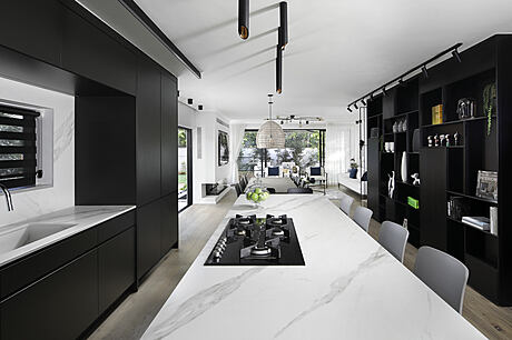
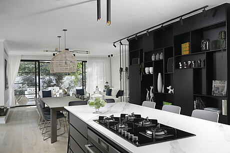
One of the most dominant elements in the property is a large black library that starts in the family space and continues up to the bedroom level. This was a custom-made design. It is a double-sided library that runs along the staircase up to the second level and also serves as a banister and storage.
The Kitchen and Basement
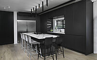
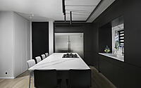
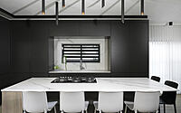
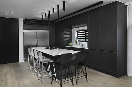
The kitchen was painted in shades of granite gray and was designed with clean lines and plenty of seating for entertaining. Behind cupboard doors, all electrical appliances are easily accessible, creating a neat look. A sliding cabinet with a Concepta mechanism was fitted to the right of the sink and includes a hidden coffee corner. Six light gray and black chairs surround the island and cylinder light fixtures in a variety of lengths and angles provide interesting lighting.
The basement renovation, where the home office and play area are located, was a major part of the project. The office space was defined with black Belgian profile glass partitions that offer privacy while blending harmoniously with the play area. White parquet was used for the floors to lighten up the space.
The Bathrooms and Garden
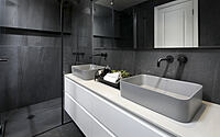
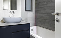
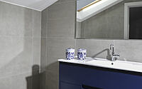
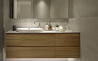
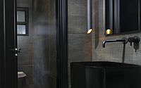
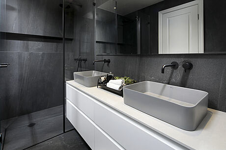
Black, gray, and white were chosen as the main color palette throughout the property and used in the bathrooms. In the en-suite, 3-meter (9.8 feet) black stone-like slabs were used to create a harmonious sense of continuity. The guest toilets were dramatically designed, and the sink was moved to an alcove outside the toilet to best utilize the small space.
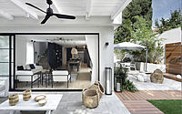
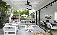
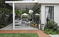
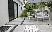
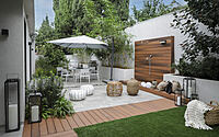
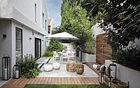
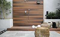
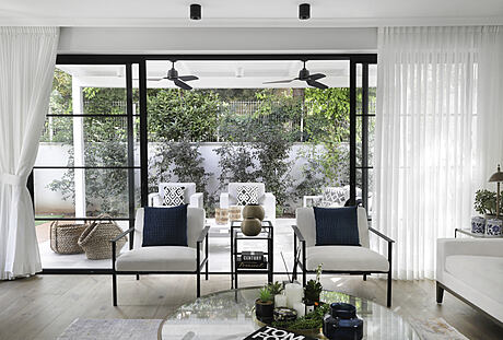
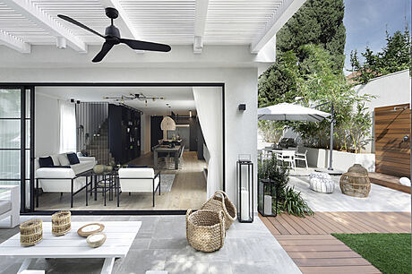
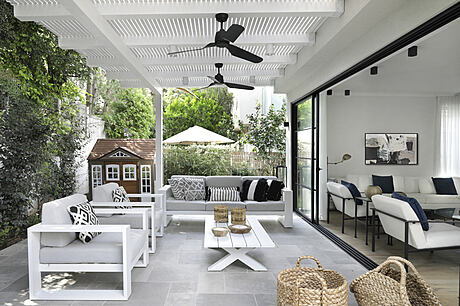
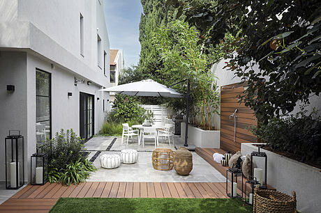
The garden was completely redone and can be accessed through Bauhaus-style windows with a Belgian profile. Granite, decking, and grass were used for the flooring. A wooden outdoor shower and a small tree house were built for the kids, both of which are American features. Custom-made rugs, golden light fixtures, and rattan can be seen around the property, all with modern touches.
Photography courtesy of Karen Maimon
Visit Karen Maimon
- by Matt Watts