Luzzatti Home: Modern Industrial “dei Ferrovieri” Mansion
Welcome to Luzzatti Home – a modern industrial house located in Cuneo, Italy, designed by Balance Architettura in 2021.
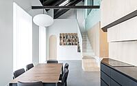
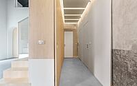
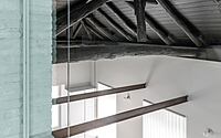
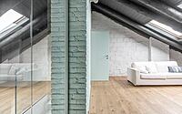
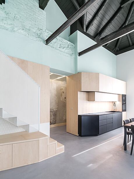
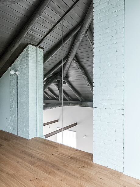
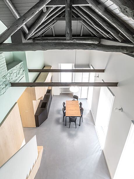
This house is a part of the Italian typology called “dei Ferrovieri” from 1921 and it is preserved and bound property by the Committee of Architectural Heritage. The main focus was on maintaining the internal spirit of the time, preserving the authentic wooden beams and the un-finished finishings to maintain the historic memory of the house. The dark coloring, sheet metal staircase and birch furniture and outfitting merge with the rest of the building and create an authentic and hospitable feel.


About Luzzatti Home
Revamping Luzzatti Home in the City Center of Cuneo
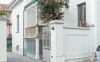
This project is the result of a refurbishment of a single-family residence in a residential area of the city center of Cuneo (North of Italy). The house dates back to 1921 and is protected by the Committee of Architectural Heritage due to its preserved facade and external appearance.
Maintaining Old Structures
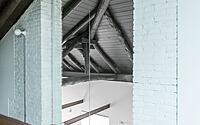
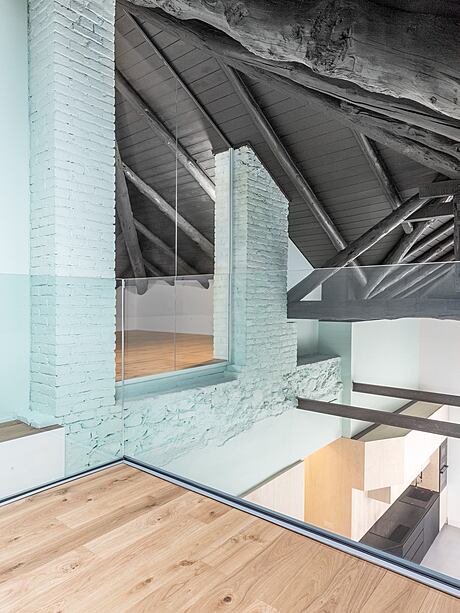
The first step of the project was to maintain the roof structure, as it was essential to keep the internal spirit of the time. Preserving the authentic wooden beams gave the project an essential part of the design spaces, as their artisanal conformation would be hard to replicate with new manufactured beams.
Adding a Contemporary Touch
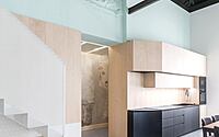
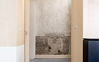
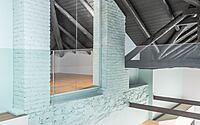
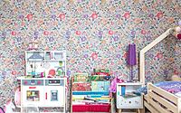
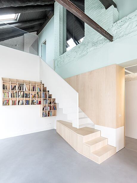
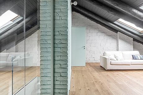
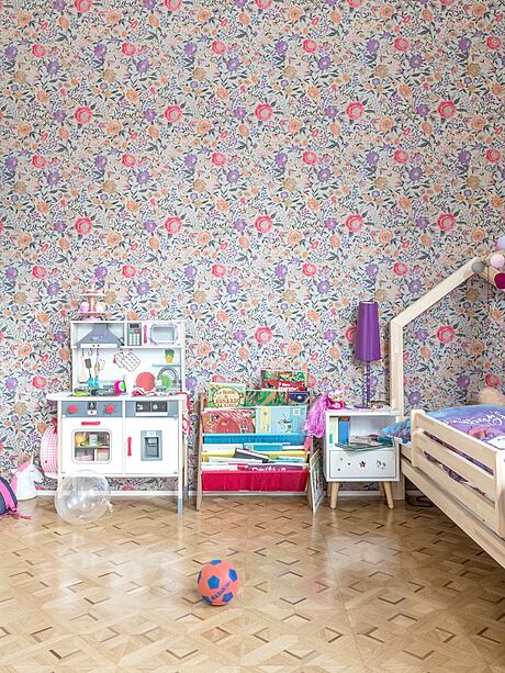
To give the design a contemporary touch, a very dark color was chosen to alter the usual perception of the ceiling. Unfinished finishes were kept to maintain the historic memory of the house and to give it an authentic and more hospitable feel. Parts of the existing wall, including parts with the original 1920s wallpaper and parts with vintage bricks, were left on display.
Designing the Staircase
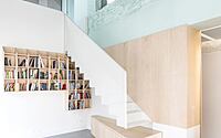
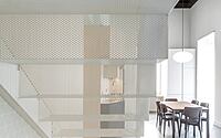
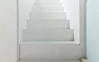
The staircase, designed by the team, is a sheet metal element micro-perforated that challenges gravity and works on transparency. It stands up thanks to its shape and its material’s properties, as it only has lateral support and is very solid.
Making it Feel At Home
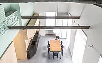
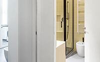
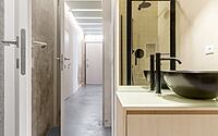
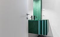
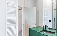
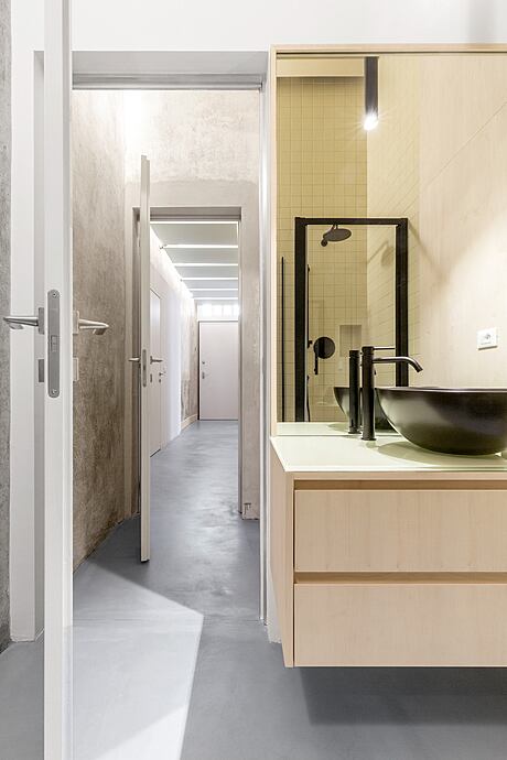
The team also designed furniture and outfitting that merge with the rest of the building, including the kitchen, bathrooms, and storage walls, which are made of birch and harmonize with the other materials used in the house.
Photography by bg Goz
Visit Balance Architettura
- by Matt Watts