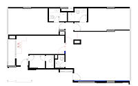
VITA Apartment: A Spacious and Comfortable Renovation in Brasília
Situated in the beautiful Brasília, Brazil, VITA Apartment is an incredible piece of real estate designed by Mosaico Arquitetos in 2019.
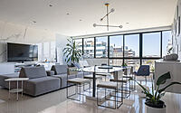
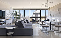
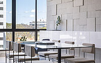
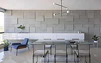
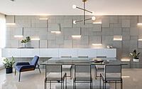
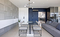
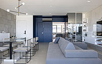
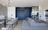
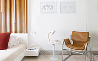
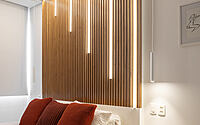
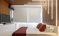
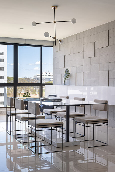
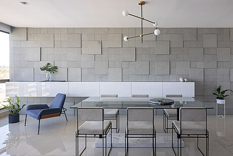
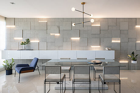
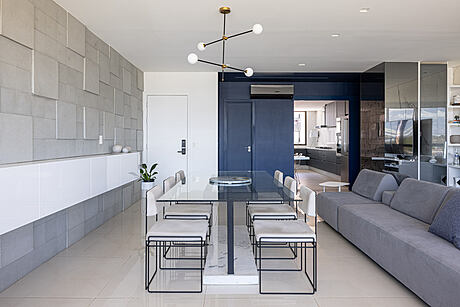
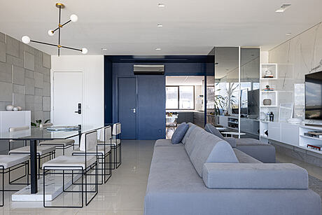
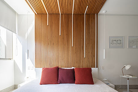
With an eye for cozy design, the renovation was designed to make the space both spacious and comfortable, with the least possible intervention. Throughout the apartment, the eye is drawn to the contrast between colors and textures as a guiding element in the design, uniting all the rooms together with a dark blue corridor. The dining room has a large stone panel with built-in LED lighting, while the kitchen features a decorative tile panel and dark woodwork. The bedroom is framed by a wooden slatted panel that goes from the headboard to the ceiling, adding a warm and inviting touch to the property.




About VITA Apartment
Minimalist renovation with contrast
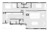
This apartment renovation was aimed at creating a spacious and cozy space for the young couple who owns it. The goal was to achieve this with minimal intervention, only replacing materials when necessary. The design approach was to use contrast between colors and textures to guide the process and help distinguish each space. The result is a consistent minimalist aesthetic that is unifying yet surprising. A dark blue corridor connects the rooms, leading to bright and spacious areas every time a new door is opened.
Designer pieces and lightness
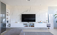
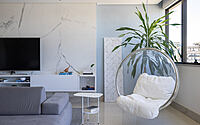
The dining room is a standout space with a large stone panel that has built-in LED lighting, specially created for the project. This robust feature contrasts with a light-toned porcelain tile panel on the opposite wall. Designer furniture pieces are distributed throughout the space to create a single integrated room.
Hidden kitchen and decorative tiles
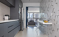
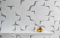
The kitchen is accessed through a large sliding door that can be completely hidden when closed, or provide continuity between spaces when open. A decorative tile panel provides a contrasting backdrop to the darker woodwork on the opposite side of the space.
Wooden slats and white lacquer
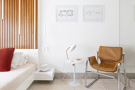
In the double bedroom, a wooden slatted panel goes from the headboard to the ceiling to define the bed space. This feature contrasts with the white lacquer used in the rest of the furniture, creating a relaxing atmosphere that is perfect for a good night’s sleep.
Photography courtesy of Mosaico Arquitetos
Visit Mosaico Arquitetos
- by Matt Watts