Xinzo House: Marrying Minimalism and Practicality in Spain
Immerse yourself in the serene countryside of Spain with the Xinzo House, a harmonious blend of traditional and modern design by the renowned Carbajo Barrios. This redesigned retreat in 2023 stands out as an epitome of flexibility and authenticity, nestled in the quaint village of Xinzo. The distinctive country house marries minimalism with practicality, boasting a layout that allows multiple configurations for various uses.
The property, with its roughly rectangular footprint of 40 meters (131 feet) by 22 meters (72 feet), is a testament to the architect’s inventive use of space and simplicity. Its unique location on a sensibly flat plot adds a touch of tranquility while its design pays homage to the area’s popular architecture, and its dramatic juxtaposition of public and private spaces.

About Xinzo House
The Unique Plot Geometry
The property sits on a plot shaped like a rhomboid, 40 meters (131 feet) on the longer side and 22 meters (72 feet) on the shorter side. Positioned with its larger side in a northwest-southwest direction, the smaller eastern edge of the plot aligns with the public road connecting to the Xinzo village. The plot’s topography is essentially flat with minimal longitudinal variation, with a sharp incline towards the north, where the property is situated.
Existing Auxiliary Building Features
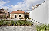
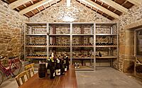
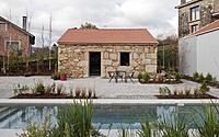
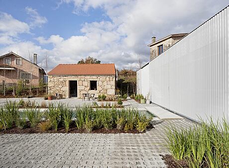
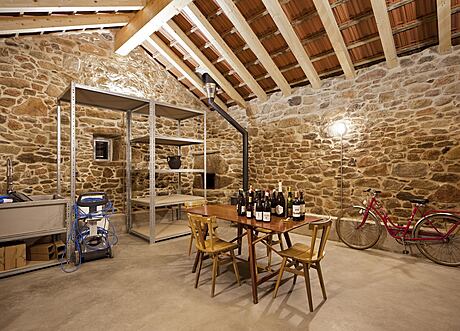
In the plot’s northwest corner stands an auxiliary building, serving as a warehouse. This rectangular building, about 7.50 x 6.50 meters (24.6 x 21.3 feet) in size, offers approximately 50 square meters (538 square feet) of space. Comprising undivided wild granite masonry walls, a prefabricated concrete purlin roof, and wooden carpentry, the building boasts a sturdy, vertical structure.
A Flexible Design for Residential Use
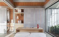
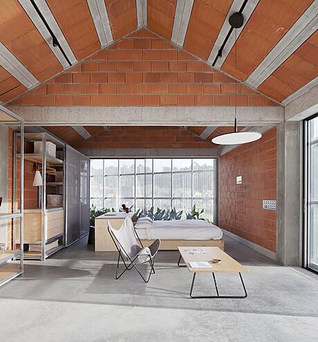
The property requires a design that, while offering residential functionality, is adaptable for various configurations and uses. The plan proposes a single space where different areas for sleeping, living, and washing are arranged. The existing warehouse building will be rehabilitated to continue its service as storage.
Adding Subterranean Elements
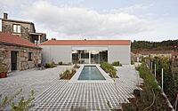
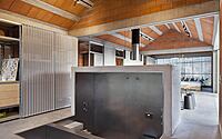
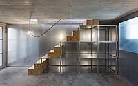
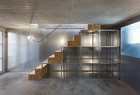
The new construction includes two subterranean spaces—one housing the complex’s service facilities and the other, a swimming pool. These spaces create a pathway for movement in and out of the property, forming a cross-axis beneath the main volume.
Designing with Local Architecture in Mind
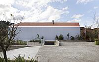
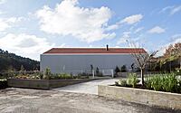
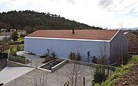
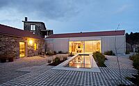
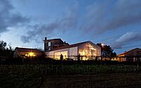
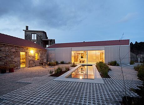
The design draws inspiration from the existing old building on the plot, replicating its archetypal, single-story structure with a symmetrical gable roof. This figure is then adapted to meet specific functional requirements and to express a unique character on a more aesthetic level.
Balancing Public and Private Spaces
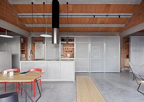
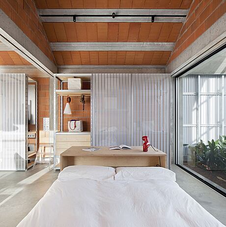
The new building’s transverse arrangement in relation to the existing building and the plot’s dominant axis conceptualizes a boundary between public and private spaces. This layout generates a sequence of ambiguous spaces from the plot’s entrance, subtly escalating privacy and intimacy levels without relying on prominent enclosure solutions. The spaces between the two buildings form a traditional courtyard, or ‘curral,’ serving as a connection and interaction point. The design ensures that all common rooms open to the exterior, emphasizing connectivity, fluidity, and continuity. Rooms requiring more privacy, like the bedroom and bathroom, are located at the ends and have access to a small green corner between the building and the plot enclosure, maintaining their privacy.
Adopting a Simplistic Aesthetic
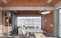
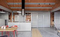
On an aesthetic level, the design adopts the humble and straightforward style of the existing building, taking cues more from warehouses or industrial buildings than traditional homes. Despite their different ages, both structures share a simple form, appearing as solid, closed volumes without superfluous materials or construction solutions. This minimalistic approach extends to the interior, with the furniture defining the purpose of each space without requiring interior partitions. The design’s transparency and honesty are mirrored in the interior finishes, where the construction materials for walls, floors, and roofs are left exposed, emphasizing the dignity of functionality and necessity.
Photography by Roi Alonso
Visit Carbajo Barrios
- by Matt Watts