Minimalist Apartment: A Masterclass in Modern Interior Design
Welcome to the realm of simplicity and elegance with the “Minimalist Apartment” project, masterfully executed by acclaimed designer Alexander Tischler. Nestled in the vibrant city of Yekaterinburg, Russia, known for its rich history and stunning architecture, this two-bedroom apartment is a shining beacon of minimalist design.
Unveiled in 2021, the space mirrors the understated sophistication of its surroundings, boasting a unified kitchen-living area for social gatherings, bespoke cabinetry, and an ingenious use of space and light.


About Minimalist Apartment
Transforming a Family Apartment: The Concept
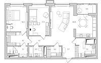
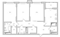
Our goal was to create an inviting, open-concept family home, catering specifically to a family with a teenage daughter. This apartment transformation included a spacious, unified kitchen-living room for casual family gatherings, along with a bedroom connected to a private dressing area and master bathroom.
Bringing the Design to Life
From conceptualization to implementation, our team remained committed to the outlined plan and budget, even customizing the cabinetry specifically for this dwelling.
Creating an Open Living Space
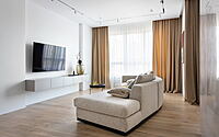
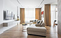
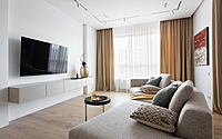
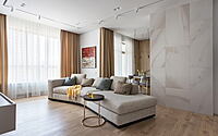
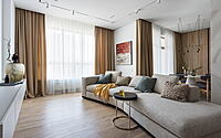
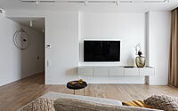
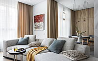
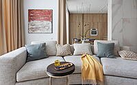
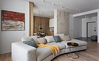
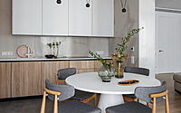
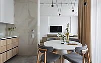
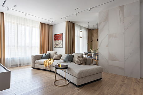
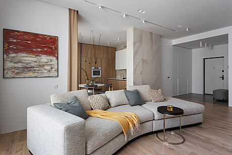
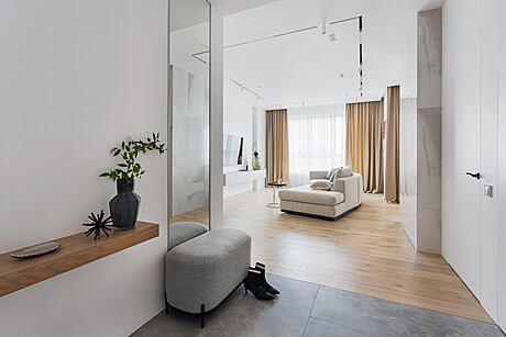
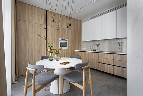
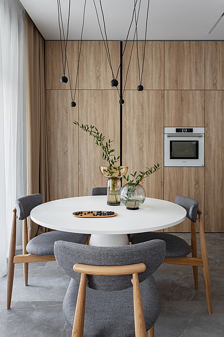
To cultivate a fluid living area, we eliminated partitions between the hallway, kitchen, and living room. This resulted in a distinctive complex-shaped area, where the minimalist kitchen cupboards, the grand chandelier, and the dining table become immediate focal points from the living room. Moreover, the worktop is cleverly concealed behind a support pillar adorned with Rex white onyx porcelain stoneware. Enhancing the space’s dynamism is a curved sofa, strategically placed in the spacious living room.
A Unified Living and Dining Experience
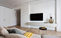
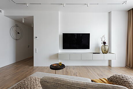
In this open concept design, the TV, sofa, and table align on one axis. This layout promotes easy communication and TV viewing from any vantage point within the combined kitchen-living room.
Minimalist Kitchen Spotlight
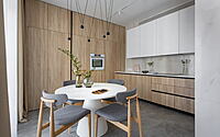
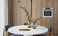
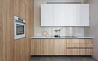
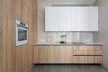
Accentuating the kitchen are several white features: the dining table, oven, overhead cabinets, countertop, and faucet. We selected floor-to-ceiling column cabinet fronts for a cohesive, monolithic look.
Innovative Design Choices
We shared our innovative approach to integrating refrigerators without a base in a previous video. The overhead cabinets stop short of the ceiling to accommodate a ducted air conditioner. Despite this, the cabinets are spacious enough to house the kitchen hood. To maintain a minimalist aesthetic, we opted for built-in profile handles, eliminating the need for applied handles.
Optimizing Space for Socializing
Merging the kitchen and living room allowed us to craft a generous communal space. Almost 441 square feet (approximately 41 square meters), this area can comfortably accommodate the family and their guests.
Refining the Balcony
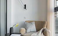
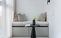
While we chose not to add heating to the balcony, we furnished it with a cushioned drawer-based seat and delicate lighting, ideal for warm evening reads.
Expanding the Laundry Room
The laundry room expansion, achieved by claiming space from the hallway and kitchen, now houses the ventilation box. It was grown from 31 to 74 square feet (from 2.9 to 6.9 square meters), with open cabinets providing ample storage for household items and appliances, including an ironing board.
Redefining the Hallway
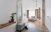
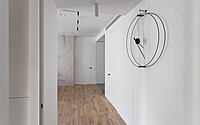
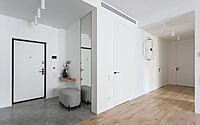
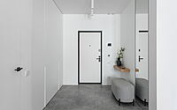
Relocating the laundry room door also helped us more distinctly demarcate the entrance area from the hallway, which now boasts a large coat closet. Hidden behind one of the facades are electrical and low-current shields, while a floor-to-ceiling mirror with soft lighting completes the hallway design.
Revamping the Corridor
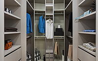
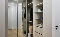
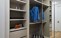
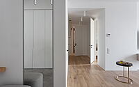
The corridor, now narrower due to the merger with the living room, leads to the bedrooms and bathrooms. This corridor also guides you to the master bedroom, which opens up to a dressing room offering both open and closed storage. Floor-to-ceiling mirror fronts, like those in the hallway, adorn the closet.
Master Bedroom: A Study in Elegance
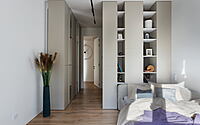
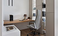
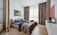
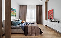
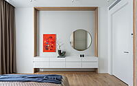
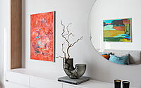
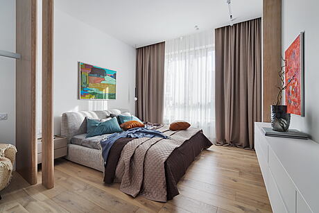
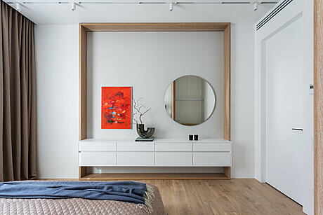
The master bedroom is cleverly divided into work and rest areas. A decorative screen, crafted from oak veneer, subtly separates the desk and armchair from the bed area. Suspended bedside tables, each under a simple lamp, add a stylish touch. To disguise an uneven wall, we created a decorative frame with in-built lighting. With the clients’ preference for a TV-free space, we added a large hanging chest of drawers and a mirror.
Designing the Children’s Room
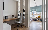
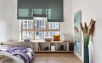
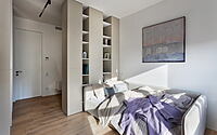
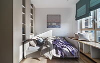
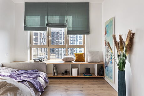
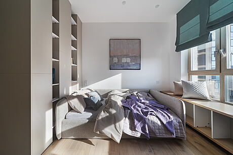
The children’s room offers a study and rest area, separated by a double-sided shelving unit. By the window, a wide console creates an additional study and rest zone. At the client’s request, we incorporated a matching watercolor radiator to the right of the window.
Lighting Up the Bathroom
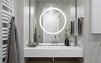
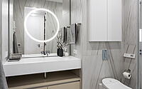
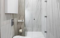
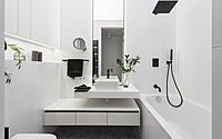
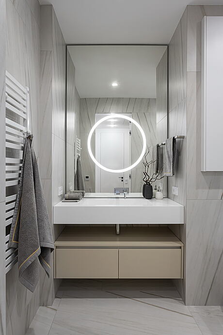
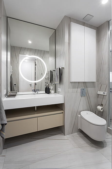
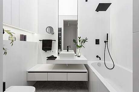
For the bathroom, we chose a distinctive light fixture, creating the illusion of a luminescent ceiling. With a simple switch, this radiant glow’s intensity can be adjusted.
Photography by @askarkabjan
Visit Alexander Tischler
- by Matt Watts