Buchanan Street Residence: A Historic Victorian Home Reimagined
Experience the rejuvenation of history with the Buchanan Street Residence in San Francisco, California. Masterfully redesigned by Richard Beard Architects in 2022, this storied Victorian era property has been meticulously transformed to cater to the dynamics of a large family while paying homage to its heritage.
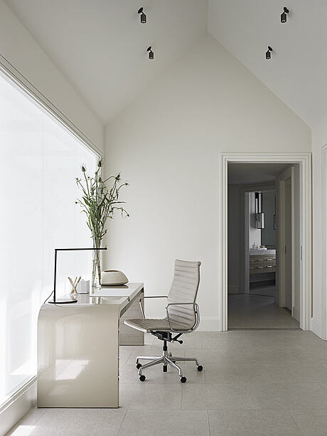
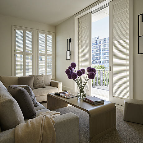
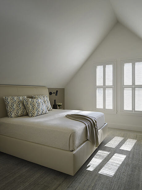
The resplendent exterior, painted in a contrasting two-tone palette, effortlessly harmonizes with the minimalist, contemporary interiors, designed to elevate spatial aesthetics and enhance natural light. The absence of traditional Victorian elements in the interior marks a deliberate, artful contrast, creating a unique confluence of history and modernity.



About Buchanan Street Residence
An Iconic Revival of a San Francisco Classic
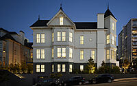
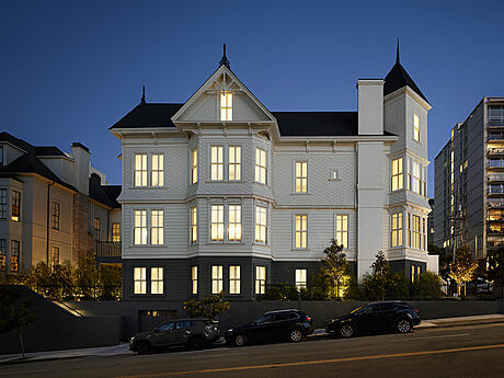
Among the legendary Victorian era homes in San Francisco, this historic residence stands out. Following years of meticulous planning and construction, the house received a complete makeover, resulting in a fresh, revitalized interior layout to accommodate a large family. The exterior, faithfully restored per the Secretary of Interior Standards, infuses a refreshing vibe into this prominent neighborhood corner.
Elevating a Classic: The Exterior Transformation
The renovation began with the ambitious task of lifting the home to construct a multi-car underground garage and basement. This move also enabled a more generous interior layout. The exterior base wears a dark charcoal hue, setting off the pristine white of the upper segments. The resulting two-tone palette offers a striking and timeless aesthetic.
Interior designer Paul Wiseman explains, “The darker color grounds the house, while the white enhances the airy upper-floor living spaces.”
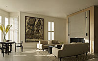
A Contemporary Twist: The Inviting Interiors
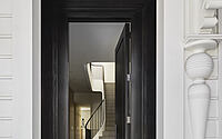
The jet-black front door harmonizes with the base color, bridging the gap between the classic exterior and the contemporary interiors within. Wiseman clarifies, “We avoided pulling any Victorian details into the interior for a deliberate counterpoint to the traditional exterior.”
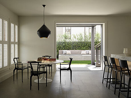
As you step inside, the modern interior unfolds, with mahogany wood ebonized to ensure a seamless blend between the interior and exterior spaces.
Bathing in Light: The Bright and Airy Ambiance
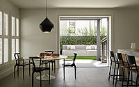
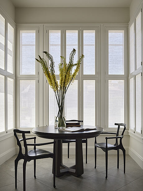
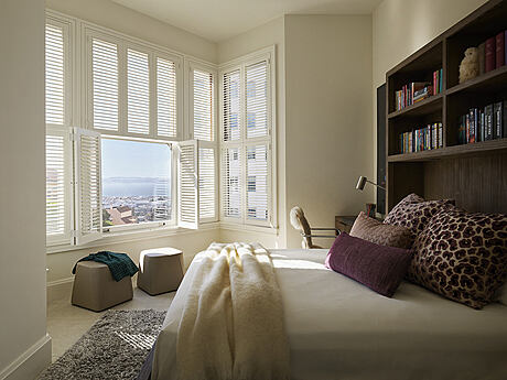
Richard Beard, the project’s lead architect, observes, “The corner location of the house allowed for additional windows, which flood the interior with natural light.” This abundance inspired the creation of light, airy, and modern interior architecture.
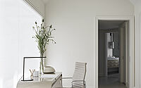
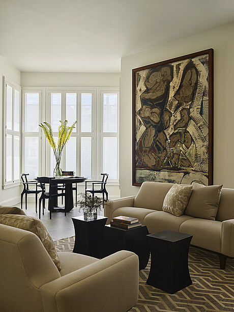
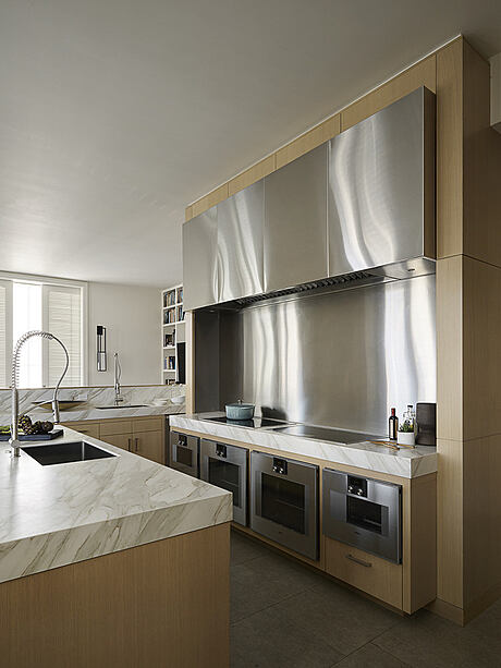
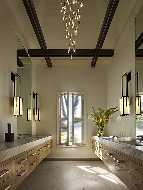
Shaking off the typically dark and heavy palette of Victorian homes, the interiors adopt a contemporary, neutral color scheme that accentuates the house’s spatial qualities and suits the active family’s lifestyle.
Sculpting Space: The Curvilinear Staircase
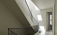
The minimalist style furnishings across the four stories are connected by a curvilinear staircase. Beard notes, “The stair was an opportunity to create a more open and continuous flow of space between floors.”
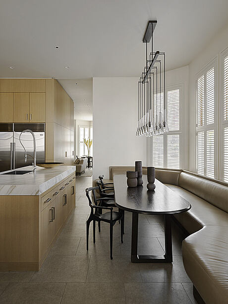
Large skylights channel light into the home, adding an expansive feel. The staircase’s graceful curves, complemented by a handrail from Chris French Metal, reverberate in the home’s furnishings, including a slender dining table for twelve, a curved banquette, and comfortable chairs.
Crowning Touches: The Primary Suite
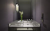
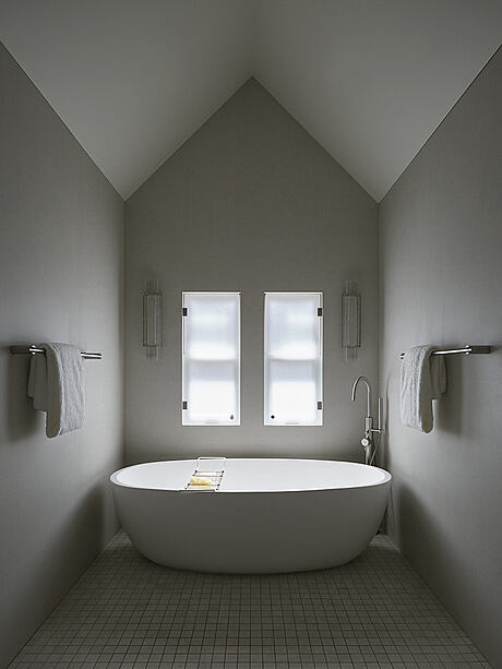
A stairway elegantly descends to a wine wall and game room, while the primary suite occupies the staircase’s apex. The primary bath nestles in the turret, its modern light fixtures illuminating a captivating dialogue between the residence’s new and old elements.
Photography by Matthew Millman
Visit Richard Beard Architects
- by Matt Watts