iaa S36: An Eclectic Duplex Revival in Milan’s 1930s Building
In the heart of Milan, Italy—a city celebrated for its rich historical tapestry and avant-garde fashion—lies a remarkable transformation. The iaa S36 apartment, a design marvel by Icona Architetti Associati, masterfully plays with space, turning a once underused attic into an eclectic duplex wonder.
With spaces flowing seamlessly and a design that tantalizingly melds the old with the new, it’s a testament to impeccable design meeting the desires of modern living.


About iaa S36
Milan’s Mesmerizing Duplex Revival
At the top floors of a distinguished 1930s Milanese building, Icona Architetti Associati crafted an astonishing duplex. The aim? To revive once neglected attic spaces, turning void into volume.
Finding the Perfect Historical Retreat
A young couple longed for a sanctuary in central Milan. They envisioned a residence within a historical structure. Coincidentally, Icona Architetti Associati was refurbishing an early 20th-century apartment building. It perfectly mirrored the couple’s desires. Recognizing an opportunity, the architects capitalized on the generous height of the attics. Consequently, they introduced an additional level by slightly lowering the floor threshold.
This clever design not only reclaimed the attic space but also birthed a comfortable duplex with two distinct levels: a main floor and a penthouse. Thus, the project came to life, carving a space from nothingness.
Designing Around Constraints
The residence’s entry level seemed like a blank canvas, save for an L-shaped load-bearing wall. Interestingly, Icona pivoted around this solitary structural constraint, channeling its potential. They likened this maneuver to a judo move, converting a challenge into a design focal point.
Three core architectural solutions drove the project’s concept, accompanied by a key stylistic principle. These concepts encompassed:
– Fluidity in dynamic and social spaces.
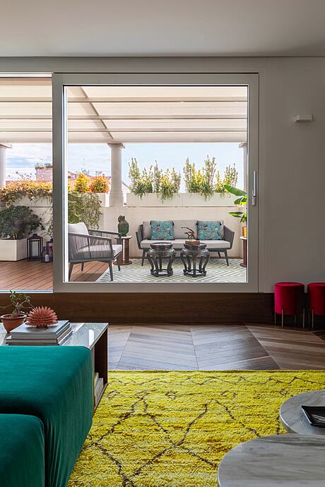
– Blurring boundaries between interior and exterior.
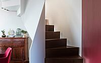
– Establishing the sculptural staircase as the design’s central axis.
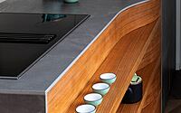
Moreover, a distinctive design choice was evident throughout: juxtaposing two contrasting elements. This pairing—of materials, colors, shapes—emphasized the union, suggesting harmony in duality.
A Harmonious Blend of Spaces
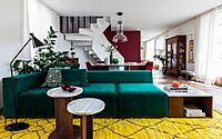
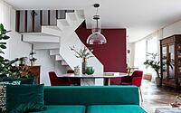
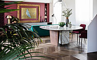
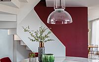
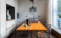
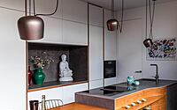
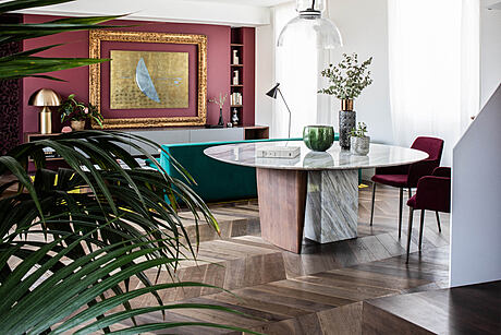
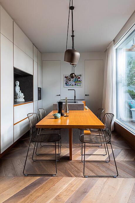
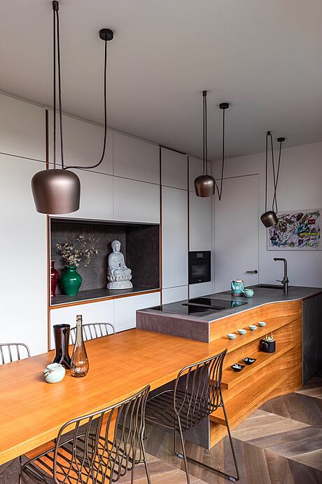
Upon entering, visitors are met with a dark textured wallpaper, setting the stage for the living area’s natural light. The living and kitchen areas epitomize the home’s open-plan concept. Bordeaux-colored walls juxtaposed against pristine white ones introduce light and shadow interplay. Contrasting treatments on adjacent walls become a recurrent theme.
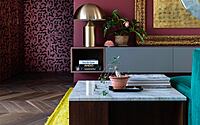
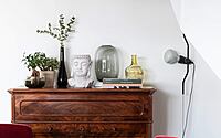
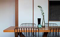
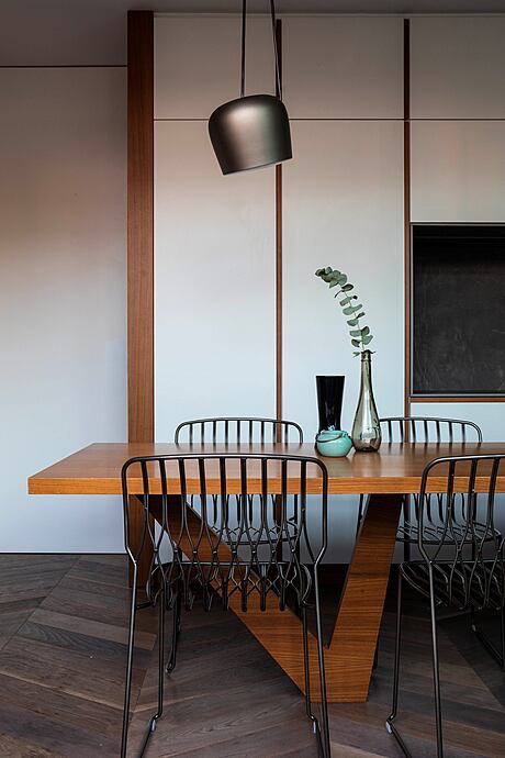
The lounge wall elegantly showcases a grand gold-leaf baroque frame, inherited by the owners. This piece complements the brass Atollo lamp on the furniture. Tailor-made velvet sofas in a rich green hue converse with the abundant greenery on the terrace. Their design: modular and adaptable. Meanwhile, marble and wood tables further emphasize the theme of pairing distinct materials. Specifically, a white marble dining table with vibrant purple and gray streaks flaunts a unique octagon-meets-circle shape, supported by two contrasting legs.
Merging Inside and Out
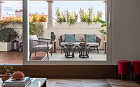
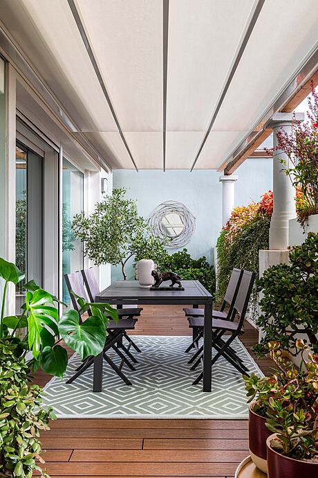
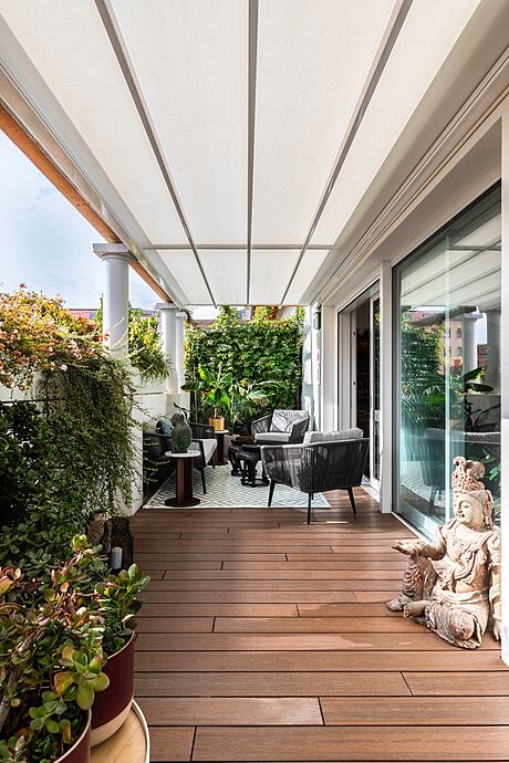
The terrace stretches an impressive 20 meters (approx. 65.6 feet) across the entire facade. To maximize transparency, large glass panels virtually eliminate barriers between indoors and outdoors. This outdoor area offers remarkable privacy, thanks to its recessed position relative to the building’s facade.
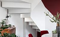
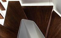
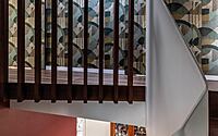
The helical staircase becomes another project highlight. Here, the pairing principle contrasts the lightness of a white metal railing with the solid wooden walnut steps. This unique design casts intriguing shadows, enhancing its sculptural essence.
Upstairs: A Serene Sanctuary
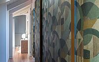
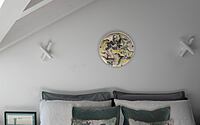
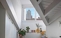
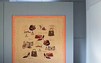
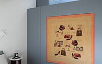
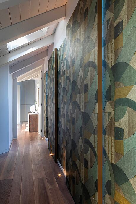
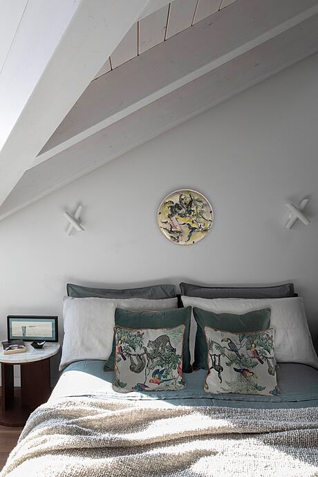
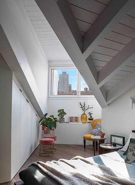
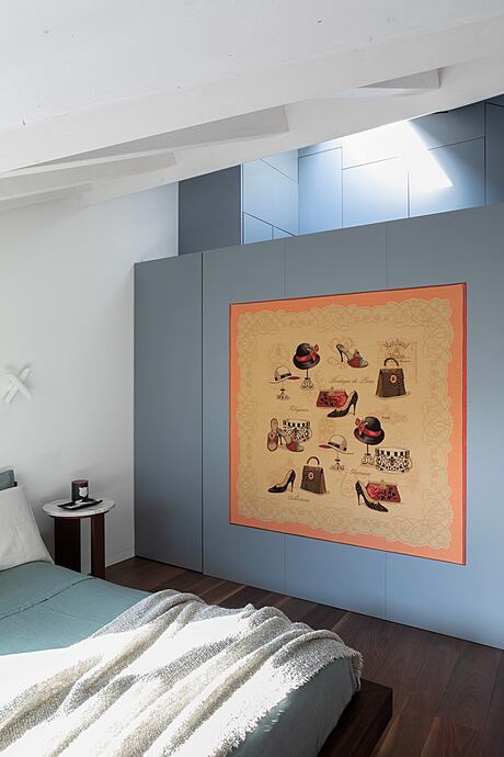
On the upper level, a wallpaper-clad wall discreetly hides the bedroom entrances. The master bedroom, with its sharply angled roof, houses a tranquil yoga and meditation nook overlooking Milan’s rooftops. A Parisian canvas, possibly from a boutique’s changing room, adorns a separating wall.
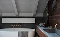
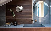
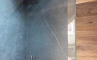
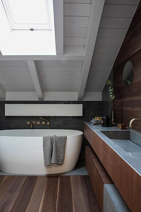
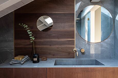
Even the bathrooms exude design flair, showcasing pairings like walnut with dark marble, bound together by burnished brass.
A Testament to Craftsmanship and Clarity
Every room in this residence radiates both simplicity and supreme craftsmanship. The spaces read as clear and linear, yet a dizzying complexity in the details prevails. These elements declare their presence, coexisting with balance and grace. In this masterful design, the sum truly exceeds its parts.
Photography by Monica Spezia
Visit Icona Architetti Associati
- by Matt Watts