Casa Prinetti: A Seamless Blend of Space & Elegance
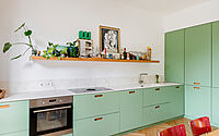
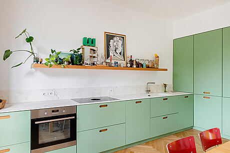
In the vibrant heart of Milan’s NoLo district, tIPS Architects unveils Casa Prinetti. This contemporary apartment, designed in 2022, brilliantly captures the essence of Milanese style. Strategically optimized for space, it boasts a unified environment dedicated to culinary arts, relaxation, dining, and remote work.
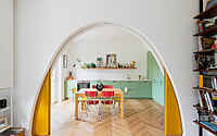
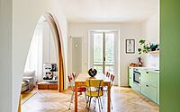
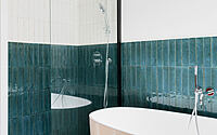
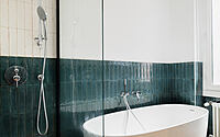
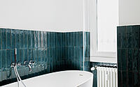
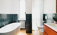
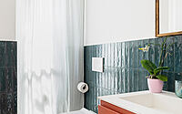
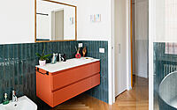
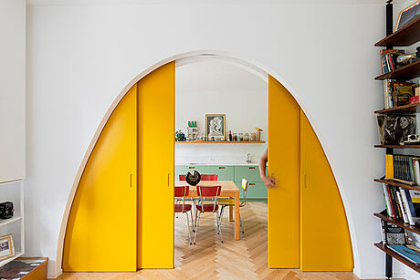
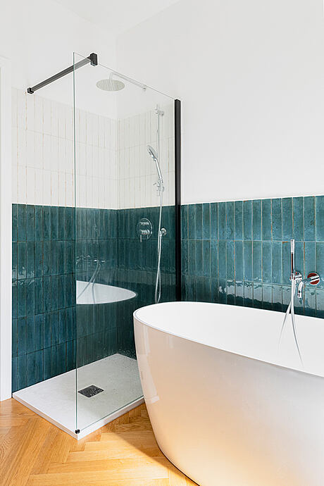
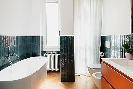
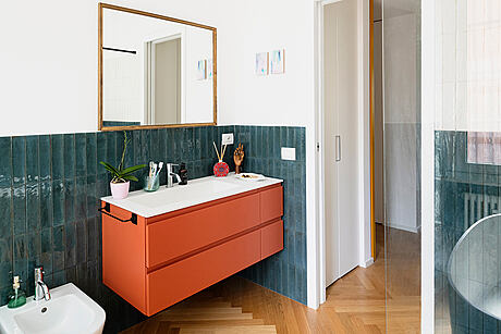
With sweeping views of urban greenery, the design leverages the apartment’s unique location. A standout feature is the dual arches in the living area, epitomizing the homeowner’s desire for a flexible space. Drenched in aquamarine ceramic tiles, the bathroom offers a refreshing contrast with its coral-red fixtures.



About Casa Prinetti
Highlighting Milan’s NoLo District
In Italy’s famous city, Milan, TIPS Architects gave a property in the NoLo district a fresh look. This area is quiet and has great views of nearby parks.
Making Spaces Shine
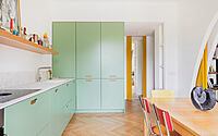
The clients wanted to make the most of the location. What did they want? A big area for cooking, eating, chilling, and working from home. If needed, this space could split into two smaller ones. Before, walls broke up the property into small areas. But now, the main living space faces the street. The bedroom and bathroom? They look out onto a peaceful inner courtyard.
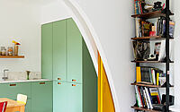
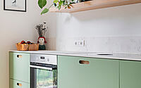
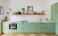
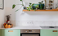
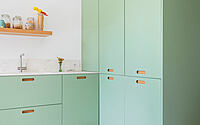
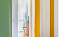
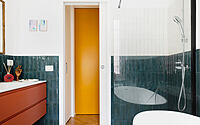
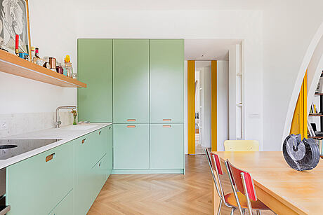
With the changes, the apartment has two clear sections. And they’ve kept the original structure in mind. In terms of design, they used every inch of space well. For example, the kitchen pillars are both practical and stylish. They smoothly split the entrance from the living space. Plus, there’s a sneaky sliding door for the bathroom, which also has room for laundry.
The Cool Arch in the Living Area
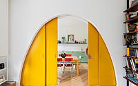
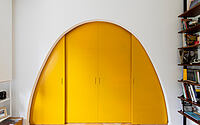
The main part of the living area has a neat arch. Is it just for looks or does it have a use? It might seem a bit out of place at first. But really, it’s all about giving the space more options. This special arch keeps its shape whether it’s open or shut.
In fact, it’s made up of two separate arches. They’re set up in a way that lets wooden doors slide between them. And guess what? They made these arches using a smart design method and cut them out with lasers.
A Bright Bathroom Space
Moving to the bathroom, there’s a clear change. Bright blue-green tiles cover the walls up to halfway. This bathroom has everything: a shower, a standalone bathtub, and a bright red sink area.
To wrap it up, they used “dry” building methods for the makeover. This made the work go faster and kept things tidy. They picked walls that not only look good but also sound good, keeping noise out. This makes the spaces comfy and strong.
Photography courtesy of tIPS Architects
Visit tIPS Architects
- by Matt Watts