House#11: Milan’s Custom Modernity by Rubini
Welcome to House#11, where Andrea Rubini‘s genius for modern design shines in Milan’s dynamic southeast area. Created in 2023 for a young couple, this 100 sqm apartment (approximately 1076 sqft) stands mere moments from the celebrated Fondazione Prada.
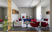
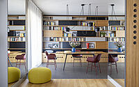
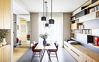
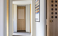
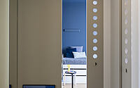
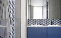
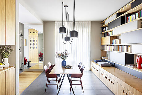
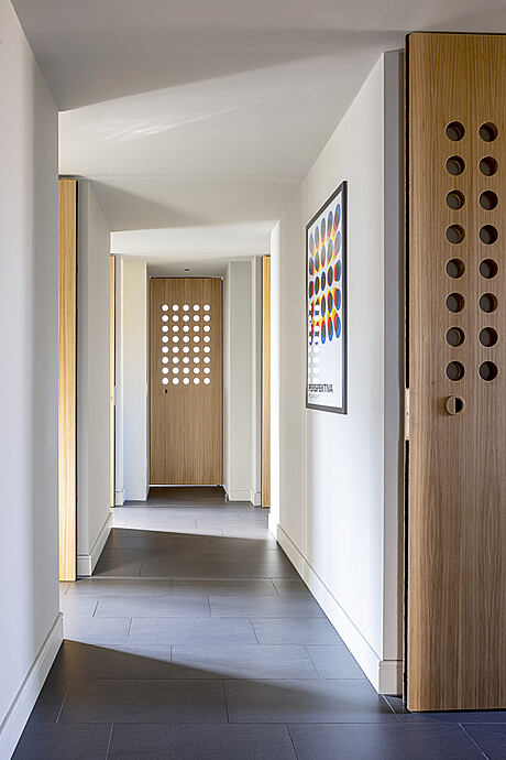
Rubini skillfully revitalizes the classic 1960s central corridor, transforming it into the home’s heartbeat. Moreover, the subtle grey tones on walls and floors provide a canvas for the striking elm veneers and furniture. Simultaneously, the innovative double-panel doors cleverly balance light and privacy, epitomizing the spirit of Milan’s illustrious design heritage.


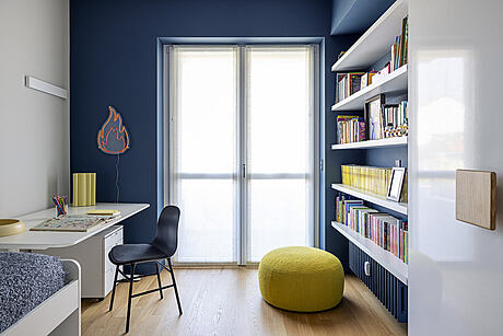
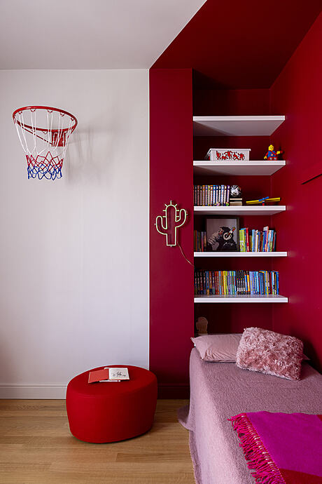
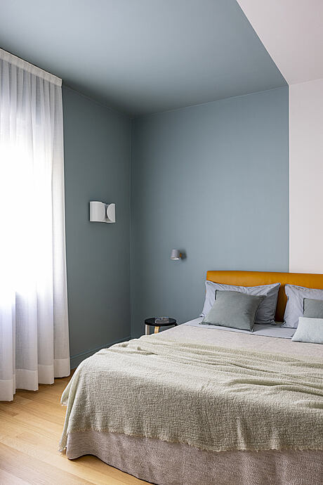
About House#11
House#11 emerges from the transformation of a roughly 100 sqm (1076 sqft) apartment, offering a young couple in southeast Milan, near Fondazione Prada, a personalized haven. Trust and foresight from the clients, coupled with mutual respect, set the cornerstone for this highly customized project.
Retaining Character, Embracing Modernity
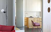
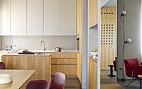
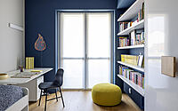
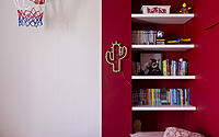
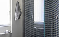
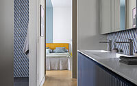
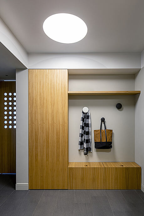
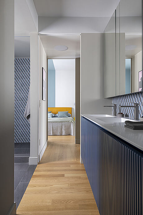
Built in the late ’60s, the home features a classic central corridor layout, a design element the team chose to enhance, not discard. They widened the hallway and recessed door alcoves, aligning doors flush with interior walls when closed. Opened, the doors tuck away, creating a greater sense of three-dimensionality. Additionally, spotlights flood each niche, transforming once-overlooked spaces into custom, meticulously crafted features like the kitchen, shower, and wardrobes.
Neutral Palette, Dramatic Impact
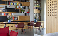
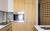
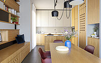
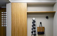
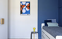
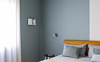
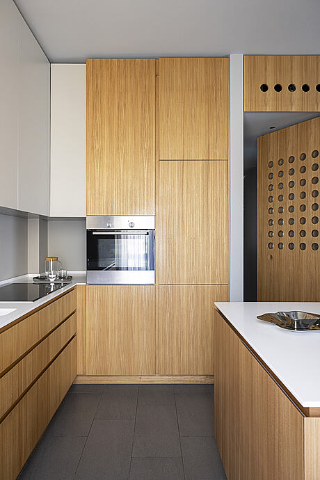
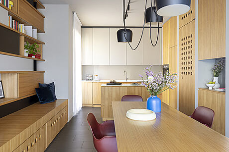
The design team’s material selection pivoted on a simple yet clear idea: neutral, grey-based hues for walls and floors. This choice visually resets the space, allowing the custom furniture and elm veneer doors to take center stage. These doors, inspired by Prouvé’s perforated pre-fabrication designs, comprise double wood panels with opal glass in-between. Nearly sixty millimeters thick, the doors lend depth to the perforations, offering privacy while still allowing light to filter through, enhancing the doorways.
The kitchen and table woods, thinner yet of the same essence as the doors, stand out. Their slender profiles offer a fresh take on the traditional use of this natural material, adding a touch of the unusual to the apartment’s overall concept.
Photography courtesy of Andrea Rubini
Visit Visit Andrea Rubini
- by Matt Watts