Itaim Apartment by Diego Revollo Arquitetura
Itaim Apartment is an inspiring home located in Sao Paulo, Brazil, designed in 2017 by Diego Revollo Arquitetura.

About Itaim Apartment
Revamping a Classic: A Sao Paulo Apartment Transformation
Diego Revollo took charge of revamping this 200 m² (2,153 sq ft) apartment in Itaim-Bibi, Sao Paulo, built over 40 years ago. A young couple, both administrators and office enthusiasts, now own it. They gave Revollo complete freedom to infuse the space with new life.
Creative Destruction and Integration
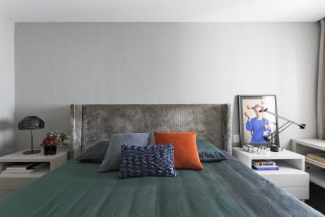
Revollo began by demolishing the outdated maid’s room, replacing it with a private bathroom for the couple’s bedroom. Furthermore, he removed several walls to merge spaces, leading to unexpected discoveries during the renovation.
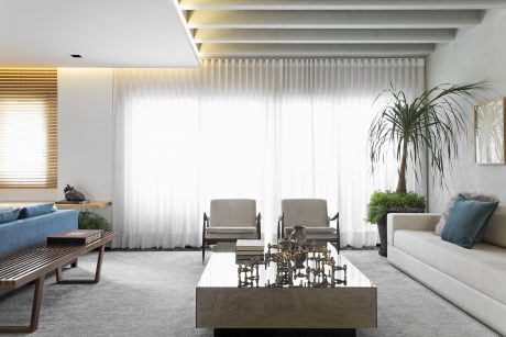
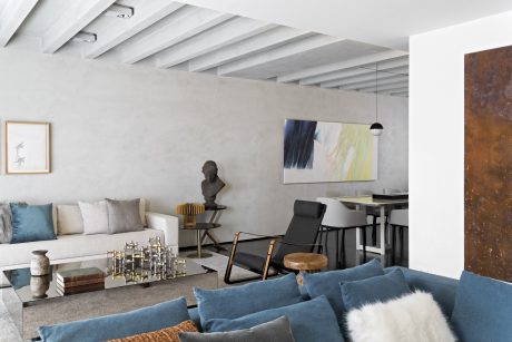
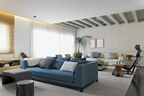
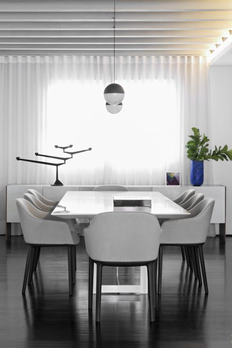
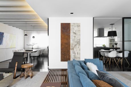
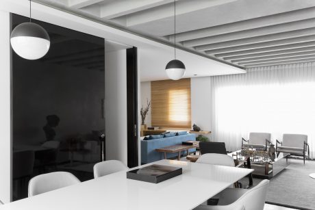
One such surprise was a cove in the dining room ceiling. Although unplanned, Revollo selected this feature as his favorite detail, enhancing the apartment’s character. “While cleaning, we uncovered a well-reinforced structure, which we then utilized to add personality to our design. This not only increased the ceiling height but also made the beam structure a focal point in the living area,” he explained.
Maintaining Harmony with Sliding Doors
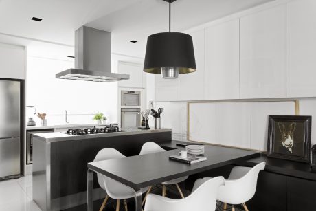
Despite initial resistance from the clients, Revollo introduced a sliding glass door to separate the kitchen and dining area. He advocated for its transparency to subtly connect the spaces.
A Palette of Black and White
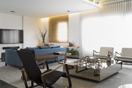
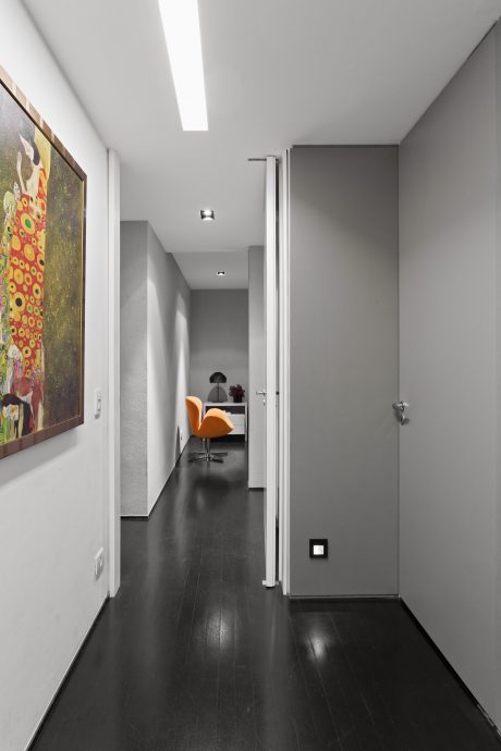
The project’s main theme revolved around a black and white color scheme. This neutral backdrop suited the clients’ style and allowed Revollo to play with contrasts, which he found particularly appealing.
The apartment now exemplifies contemporary chic, offering a functional decor that gracefully blends various cultural influences. This space not only accommodates but also enhances daily living, making it a prime example of modern urban living.
Photography courtesy of Diego Revollo Arquitetura
Visit Diego Revollo Arquitetura
- by Matt Watts
