Carmen House by Carles Faus Arquitectura
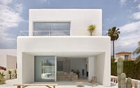
Embodying the elegance of traditional Ibizan architecture and minimalist design principles, the Carmen House in Dénia, Alicante, Spain, is a testament to the refined style of Carles Faus Arquitectura.
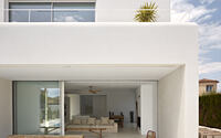
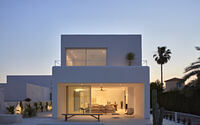
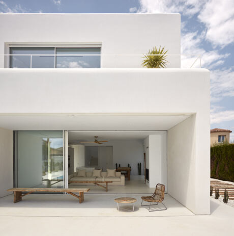
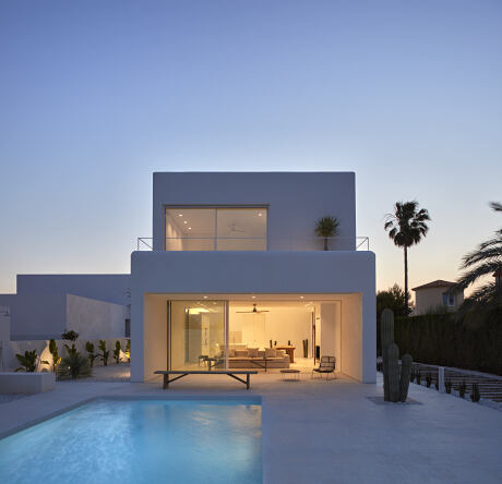
Strategically designed in 2018 to enhance natural light within its white-hued interiors, the property marries the essence of its surroundings with interior design finesse, while cleverly diverting attention from the city’s hustle and bustle. Key highlights include a rectilinear layout, a large light-infused opening overlooking a pool and Dénia castle, and a double height main nucleus that breaks the exterior continuity.

About Carmen House
The Ibizan-Inspired Design
The design of this home takes inspiration from the quintessential Ibizan country house, boasting simple, clean lines, careful control of light, and an emphasis on white as a primary color.
Influence of the Dénia Cityscape
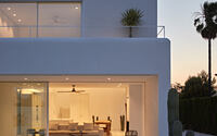
Bathed in the glow of the Dénia city lights, the house stands out in its setting, pulling focus towards the interior and intentionally detracting attention from the external environment.
Adherence to Rectilinear Formality
Throughout the design process, we’ve adhered to a rectilinear formality, with few deviations from the plans that form the main axes of the house.
Incorporating Light Pathways
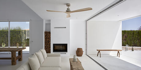
Our design strategically places spaces according to the path of light throughout the day. Upon entry, visitors are greeted by a large opening that overlooks the pool, and beyond that, the Dénia castle.
Blurring Interior-Exterior Boundaries
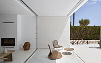
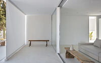
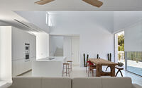
This spacious opening, when fully opened, seamlessly merges the interior and exterior. A porch of matching dimensions shields the house from excessive sunlight during the hottest months, making it an ideal space for relaxation.
Innovative Access and Increased Connectivity
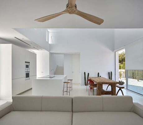
Access to the house is innovatively designed through a side entrance on the north facade, which opens up to an expansive view, framed beautifully from the kitchen and dining area. This design decision enhances the connection between these spaces, integrating a slice of the exterior garden into the main living area.
Introduction to the Main Core
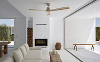
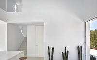
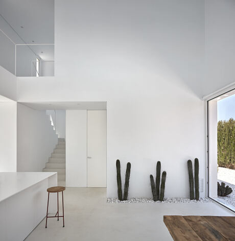
Upon entering, visitors are introduced to the main core of the house – a double-height space that effectively contrasts with the exterior. The largest volume of space, along with the expansive opening, clearly demarcates the daytime zone, from which the rest of the house’s features are accessed. The vertical communication core is subtly situated within this arrangement.
The Power of White
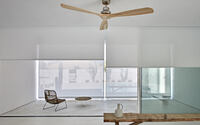
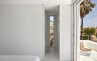
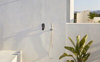
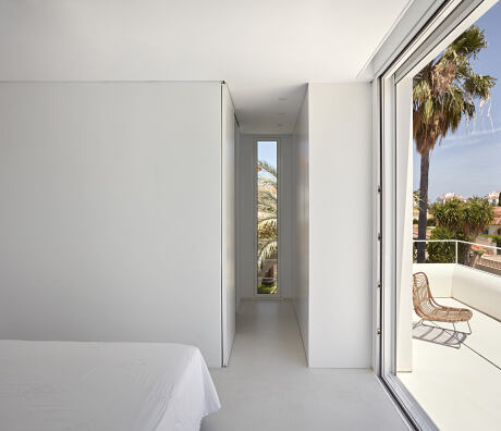
White reigns supreme in this project, providing a consistent theme from beginning to end. More than just a color, white acts as a catalyst and conductor of light, with black shadows gently softened against its crisp backdrop. The exterior vertical faces feature white lime, seamlessly transitioning into white microcement at the base to maintain linearity. The project essentially emerges as a large white canvas, touched with varying white pigments to create a harmonious ensemble of spaces.
Photography by Mariela Apollonio
Visit Carles Faus Arquitectura
- by Matt Watts