Apartment at Sea by Michael K Chen Architecture
Introducing the “Apartment at Sea,” a luxury apartment in Brooklyn, New York, designed by Michael K Chen Architecture. Inspired by Le Corbusier’s fascination with streamlined, mid-20th century steamship design, this stunning residence transforms from a one-bedroom to a two-bedroom apartment, boasting a unique, efficient, and elegant design.
With clever multifunctional spaces and a modernist aesthetic, this luxurious getaway truly redefines urban living.


About Apartment at Sea
A Nod to Le Corbusier and MKCA’s Expertise in Compact Spaces
Taking inspiration from Le Corbusier’s interest in streamlined, mid-20th century steamship design and MKCA’s expertise in creating compact, multifunctional spaces in contemporary urban environments, this apartment boasts adaptability, efficiency, and striking elegance.
Introducing the Pied-à-Mer: A Transformative Holiday Home
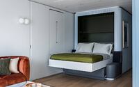
MKCA playfully dubs this residence a pied-à-mer, as it serves as a holiday home for a couple and their grown children. The apartment seamlessly transforms from a spacious one-bedroom to a two-bedroom space through cleverly designed tables and beds that fold away and unfurl as needed. MKCA drew inspiration from modernist architecture‘s fascination with nautical design, which prioritizes small-scale living, modular organization, and efficiency.
Convertible Layout and Streamlined Functionality
The apartment’s convertible layout builds on these concepts, with a focus on streamlining and smoothing its functional dimensions. Carefully choreographed movement and the unfolding and concealing of different functional zones create an illusion of spaciousness.
Innovative Design for Privacy and Circulation
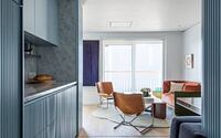
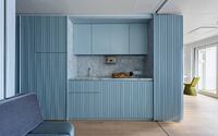
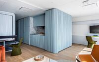
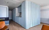
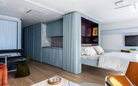
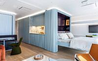
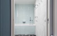
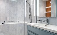
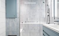
Upon entering the 600-square-foot (approximately 656 square feet) apartment, visitors move from a bright foyer towards a broad wall of ocean-facing glass, flanked by two separate ribbed aluminum pod-like volumes that house private bath and storage areas. These volumes organize the space and create paths for circulation, allowing for an experience of moving down long corridors and peeking around corners, despite the small footprint.
Clever Space Utilization in a Compact Footprint
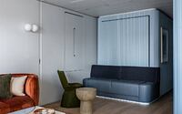
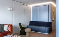
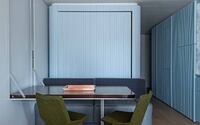
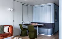
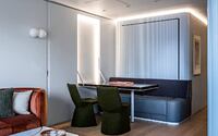
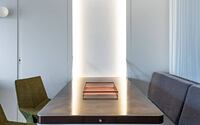
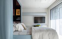
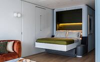
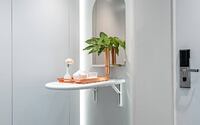
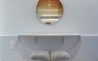
Within the limited space, MKCA has included two bedrooms, two baths, a kitchen, a dressing room, a sitting area, a trunk room, and a landing zone. The dining area easily converts into the second bedroom, with the dining table collapsing into the wall to make way for a sleek cantilevered fold-up bed. A sliding screen ensures privacy for guests when the apartment is converted into a two-bedroom space.
Motion and Multi-Functionalism: The Core Principles
Concepts of motion and multi-functionalism underpin the residence’s organization and aesthetic. MKCA incorporates hidden lighting and integrated appliances that can be boldly revealed or neatly tucked away. The modernist embrace of industrial materials inspires the continuous aluminum ribs that help conceal panel divisions, doors, and appliances, while also accentuating a sense of height in the relatively low, 8-foot (approximately 2.44 meters) tall space.
A Balance of Durable and Patina-Prone Finishes
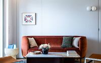
Finishes throughout the apartment are either impervious or designed to patina over time. This dichotomy extends to the furniture selection, which features highly tactile surfaces that shift from polished metals and stones to plush materials like mohair, velvet, and suede. These pieces serve as sculptural elements within the space.
Curated Furniture and Collaborative Sourcing
Contemporary pieces are mixed with several vintage items, primarily in natural materials and rich, warm colors, as a counterpoint to the cool blue and grey, slightly machine aesthetic of the custom-fabricated elements. The ship’s furnishings were specified in the spirit of collaboration, whether sourced from independent designers, commissioned or customized specifically for the project, or custom-designed by MKCA.
Enhancing Spaciousness through Light and Reflection
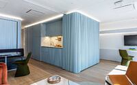
Motion and a sense of spaciousness are further encouraged through light and reflection. The aluminum ribbing along the central volumes facilitates the play of natural and artificial light across the lacquered surfaces, while LED cove lighting embedded into the top of the ribbed surfaces gives the impression that the capsules are floating—their edges luminous. The apartment’s continuous glass wall, which leads to the private terrace and view beyond, allows for vast horizons to shapeshift from sea to land and from day to night.
Photography by Alan Tansey
Visit Michael K Chen Architecture
- by Matt Watts