Casa Farfaglia by Studio Gum
Casa Farfaglia is a traditional holiday house located in Noto, Italy, redesigned in 2018 by Studio Gum.

Description
Casa Farfaglia represents one of the many examples of architectural projects, scattered throughout the Val di Noto territory, financed with European agricultural funds. The main characteristic of these farms consists in satisfying simultaneously two primary family requirements, the first being a place of work obviously linked to agriculture and livestock breeding and the second a place for short or long term residence.
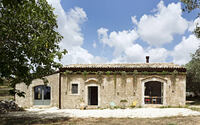
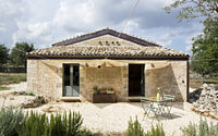
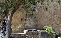
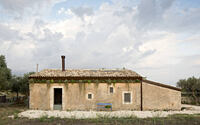
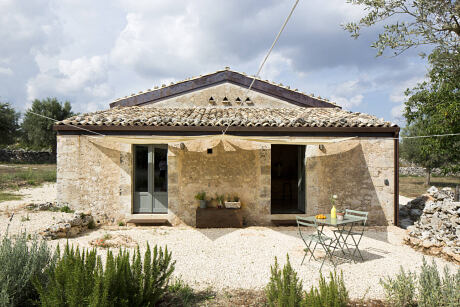
Casa Farfaglia consists primarily of an original core with a 9×12 m surface and a double-pitched roof, two east access gates and small sparse openings along the westside of the property; there is another core of the same width of the farm on the south side, which houses the barn, with two south accesses and a large opening used as a cattle entrance to the east. On the north side, with no openings, we find the animal trough and the large water well that extends widely under the house.
The building, from the 1800s to the early 1900s, housed an olive oil mill for the production of olive oil and stables for livestock, and then became a holiday home until the 1950s, leaving the original internal division unchanged: a work area in open country and wooden lofts where to rest and cram the hay.
The project involves the conversion of the building into a private residence for a young couple with two daughters, and a guesthouse for tourism.
Since the very beginning, the designers and their client have agreed on the importance of preserving the characteristics of the structure, which over the years, have made it, as often happens, a harmonious whole with the environment that surrounds it. So much so, as to make it almost a landmark for all the generations who have lived in that area, like a millennial monolith that has always been there.
However, when having to face the structural and safety needs of the building, the challenges in bringing together new materials with the patina of time that over the years covered the external walls, needed to be dealt with. In this sense, the controversial need to create a structural concrete curb (CA) was the element that allowed the integration but at the same time an almost temporal detachment, between the new layers and the old walls of more than 150 years.
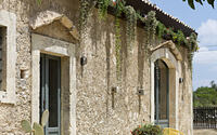
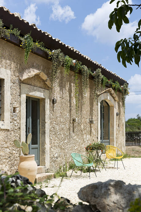
With regard to the abandoned country houses, the ends of the roof tiles are covered with spontaneous plant life creating an easily noticeable horizontal green line just above the gutters. With this as a starting point the designers wanted to create an element in mat black steel with a triple function: one, to shield the concrete curb (CA), two, to allow the rainwater to flow out of the gutter and three, to have a pocket which would allow the owners the possibility to plant different types of vegetation. The steel element flows seamless, even on the inclined sides of the pitches, where the tasca and the gutter disappear but the casing that shields the curb remains.
The interiors follow the same design approach: the original functional layouts have been maintained, even if new practical living needs and technology needs have been adapted.
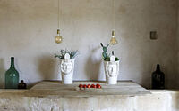
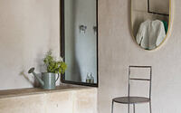
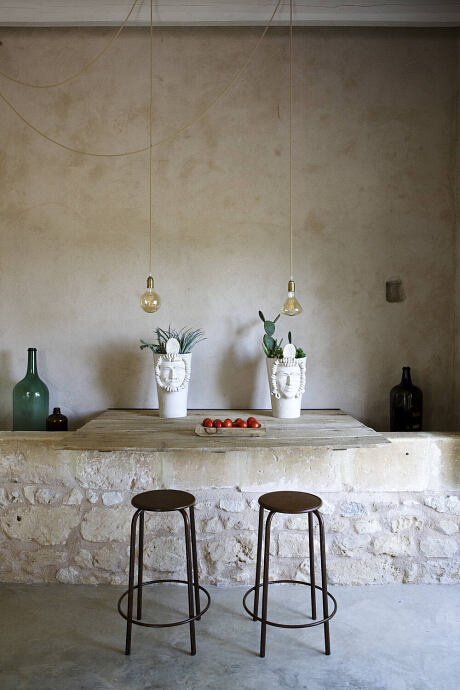
Dry and minimal environments, without unnecessary decorations, few materials found during the demolition phases have been re-purposed.
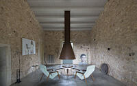
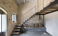
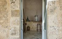
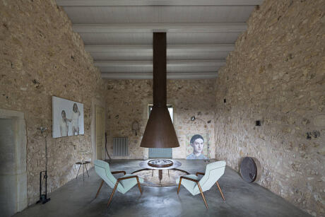
The area that used to host the mill, becomes the living room, leaving a circular trace on the floor where the stone wheels used to press the olives. It is in this area, with its original stone paving, where the large chimney, consisting of a conical flue (chimney pipe) hanging from the ceiling and suspended about 50 cm from the brazier, comes to life. The floor is an industrial concrete pavement to recall the original working environment of the mill. The walls have been left in raw stone along with a stained wooden ceiling. On the blind wall to the north, iron structures cross the stonewall from inside to outside, acting as viewing points for the outside during the day and small night-time lanterns that signal a presence in the house. The two French doors that open onto the outside spaces are aligned both to the east and west side.
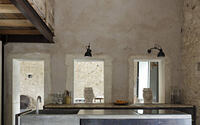
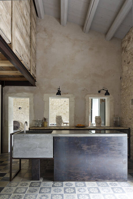
The load-bearing wall that cuts across the rectangular layout separates the living area from the kitchen, communicating through pre-existing openings that were certainly used to transport the olives from a storage area to the milling room.
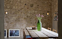
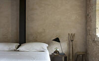
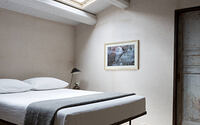
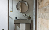
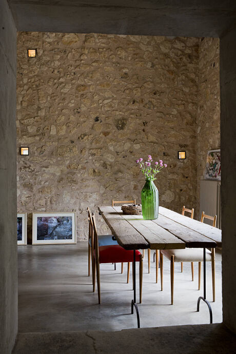
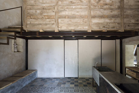
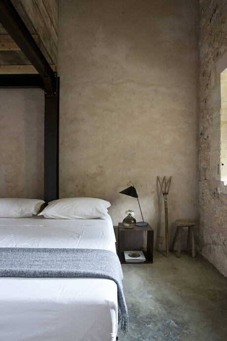
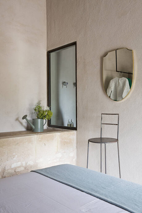
The dining room, which faces east, ends at the wall that separates it from a bedroom with its bathroom and a closet. Two pivot doors that close almost touching the wall allow access to the two rooms.
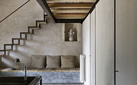
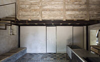
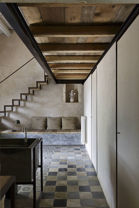
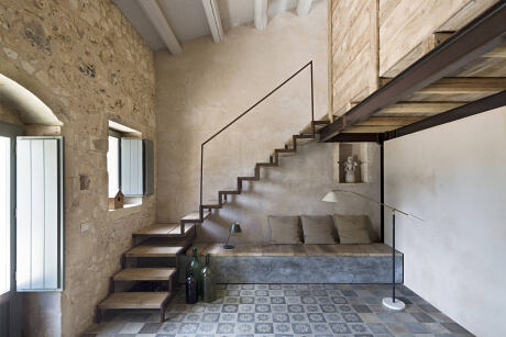
Few but essential are the elements in the kitchen: the iron and concrete island block that houses the stove and the sink, the back counter serving as a pantry, a concrete container bench and the staircase that connects vertically to the mezzanine where the second bedroom with bathroom was created.
The core of the loft, entirely self-supporting thanks to a structure in beams and HEA pillars, is visible both from the bedroom on the ground floor and from the kitchen throughout the whole double height.
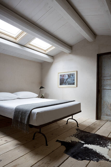
The loft, entirely made of wood, was designed following the construction methods of the old haystacks, in fact, a place originally used to keep straw.
For the flooring, only in this case, old decorated cement tiles were used; just to underline the living function by identifying the domestic element in the dining room.
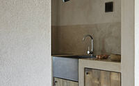
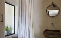
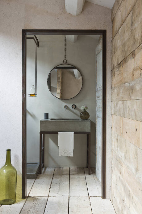
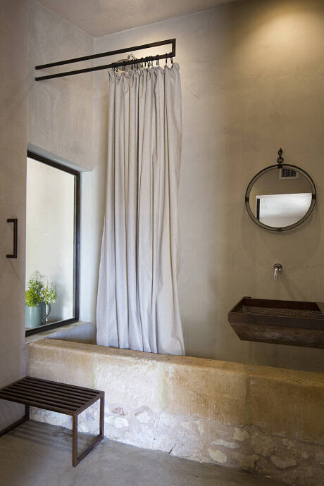
Finally, the guesthouse, attached to the main unit but only reachable from the outside, has a rectangular plan of 5 x 9 m. The original manger that runs longitudinally throughout the width of the compartment, is the connecting element between the three rooms, changing its function and small accessories according to the area in which it is located, such as a table in the small living room, a shower and sink in the bathroom and a wardrobe in the bedroom. Inside this unit there is also a small kitchenette placed in a space that acts as a hallway between the three rooms.
Photography by Filippo Bamberghi
Visit Studio Gum
- by Matt Watts