Casa Rex by FGMF Arquitetos
FGMF Arquitetos designed quite an unusual office building located in Sao Paulo for an important Brazilian design office.


Description by FGMF Arquitetos
When Casa REX, an important Brazilian design office, came to us looking for a reform of its new seat, the initial goal was to create a new identity for the physical space of the office, which didn’t exist before because of its rapid expansion.
A former residence in Pacaembu, built in the 1940’s, was chosen. The property had had several reforms poorly made through the decades that hid almost entirely the building’s original architecture.
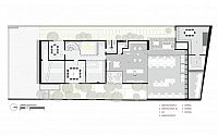
Since the beginning, the clients’ program was divided in three parts: the meeting area, where there would be the reception and a place exhibiting the office’s projects. The studio’s area, completely separated of the first one, where everybody would work together in an open space. And, finally, the external front area, with restricted and controlled access.
Having issues such as the limited budget in mind, we decided to use some unusual resources while designing the building: a lot of demolition and the usage of some infrastructure pieces.
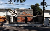
In the façade we piled stone gabions, a material used as an earth retaining on the roads and the like; together with the REX team we made a specific pagination where we used red sandstone and big gray gravel to form a visually remarkable façade. One of these modules was suppressed and we put a plate with negative cuttings indicating the office.
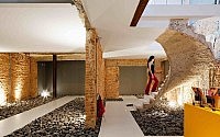
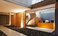
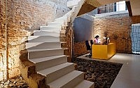
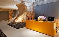
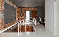
In the reception and meeting area, we made an extensive demolition: we created a two-story high ceiling, destroyed the floor and removed every plaster of the original walls, in a form of “architectural archaeology”. Inside this space with a demolished aspect, we created a pure, clean, white path leading the visitor to the two meeting rooms – entirely white blocks inside those ruins. The rest of the space was filled with the same gravel of the façade, and it is in that “inter-space” that the exhibition of the office’s projects will be mounted, almost as a gallery amidst the building’s ruins.
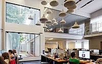
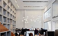
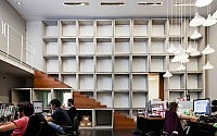
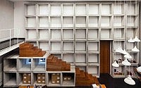
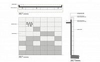
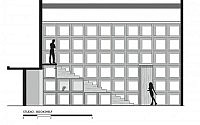
As for the studio’s area, it was designed as a two-story high ceiling – which was built – occupying a little more than a half of the entire space, and a section of normal ceiling, original from the construction, where the upstairs acts as a large room for the company’s president. In the two-story high ceiling, a “cloud” of luminaires helps lightening the place, in addition to delimiting spaces. On the two-story high ceiling back wall, behind which we found the bathrooms, the financial area and the models area, we made a 70-m2 bookcase with piled pre-shaped concrete pieces that are normally used for channeling streams, consigning the façade. Into this big bookcase, we have incorporated some wooden flights of stairs, in addition to the modules themselves, in order to reach the footbridge connecting the director’s office to the rest of the agency.
Using heavy building materials in an innovative way as well as demolishing tiles and slabs creates a unique space, very different from the existing offices. It is almost as a mix of a gallery and a corporative space, something different for an unusual company.


