Exchange Building Project by Callender Howorth
Designed by Callender Howorth, this industrial apartment is situated in London, United Kingdom.

Description by Callender Howorth
The building was converted into apartments in the year 2000. It was originally a telephone exchange hence the name – Exchange Building project. Our client had owned it from the time it was originally converted and it hadn’t been changed in that time. It had been rented to private clients over the years and generally it had become very tired and dated.
The original brief was to simply update the apartment with a new kitchen and bathrooms and decorate it throughout in order to increase the return on rental and bring it into line with newer rental properties in the area.
However, upon viewing the apartment we instantly spotted the potential to make it a much more special place with a distinctive ‘loft’ style.
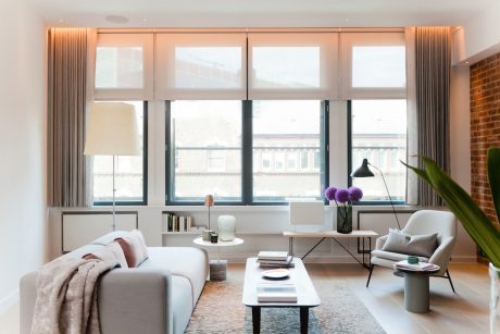
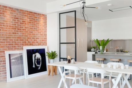
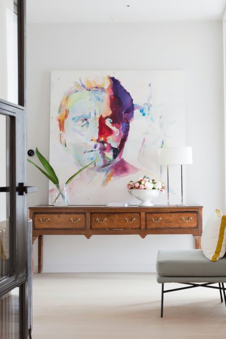
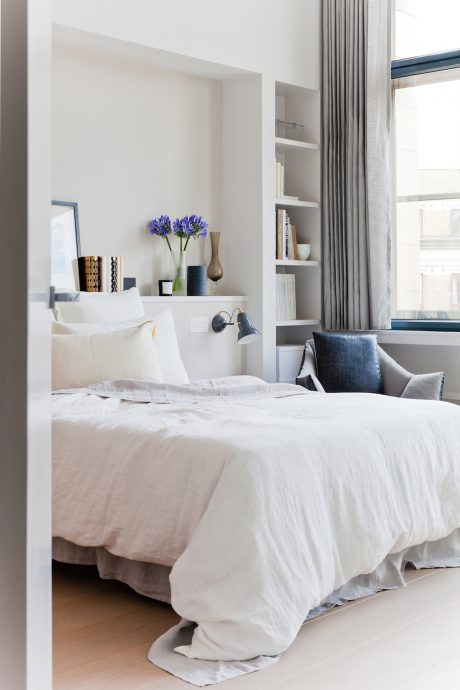
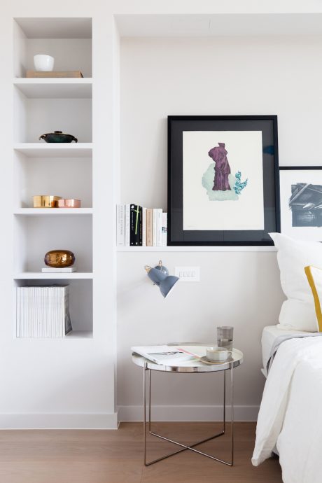
Starting from scratch, we took the walls back to bring this spectacular space up to date. In places we left brickwork exposed to evoke the industrial feeling that is associated with loft apartments in the Big Apple. White colours and simplistic fittings imbue the space with a contemporary feel, while colourful, bold art pieces give character.
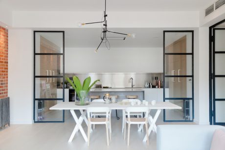
We used glass partitions to segment the space, yet maintain the open-plan feel – as would be found in a loft apartment. Light permeates every corner of this chic penthouse.
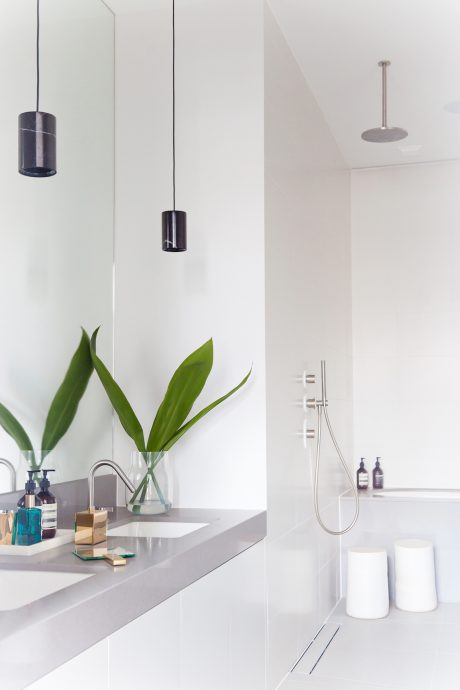
The master en-suite bathroom was reconfigured to make it twice the size by removing a dark corridor of cupboards. An open plan rain shower was added. The guest bathroom was also refitted, both bathrooms used large scale tiles and expanses of mirror to make them feel much bigger and brighter with slot light detail.
In the main living space a feature wall was added using reclaimed London brick tiles – this helped with the industrial loft look.
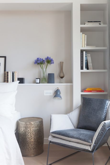
New joinery throughout maximising storage wherever possible was a key client request.
Overall the palette of materials was kept to a minimum. All walls, joinery and internal woodwork we’re painted the same colour. The same tile was used in the bathrooms and on the kitchen floor. Wide plank wooden floor throughout. Stainless steel and veneered joinery to match the floor in the kitchen.
Maximising the space and increasing the feeling of lightness were the main challenges in this project.
Also, getting air conditioning integrated into the bedrooms and main living space was challenging. We couldn’t mount anything to the exterior of the building so found a system which didn’t require external equipment.
The desirable home is perfectly suited to its surroundings: Shoreditch is a young, trendy area, inhabited by an eclectic mix of people. Tailoring this project to the desires of our client was both challenging and rewarding.
Photography courtesy of Callender Howorth
- by Matt Watts
