Prospect House by Swivel Interiors
Prospect House is a modern house located Seattle, Washington, designed in 2020 by Swivel Interiors.

Description
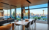
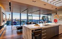
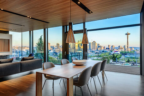
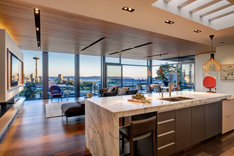
Long-time residents of Seattle’s Queen Anne neighborhood, the clients were passionate about staying on the hill, but also deeply desired a new modern home. After an exhaustive multi-year search they found a hillside location with breath-taking views of the downtown Seattle skyline, Puget Sound and Olympics. Best of all is a straight-line view of the iconic Space Needle. The steeply-sloped site created a challenging design and build project. The clients asked for views to be maximized on every floor while also creating a year-round living opportunity. Although the architecture, interior finishes and furnishings were both inspired and shaped by the desire to allow the panoramic City and Sound vista hold center court, the confident design lines of the home and thoughtful material selections never take a back seat.
Design Plan:
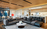
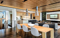
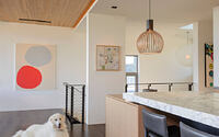
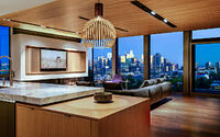
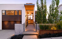
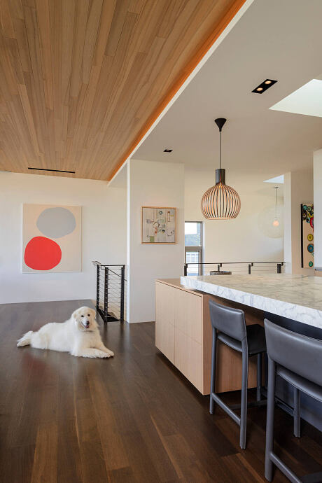
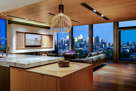
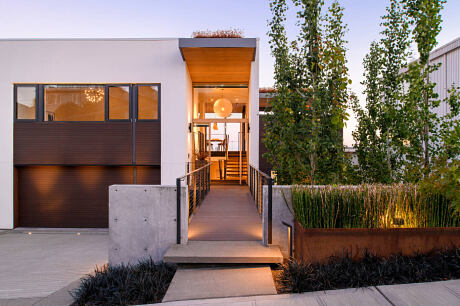
From street view the house reads like a large white modern box that clings onto the hillside, a nod to the complexity of the demanding build. Internally it is an engaging and layered experience of integrated materials, design lines, furnishings and art. Confident details (slat wood ceilings, a large marble and wood box island, dark floors, bright art), compliment the home’s panoramic views, especially in the evenings.
The clients wanted to maximize the indoor/outdoor features and were willing to sacrifice indoor space to maximize outdoor living opportunities. A reverse floor plan for the sleeping rooms (located on the lower second and third floors) allowed the creation of an open floor plan (kitchen, dining, living and deck and balcony) on the entire top level.
The design of the exterior minimizes the impact of a double width garage door through the creation of an elevated entry bridge along with an extended roof over the entry, collectively working as a focal point. The garage door is also blended with windows in the floor above. The door design boasts the sturdy beauty of cedarwood. Its cedar garage doors speak of the wood’s reliability that can withstand damage brought about by the changing weather. This garage fixture’s highlight is the lightweight cedar built for easy handling without sacrificing utility and style.
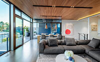
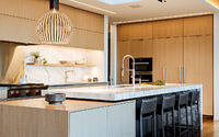
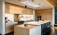
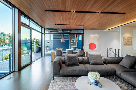
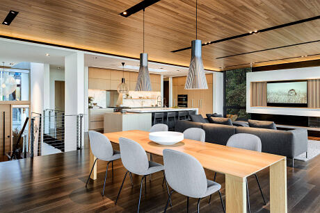
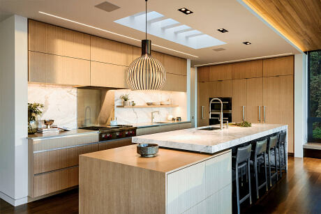
Entering through a ten-foot tall oak pivot door opening, one enters midway between the upper and middle floors. On the main floor, the dropped kitchen ceiling features a large skylight, punctuated by structural members, which floods the space with light during the day. The kitchen ceiling transitions to the ash planked main living/dining room ceiling. To provide a friendly ambiance and convenience for the family and as they entertain their guests. This all-wood ceiling angles upward towards the glass wall and deck to enhance the impact of the expansive scenic vista. (Clients have shared that they feel like they are floating over the city and sound.) Large pieces of structural steel frame the windows and doors on the south-facing view side of the house, allowing for maximum glazing.
Design Goals:
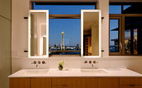
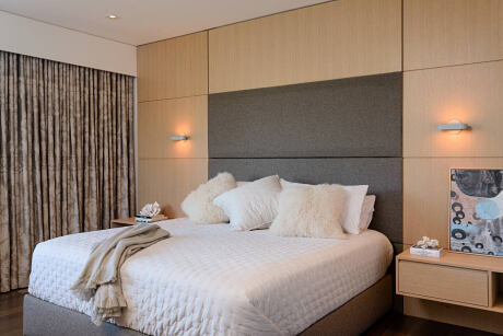
The main goal was maximizing views of the Space Needle and Seattle’s downtown skyline, from all three floors and almost every room, while also addressing some rather complex and challenging requirements due to the steeply sloping site and permitting requirements. Interior finishes, furnishings and artwork needed to be confident without competing with the breathtaking views. Elegant and comfortable, the sumptuous interior was created for the most stylish of guests. Our clients also asked us to maximize the opportunity to have year-round outdoor livability in the home. The west side of the home includes a fully terraced “room” complete with fireplace, heaters and even skylights (for sunshine and nighttime star-gazing). The design team collaborated on a fireplace wall and privacy screen composed of metal and Dekton. Outdoor furnishings have modern low-profile lines while making comfort a priority. At the same time, explicitly making the client’s request come true by amplifying the outdoor living space.
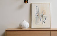
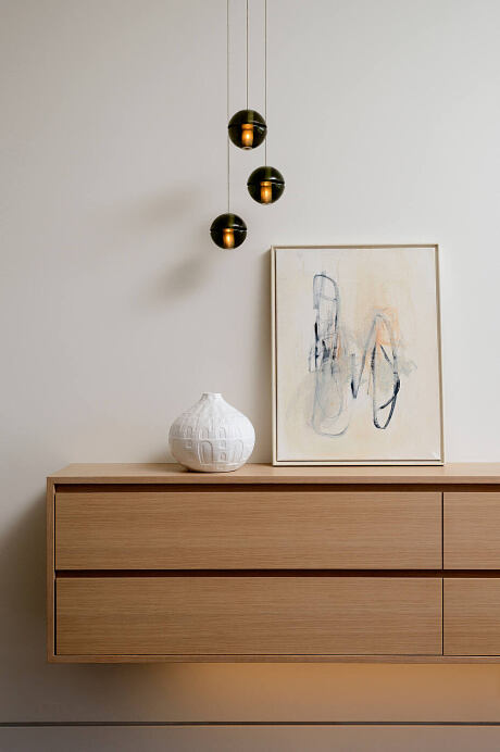
Everything started with the ceiling! The design team wanted to give the clients bright modern interiors while making sure the home still felt anchored into the hillside. Collaborating with European Hardwoods, the team landed on rift and quartered planked Ash. The ceilings quietly float above you – serving to simply and softly frame the panoramic city and Sound views. Artworks by Mia Farrington and Sherry Ruden reflect the exterior colors of the sky and landscape. The color palette and combination are fashioned to evoke a feeling of relaxation and tranquility for the owners.
The remainder of the finish and furnishings plan was built out from the ash ceiling decision. Cabinetry is flat-paneled rift white oak mixed with velvety Polaris (a new generation laminate from Abet Lamineti). A multi-level honed marble (Calacatta Carrara Classic island), with sink and space for seating, runs a full-slab length. A cabinet box is partially tucked under the cantilevered slab. The result is an island that runs the entire width of the kitchen. A Secto Octo pendant is centered above the oak wood box section of the island while two standard Secto Slat-wood pendants hang over a ten-foot Benson oak table with Gubi dining chairs, upholstered in a Kravdat black and white fabric. Most furnishings are modern European pieces sourced from local resources (Inform Interiors, B&B Italia, Driscoll Robbins, Ligne Roset).
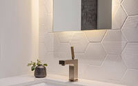
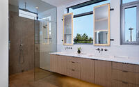
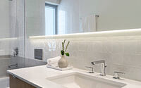
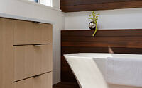
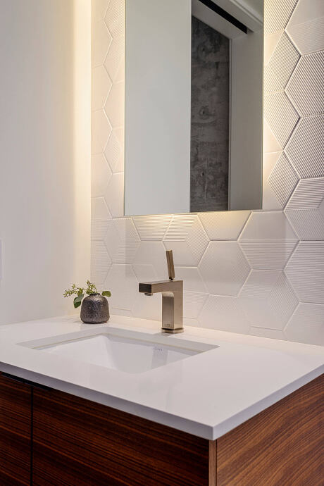
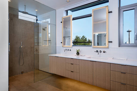
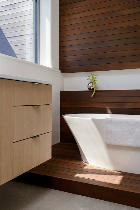
The home has 4.5 baths which the design team wanted to all have the same bright patterned vibe without feeling redundant. The overall design has to match and enhance the aura of lightheartedness desired by the clients. To achieve this, flat and dimensional white tiles were selected (of note, Mosa’s Kho Liang Le’s classic 60’s tiles) and mixed them with matte gray and ribbed basalt tiles on accent walls and floors. While no two bathrooms are the same, they all feel connected. The other one exemplifies a modern cedar bathroom with part of the floor and wall area perfectly accentuated with superb cedarwood. The warmth of the wood gave a fantastic combination with the pristine white bathtub purposely put up near the bathroom’s stylishly clear steel-framed window.
Final Thoughts
It is all about client collaboration and satisfaction. Client satisfaction has to be the prime objective from the proposed plans to actual living. The home is the owner’s castle and comfort zone that every detail has to be brought to their attention or awareness. Every minute detail should be known and discussed to avoid uncomfortable discussions on the premise that a home is made out of love for family or oneself.
Photography by Will Austin
Visit Swivel Interiors
- by Matt Watts