Retorno Apartment by Leonardo Tulli
Retorno Apartment is a modern home located in Curitiba, Brazil, designed in 2021 by Leonardo Tulli.

Description
Return: a term that evokes not only a displacement in tactile space, but a plunge into a nostalgic temporality. Return, as an act, is always a trinomial of “who”, “where” and “when”. Therefore, the mission of creating this impact of returning to one’s origins must be even more cautious, because each new little piece of wall must open paths for a new return to oneself.
The family of this apartment, even though they left, never forgot their property in Bigorrilho, Curitiba, well located and with a great floor plan. The years went by and the interest to remodel and return to the place, now rented, grew. After some research, Tulli was hired to make the most of the interiors and modernize the definitive residence.
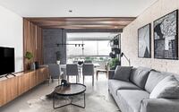
Right at the entrance you can see the integration of the living room with the balcony. In addition to expanding the space, the Studio’s intervention gave way to a beautiful suspended table connecting the environments and matching the view from the 14th floor. Next to the clouds and without supports below, the structure seems to be floating. The old balcony now gave place to a reading corner with a bench, also without supports.
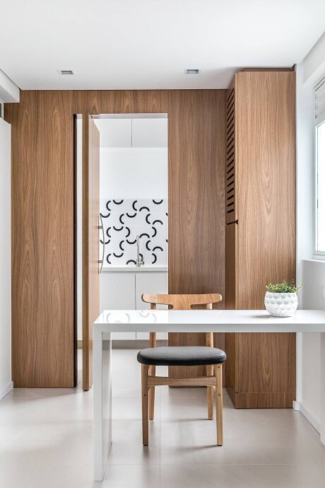
Composing the dining table, a slatted panel was developed with diffused linear lighting that crosses vertical and horizontal leds, imitating the natural progression of the sunlight seen from the windows. The panel and the floating table are connected to a wooden cabinet with minimalist details.
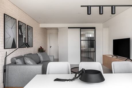
This cabinetry makes up the underside of a pillar in burnt cement. Contrary to the traditional technique of hiding structural axes with neutral tones, Tulli dared with an industrial style painting to create a focal point. The gray texture contrasts with the beige of a brick cladding wall from Brick Studio on the opposite side, which gives a slightly rustic style to the modern design of the rest of the room. A vertical garden with black metallic cachepots – author’s design Tulli Studio – begins just as the long brick wall ends. Both the panel and the supports, both following the industrial line, were designed specifically for the project.
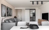
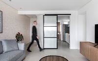
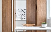
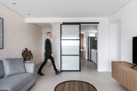
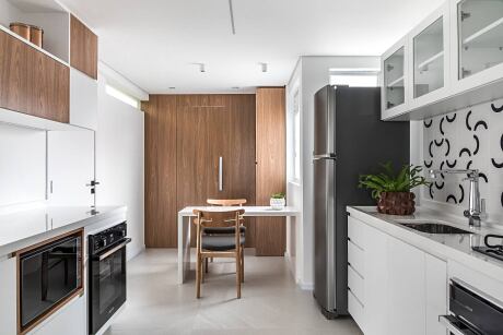
Together with them was also designed a sliding door with semi transparent glass that separates the kitchen from the living room. The option found gives privacy to the kitchen, but still maintains interconnection between the two, by simply sliding it to the side.
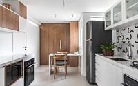
Inside, the kitchen works with a white design with niches and cabinets, but maintains the contrast with the wood. A panel with a hidden pivot door made of this material is seen in the background hiding a new service area, a remodeled former employees’ room. The pagination of the white coating with black semi-circles brings a playful air to the pediment.
The central corridor follows the minimalist line, containing only a sconce with indirect light at the entrance and a blue painting already alluding to the base color of the two rooms on both sides and to the social bathroom that is at the first door when entering it.
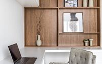
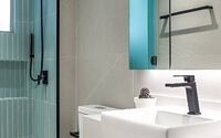
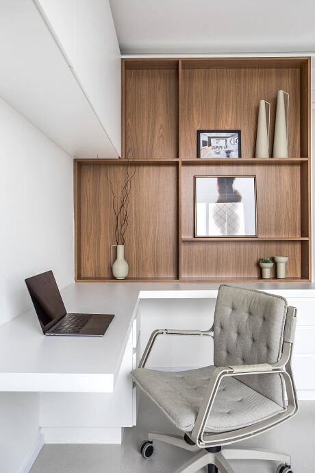
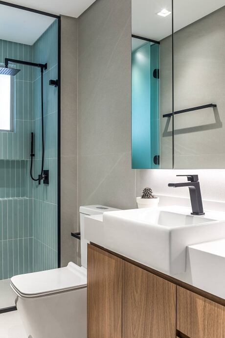
The master bathroom is the first room to use color as the main element of the composition. The green and citrus tones, with Portobello tiles, bring a feeling of freshness into the apartment, and a folding door of milky glass makes the room versatile and can function as a toilet. The office ahead is a little more traditional in the use of colors, but innovating with a custom made bookcase in wood and asymmetric niches that hold a TV, books and decorative objects.
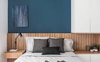
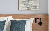
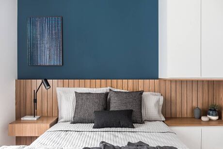
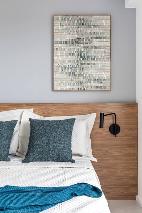
The guest room has an elegant milky white glass cabinet with metal knobs, a bedside lamp and two sconces on the side, and the panel above the bed in a beautiful shade of gray. The suite has a similar concept, but with the use of a navy blue that evokes a duskier sunset. As with other details of the project, the idea was to bring external elements into the interior of the apartment. This can also be seen in the panel lighting, but now with a niche beside the bed that leads to an “L” shaped cabinet also made of wood.
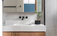
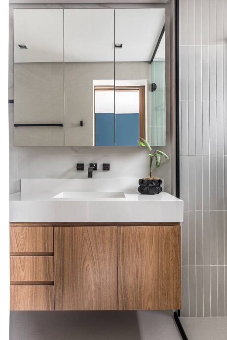
Instead of sconces, here a black lamp was used on top of a bedside table raised from the floor. Hidden behind the wooden panel of the TV, the sumptuous bathroom in the suite completes the project, with a black wall mounted faucet, a tub sculpted in white quartz and tiles also from Portobello composing a gray niche.
Photography courtesy of Leonardo Tulli
Visit Leonardo Tulli
- by Matt Watts