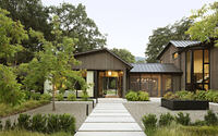
Oak Woodland by Walker Warner
Oak Woodland is a modern wooden residence located in San Francisco Bay Area, designed by Walker Warner.


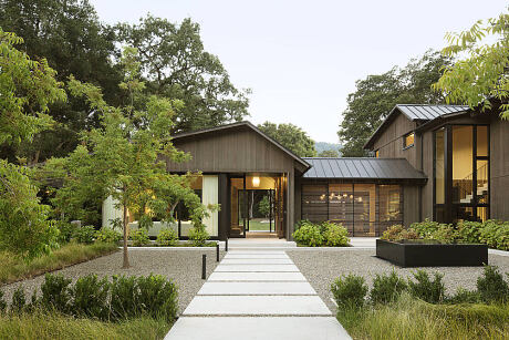
Description
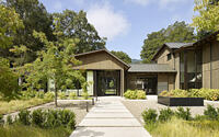
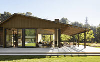
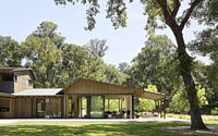
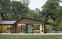
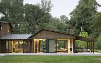
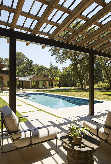
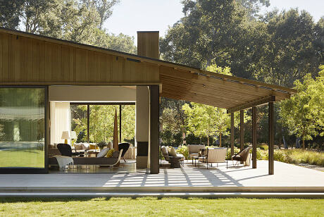
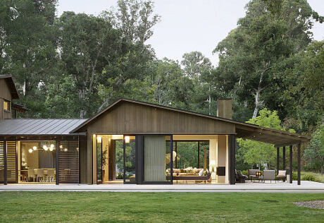
Located in a magnificent, park-like setting filled with mature, 80-foot-tall oak trees, this residence meets the clients’ desire for a family home that is casual, stylish, functional, and adaptable. Flexible indoor and outdoor spaces allow for the use and enjoyment of the site in its entirety, both house and grounds.
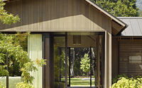
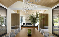
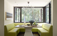
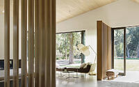
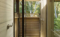
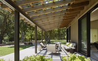
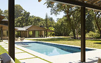
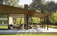
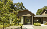
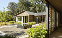
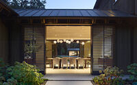
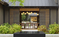
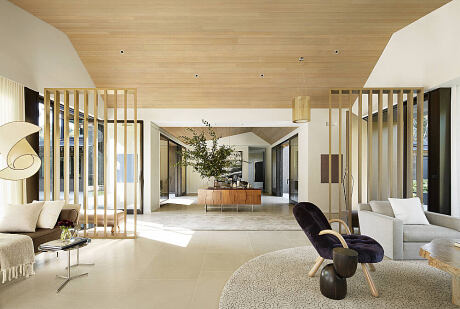
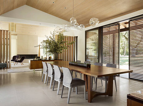
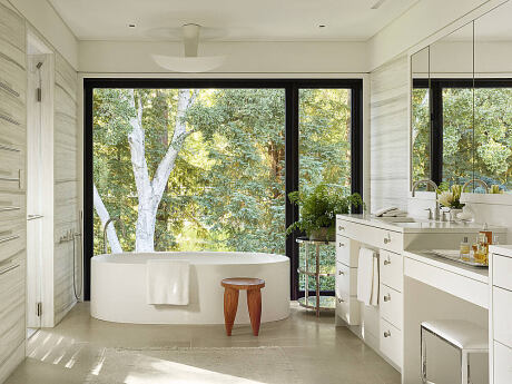
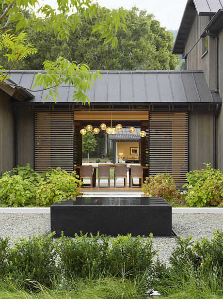
Accessed via a long drive, the property had developed piecemeal over the years, resulting in an experience that was anything but peaceful. By completely reworking the site and blending the clients’ traditional and modern tastes, the design team created an evocative new home that’s nestled into the woods. Utilizing clean lines and a pared-down palette of cedar, metal, and concrete, the two-story residence borders an open space preserve. The home’s transparency and relationship to the land reflects the site’s expansiveness, which is evident upon arrival at the formal entry where guests can immediately experience the natural setting through seamless indoor-outdoor connections. The home’s rooflines are stretched to protect the interiors from hot summers, while responding to forms prominent in the California rural landscape which served as design inspiration for the home. Inside, the team created zones where family activities can happen in a communal way. “The home was organized into public and private zones,” notes Mike McCabe of Walker Warner Architects, “with the family’s everyday living spaces easing into one another. The architectural intent was to provide a house that lives small day to day for the family but can expand to accommodate bigger gatherings and events.” A mudroom with cubbies allows for easy organization of family belongings while everyday casual areas for living, dining and cooking are immediately adjacent to the pool and terrace. “The private parts of the house are about retreat and family time,” adds McCabe, “while the public parts allow them to mingle with their guests and enjoy all the site has to offer.”
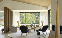
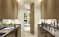
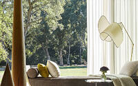
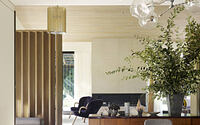
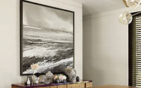
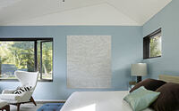
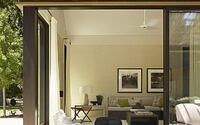
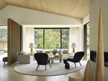
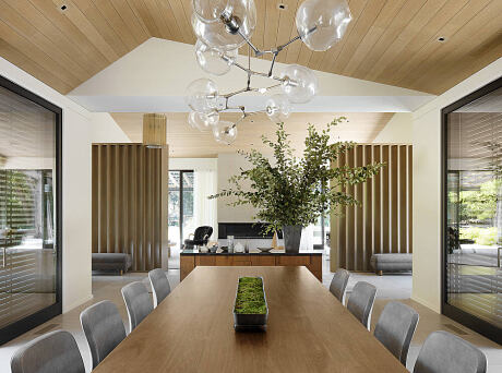
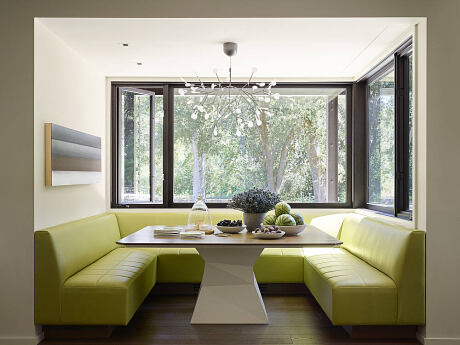
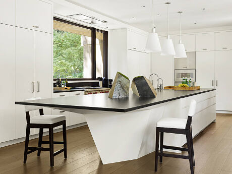
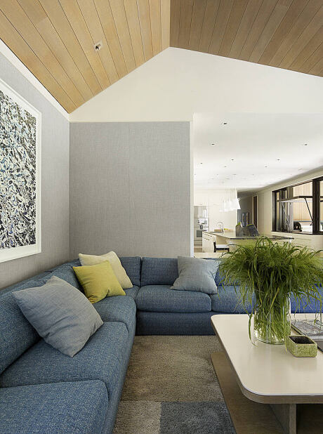
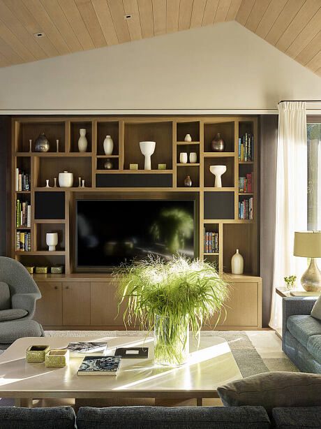
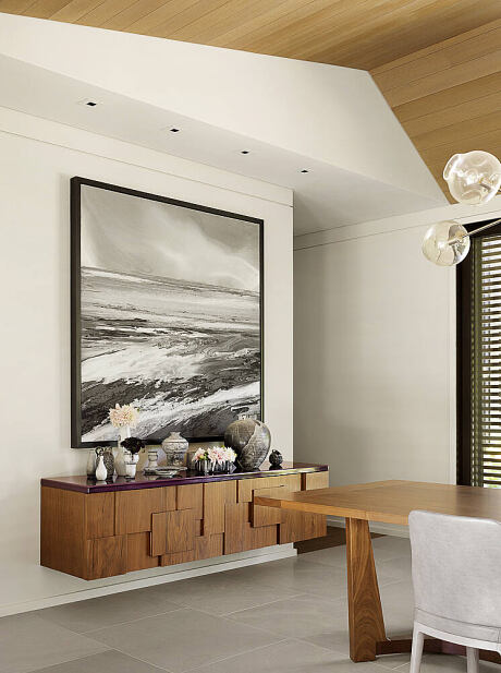
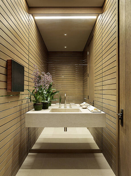
Interior materials and color palette complement the architecture and work their way throughout the house across a variety of different finishes. Stained wood plank doors were installed in painted frames with textural bronze hardware, gentle gray limestone floors were combined with warm walnut planks, and walls were covered in grayed white paint to create a feeling of warm modernity. The stone on the fireplace is the same material as the stone flooring but hand-treated in a brushstroke-like effect that lends the surface a light, elegant texture. All interior furnishings that were designed and curated for the project compliment the casual yet dynamic architecture while giving a chic air to the residence. Simple sculptural shapes, textural woven fabrics, organic elements and a few accents of forest colors complete the marriage of inside and out. “Almost every piece of furniture has an angle or slope,” notes David Oldroyd of ODADA. “But more natural shapes—such as the curvy chair legs or pebble-shaped poufs—bring in some softness.”
The property borders an open space preserve, so landscape designer Bernard Trainor of Ground Studio gently transitioned the manmade garden into the natural surroundings to trick the eye, making the property appear to go on forever. As with the architecture, Trainor’s approach to design was to deftly “thread the needle” between the oaks. “Closer to the house, notes Trainer, “the hardscape and plantings reflect the house’s architectural shapes—more linear. As you move farther away, into the oak woodland, they get wilder.” Overall, the residence’s indoor and outdoor design reconciles historic context, building constraints, and functionality, resulting in a cohesive and harmonious space for living.
Photography by Matthew Millman
Visit Walker Warner
- by Matt Watts