Single-Family House by Klaus Bürger Architektur
Modern single-family house on the outskirts of Ratingen in Germany, designed in 2012 by Klaus Bürger Architektur.

Description
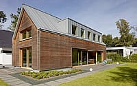
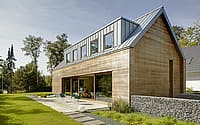
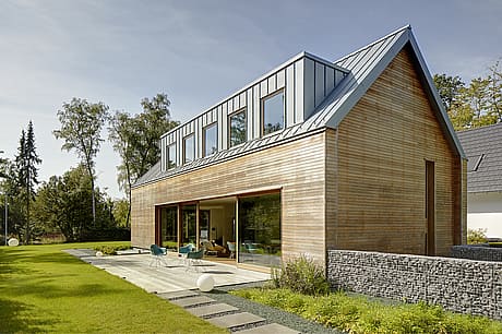
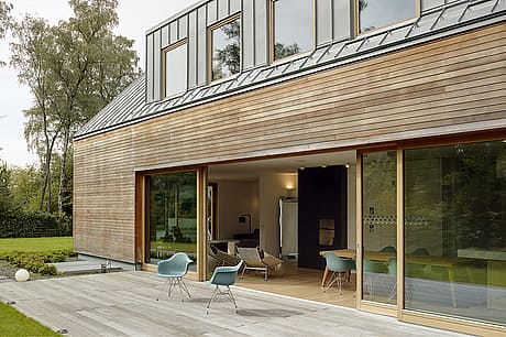
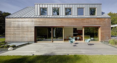
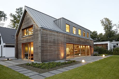
The gable-roofed house on the outskirts of Ratingen, not far from Düsseldorf, stands out in an environment dominated by ordinary single-family houses. Today, there is a multitude of modifications of the original type of all residential houses with sometimes exaggerated design details that want to represent something special. The fact that it is also possible in a different way is confirmed by the design of the office Klaus Bürger Architektur from Krefeld. Architect Klaus Bürger and his team chose a reduced, clear structure with a façade design that pleasantly corresponds with the classical form: The two striking materials, wood and titanium zinc, lend the area structure and a varied surface effect.
But before the actual planning could begin, it took some time. During the first inspection, the initial 1,350 m2 plot appeared to the architects like an oversized front garden of a bungalow set back from the street. “Quite with a beautiful view of impressive groves of trees as far as the eye could see,” recalls architect Klaus Bürger. The concept and regulations called for preserving the bungalow, dividing the property and developing a master plan with the two new owners to regulate the location and shape of the houses, access and spacing. In accordance with the development plan and conditions regarding height, storey height, roof shape and pitch, two almost identical structures were created, which were designed, planned and built independently of each other. Thus the very sober starting position for a residential building that the architects completed in 2019 and brought to life for a young family of three.
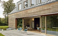
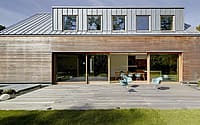
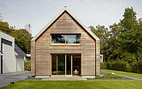
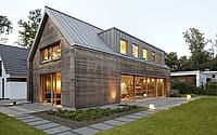
Binding constraints and specifications can be constricting, so good ideas are needed. The bungalow’s impractical location, as well as its proximity to neighbors, sensitized the architects to use clever arrangement of open and closed spaces to make the property experience a certain generosity and create unexpected views. As for the exterior design, the architects planned intensively. After four drafts and many discussions about the materiality, the result was decided. It all started with the vision of basing the gable-roofed house on the façade cladding typical of the Bergisches Land region, with slate slabs, black studding with white clay lattice, white windows and green folding shutters. The first design thus provided for a “shed skin” of slate lozenges leading from the roof further over the facade; as a contrast, dormers and garage were clad in titanium zinc; in addition, typical accents with white windows and green sliding shutters. This was followed by the second design: Dieer panels were exchanged for a diamond roofing of titanium zinc; wood was planned for the gable walls. One design further on, the dormers were fitted with curved overhead glazing with the effect that the attic opened up to the sky like an orangery. A spectacular design, but the cost was exorbitantly high. “It was a constant back and forth during this design phase. We didn’t really feel comfortable with the first three designs,” Klaus Bürger tells us honestly. Anyone who thinks that the fourth and ultimately realized design simply has to be a compromise is mistaken. The development of this design phase is exciting in that in the end, over the many intermediate steps, a residential house has emerged that is clearly and comprehensibly structured on the outside and inside, with two materials that give the home an unmistakable character. The result is a modern gable roof house with a roof made of silver-colored RHEINZINK titanium zinc elements and a wood bevel. Along with the striking horizontal battening of Robinia wood, the vertical RHEINZINK titanium zinc elements create a beautiful and sophisticated contrast that draws attention in the neighborhood. “Our clients were enthusiastic about the idea of using titanium zinc right from the start. But it wasn’t just the look that was decisive, but also the positive properties of the material, such as being maintenance-free and durable,” says architect Klaus Bürger. The fact that wood and titanium zinc also age did not bother the client and architect; on the contrary, the fact that a bit of naturalness remains was important to both. “With all the materials we use, we always consider how they will look in ten, 20 or 30 years. We are very keen to choose something that will age gracefully and take on a beautiful patina over the years. We want to give the materials and thus the entire building the opportunity to live and also be allowed to change,” emphasizes Klaus Bürger and consequently adds, “Plastic can’t do that.” The collaboration with RHEINZINK began throughout the early design phase and was always professional and enjoyable, he says. “We had intensive discussions about properties and design and were provided with many material samples and useful tips, such as how to implement the interior gutter,” reports Klaus Bürger. The subsequent works planning and execution were carried out by the site manager and roofing contractor. The roof was built in RHEINZINK-prePatina blue-gray surface quality using the angled standing seam system.
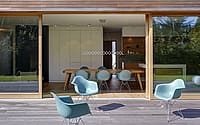
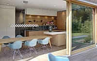
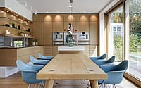
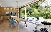
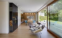
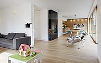
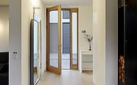
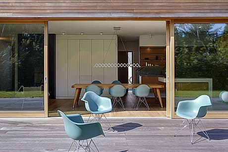
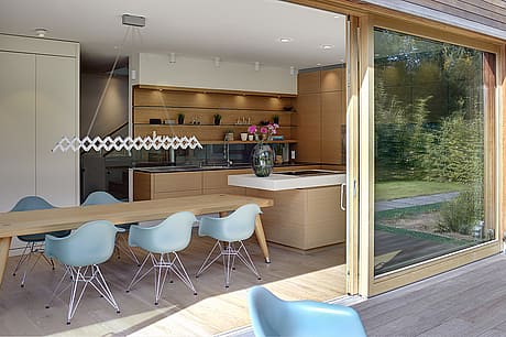
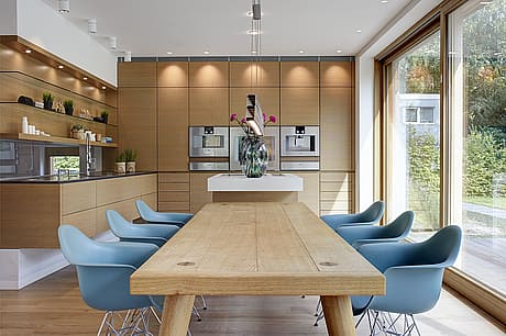
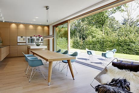
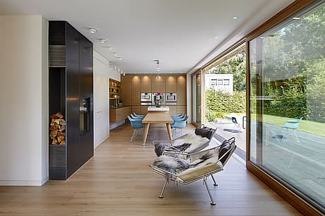
The interiors of the approximately 300 m2 house are just as clear and reduced as the design of the facade. While the entrance, guest toilet, pantry and staircase are oriented towards the neighbor behind the largely closed facade, the living and food center opens up across the entire width of the house to the garden. Kitchen, dining room and living room merge into one another and offer unobserved views of the greenery via a floor-to-ceiling special lift-and-slide system. The open fireplace serves as a visual room divider between the living and dining areas. The adjoining living room offers a welcome retreat with additional views via a large glass facade in the gable wall.
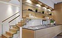
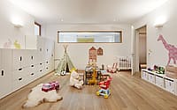
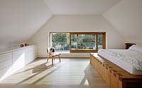
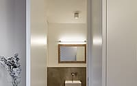
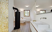
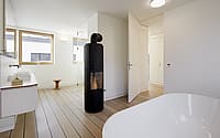
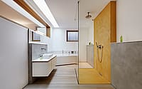
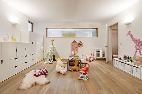
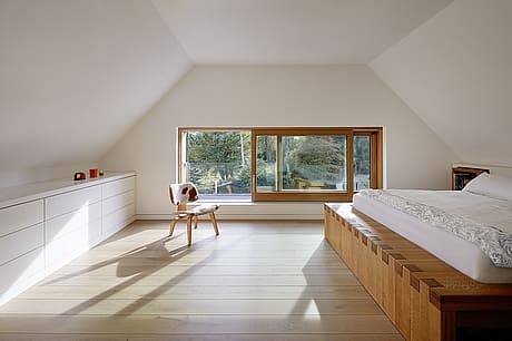
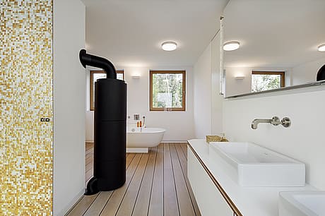
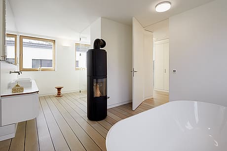
A double flight of stairs behind the kitchen leads to the attic, which is entirely dedicated to private spaces. There is the children’s room with its own bathroom; a walk-in dressing room leads further to the parents’ large bathroom with a second fireplace; finally, behind it on the gable side is the master bedroom, from which one can enjoy the view over the garden. Hard to believe: in the basement there are more livable rooms. This part of the house was planned as a partially self-sufficient living space. On the northern gable wall, an external staircase leads to the basement, which, with its separate entrance, is intended to serve as a study or, later, as a teenager’s room complete with a spacious bathroom. Above the vanity is a skylight strip that lets in the longed-for daylight. Furthermore, a large gym/game room, the utility room and a laundry room are located in this space. “Our idea of having planned a laundry chute directly from the dressing attic down to the basement proves to be very practical,” Klaus Bürger tells us.
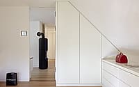
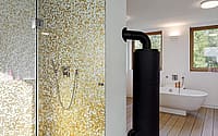
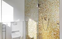
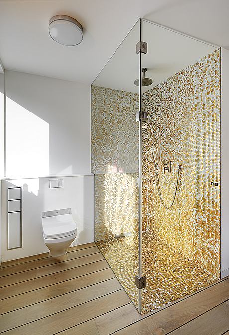
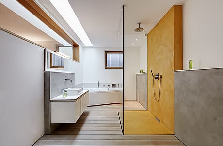
In keeping with the straightforward architecture, the client and architect opted for a clear material and color concept. On the first floor, a parquet floor of white oiled country house floorboards was laid. The surfaces of the kitchen were finished with a horizontal grain pattern in oak veneer and color-coordinated with the parquet. To create a uniform appearance, the built-in cabinets were made according to the architects’ designs. The fronts were painted white with the effect of making them appear inconspicuous like the white walls. The striking fireplace in the living room was made in aesthetic black steel and is also one of the custom-made pieces. The parquet floor continues in the attic. Only in the bathroom, the floor was laid similar to a ship’s deck with black expansion joints. As a contrast, gold-colored mosaic was laid in the shower to bring sunshine into the bathroom, especially in the dark season. The single-family home is completed by networked building technology. The home automation system ensures, for example, that systems such as lighting, heating and sun protection can be conveniently operated either via a central tableau or a smartphone.
Photography courtesy of Klaus Bürger Architektur
Visit Klaus Bürger Architektur
- by Matt Watts