Autumn House: A Victorian Terrace Transformed by Studio Bright
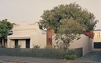
Introducing Autumn House – a stunning Victorian terrace house situated in Melbourne, Australia. Designed by Studio Bright in 2021, this property features a careful new layer stitched into the existing architecture and an 80’s renovation by architect Mick Jorgensen.
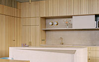
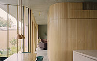
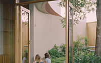
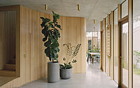
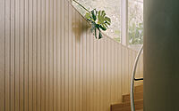
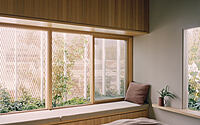
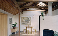
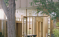
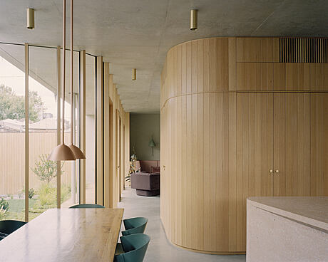
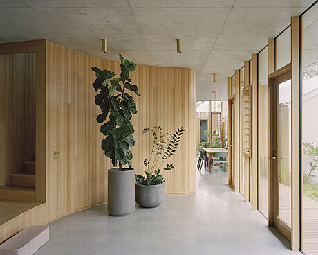
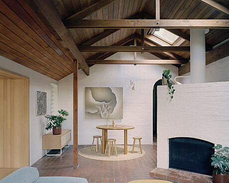
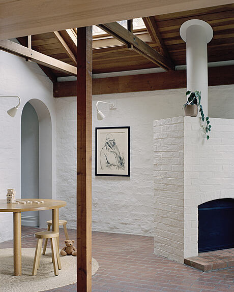
This project offers the perfect balance between the original Victorian elements and the addition by Studio Bright. It offers northern sunlight, raw-timber-lined ceilings, red brick floors and an outlook to the elm tree. The new work forms a series of curving and angled moves at ground level, and the exterior is defined by a mesh-screen clad wedge. It is the perfect place to escape the hustle and bustle of Melbourne city, offering a secret garden bursting out over the brick wall.

About Autumn House
Adding a Careful New Layer: Restoring a Victorian Terrace and Adding Warmth
Architect Mick Jorgensen extended a Victorian terrace with a 1980s renovation and a mature elm tree in the backyard. To sympathetically balance the architecture of the Victorian and the Jorgensen addition, our studio added a careful new layer.
Restoring the Existing Space
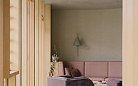
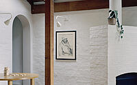
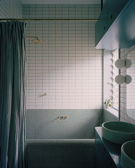
Jorgensen had reconfigured the interior of the original Victorian terrace. He added a studio, storerooms and garden buildings around courtyard spaces. The spaces, however, did not meet the living requirements of a young family and lacked northern sunlight. The space was nevertheless much-loved for its raw-timber-lined ceiling, red brick floor and outlook to the elm tree. To restore the main entry and make it operable again, the part of the house was sensitively restored and transformed into night-time spaces, including kids’ bedrooms and an informal living area.
Wrapping the Southernmost Edge of the Site
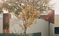
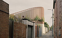
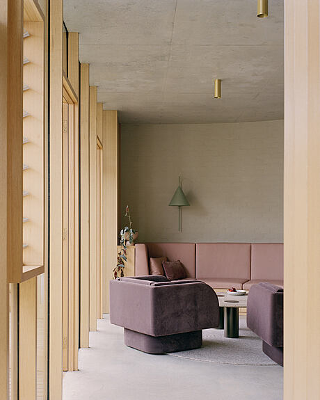
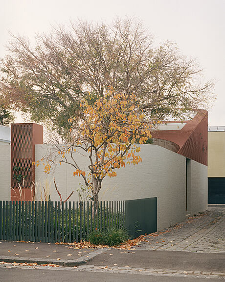
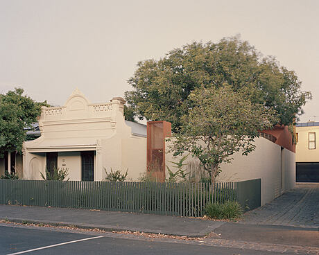
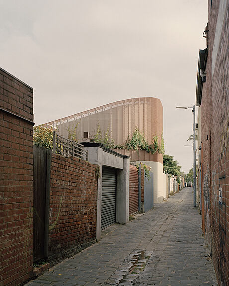
The new work added to the rear of the site forms a series of curving and angled moves at ground level that holds the new north-facing living, kitchen and dining spaces and an activity space at the front of the site. The form creates a continuous solid brick perimeter wall to the laneway edges, entirely consistent with the adjoining conditions. To the front, no new roofs are visible above this brickwork, making it seem like a garden wall enclosing the tree that towers above. To the rear, an angled form rises over the brick base in a mesh-screen clad wedge.
Porous Thresholds and Enclosing Garden Framework
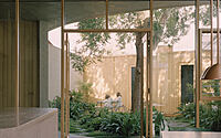
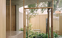
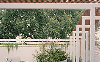
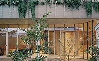
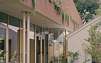
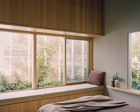
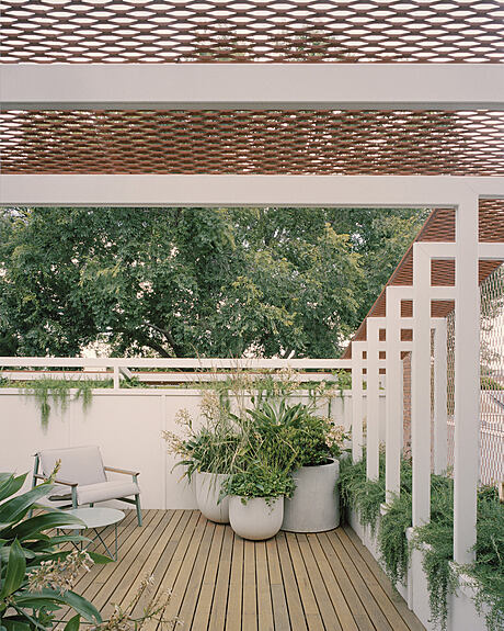
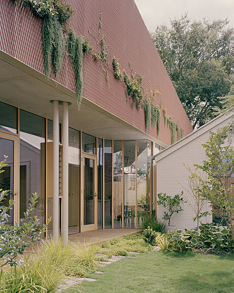
All thresholds to the courtyards and outdoor spaces are porous and defined by operable glazed doors and windows. An angled wedge-like mesh structure at the exterior encloses the main bedroom, ensuite and roof top deck. Outer screen layers with continuous climbing plants filter the light and mute the immediacy of neighbours. Deeply recessed openings and warm lining materials heighten the sheltering.
A Garden Offering for the Lane and Neighbours
From the laneway below, the second level is imagined to be overtaken with planting, reading almost like a hedge. The mesh colour is inspired by the red brick buildings of the laneway. Up close, the form reads as a delicate veil rather than a solid mass. The mesh also takes its color from the autumnal elm tree and creepers spilling out to the lane.
Photography by Rory Gardiner
Visit Studio Bright
- by Matt Watts