DA34 House: A Masterclass in Intimate and Minimalist Apartment Design
Rediscover the charm of the 1960s, revitalized with a modern flair in DA34 House, a stunningly renovated apartment in the heart of Saronno, Italy. The acclaimed Ilaria Nava Studio intricately transformed this once traditional period villa into a seamless blend of contemporary minimalism and intimate warmth.
Bathed in natural light and adorned with sophisticated elements like the oiled natural oak parquet flooring, this 90-square-meter (approx. 969 square feet) apartment exemplifies the marriage of form and function. From the cleverly designed walk-in closet behind the master bed’s headboard to the child’s room devised to be a canvas for youthful creativity, every detail in DA34 House evokes a sense of artful simplicity and homely elegance.

About DA34 House
Refining Elegance: A Vintage Apartment’s Modern Makeover in Saronno
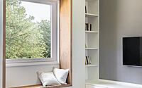
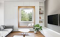
Perched on the second floor of a distinguished, period villa in Saronno, this apartment project paints a vibrant picture of the transformation from the traditional 1960s flair to a contemporary masterpiece. The 90-square-meter (968.75 square feet) pied-à-terre, serving as a quaint refuge for a young family residing abroad, came under the expert hands of the INS Studio. Embracing a minimalist approach, the team delicately reimagined the space, light, and materials, crafting a narrative that draws inspiration from a spacious, sunlit window gracing the living room.
Open Space and Coherent Aesthetics: Redefining Spatiality
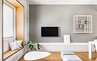
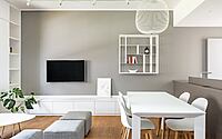
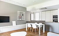
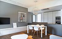
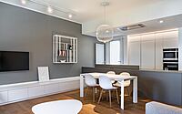
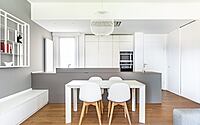
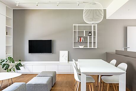
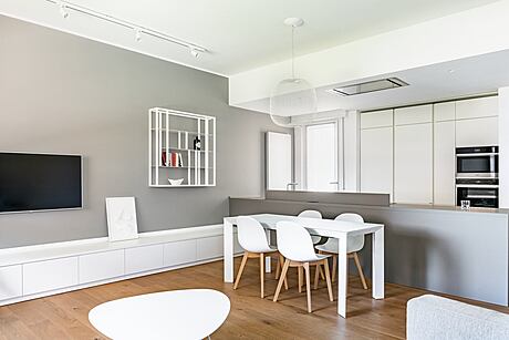
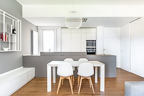
The renovation journey commenced with the removal of the partitioning walls separating the kitchen from the living room. This move, designed to create a bright, open space, resulted in a continuous, fluid layout. The use of oiled natural oak parquet flooring introduces a warm, welcoming mood, while also enhancing the intimate appeal of the abode.
Rethinking Fixtures: A Focus on Detail
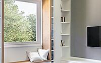
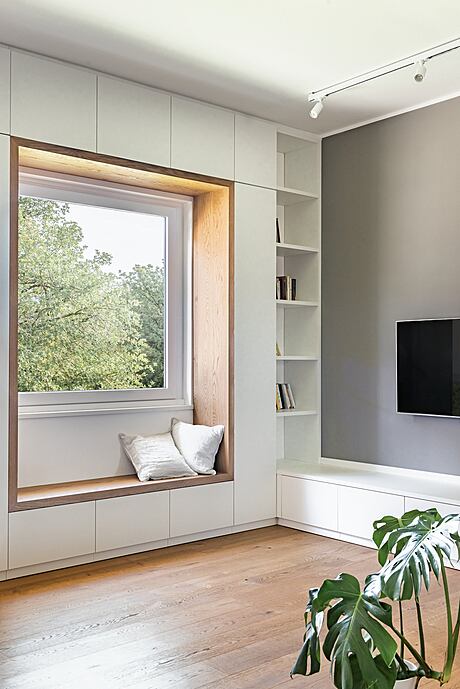
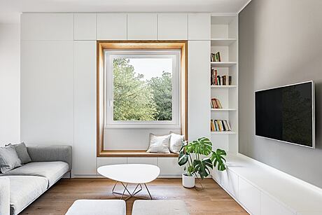
The redesign process also entailed a thorough revamp of all window and door frames, with special attention bestowed upon the luminous central living room frame. This frame, featuring a single sash, casement, and vasistas opening, serves as the visual fulcrum of the entire living space.
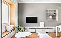
An expansive, custom-designed furniture piece, featuring white lacquered doors and drawers, complements the wooden frame beautifully. In a symphony of horizontal and vertical wooden planes, this furniture piece also doubles as a bench, providing a serene alcove that harmoniously bridges the interior and exterior vistas.
Innovation in Interior Design: The Role of Furniture
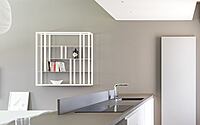
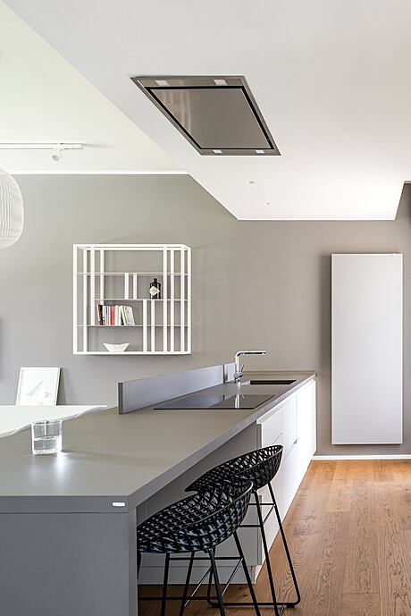
The cleverly placed furniture draws its design cues from this wooden frame. A continuous, low white lacquered wood furnishing housing storage drawers precedes the kitchen island, entirely crafted in gray by INS, and partnered with sleek, black designer stools. This setup introduces a striking counterpoint in the living area, leading to a composed backdrop of white, equipped kitchen columns.
A Subtle Palette: Enhancing Perception with Neutral Tones
Neutral tones of white, wood, light gray, and dark gray dominate the interior, ingeniously maximizing the natural light’s impact. This careful orchestration of color subtly enhances the home’s spatial perception.
Mastering Bedroom Design: Creating an Ingenious Walk-in Closet
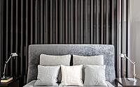
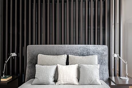
Despite spatial limitations, the architects heeded the clients’ wish for a walk-in closet in the master bedroom. The ingenious solution involved positioning the closet behind the bed’s headboard, using a system of vertical slats to maintain an airy feel. This design not only optimizes the available space but also introduces an intriguing visual effect, further accentuated by the play of natural light on the vertical uprights.
Little Wonders: Detailing the Walk-in Closet and Child’s Room
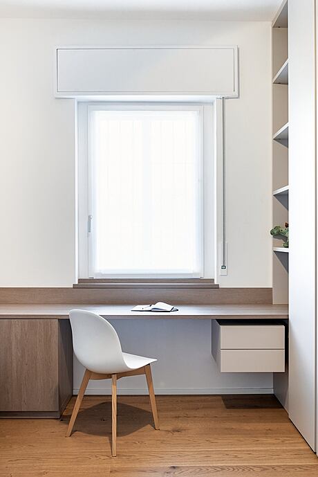
This walk-in closet, a charming gem in its own right, features dark-stained oak furniture and full-height smoked gray glass doors. In the child’s room, simple and neutral shapes provide a versatile backdrop for the future inhabitant’s toys and colorful accessories. The decision to convert the pre-existing two-door window frame into a single-door one further accentuates the room’s functionality. To create a cohesive look, similar to the living room, the window frame is embellished with a large desk top, ensuring a seamless design transition from bed to desk, bookcase, and closet. This strategic design-on-design approach allows even the smallest spaces to be emphasized and ennobled.
Revitalizing the Bathroom: A Play of Colors and Textures
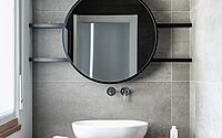
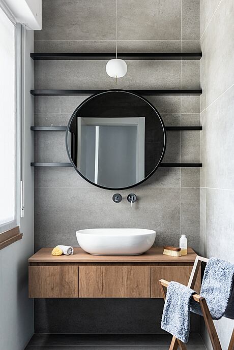
The architect’s creative prowess is also reflected in the bathroom, an intimate jewel of the home. The traditionally long and narrow 1960s bathroom is visually divided into two distinct sections using a dual-color flooring scheme. Extra-large, resin-effect slabs in shades of dark gray and light gray construct a raw, textural pattern. The combination of this resin effect with the teak wood furnishings introduces a stark contrast against the elegant, geometric, and delicate system of a mirror and black metal shelves set behind it, all custom-designed by the architect.
Bringing it All Together: A Seamless Unison of Old and New
This renovation project, undertaken by INS Studio, meticulously preserves the time-honored elegance of the period villa while infusing it with a contemporary spirit. Each design decision, from the spacious open layout to the clever walk-in closet, echoes the ultimate goal: to create an inviting, modern space that honors its historical roots. The final product, therefore, is more than just a redesigned apartment—it’s a seamless unison of the old and new, paying tribute to the past while embracing the comforts of the present.
Photography by Andrea Ceriani
Visit Ilaria Nava Studio
- by Matt Watts