Lluvia: Where Mexico City’s History Meets Modern Minimalism
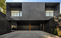
Step into the heart of Mexico City, where the minimalist two-story house, Lluvia, resides. Nestled in the historic Jardines del Pedregal neighborhood, PPAA‘s 2019 design is a flawless blend of nature and architecture. With inspirations drawn from the surrounding volcanic landscape, this single-family residence presents an enchanting dialogue between the environment and structure.


About Lluvia
A Masterpiece Nestled in History
Lluvia, a single-family residence, stands proud in the heart of Jardines del Pedregal, Southern Mexico City. This neighborhood, first sculpted by Luis Barragán in the 1940s, beautifully cradles the residence. Although initially designed to blend city and landscape, it’s now flanked by neighboring structures.
Drawing from Nature’s Palette
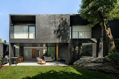
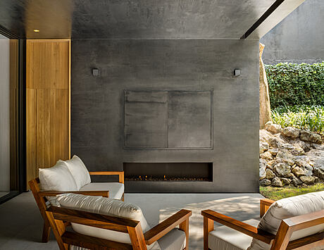
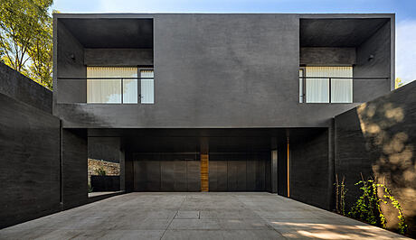
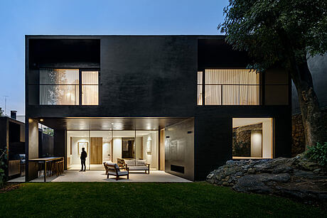
The volcanic site of Jardines del Pedregal sparked our inspiration, particularly for the home’s material selection. Consequently, we swathed the exterior in a dark hue, forging a dialogue between the environment and the structure.
Fusing Interior with the Verdant Outdoors
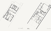
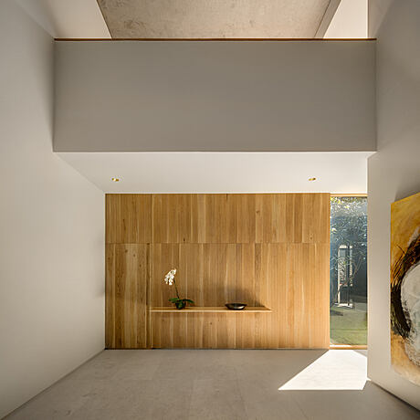
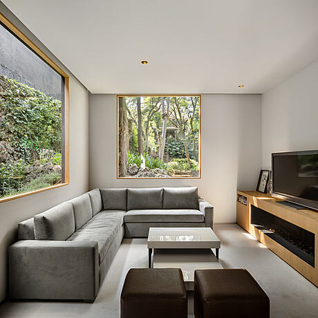
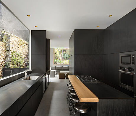
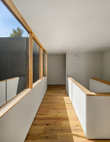
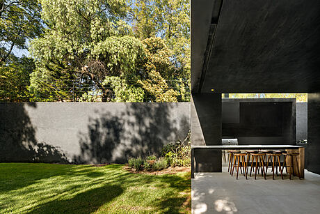
Our primary goal? Seamlessly integrate segments of lush vegetation with the home’s interior. The outcome? A solid structure marked by subtractions along its main axis. As you traverse the house, small courtyards and double-height spaces reveal themselves, framing snippets of nature. These punctual openings fracture the geometric form, thus establishing a visual and physical bridge to nature.
Contrasting Interiors and a Seamless Layout
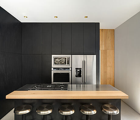
In stark contrast, we washed the interior in light hues, intentionally juxtaposing the inside with the outside. Public and service areas find their place on the ground floor. Service quarters house a six-car garage (approx. 540 square feet), two bathrooms, a utility room, and a laundry room. Public spaces flaunt an open-plan living room, dining room, kitchen, family room, and an outdoor terrace that seamlessly connect with the courtyards.
Photography courtesy of PPAA
Visit PPAA
- by Matt Watts