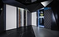
Lamborghini Rock Board Flagship Store in Beijing
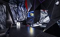
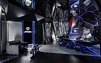
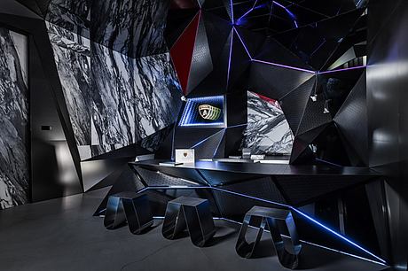
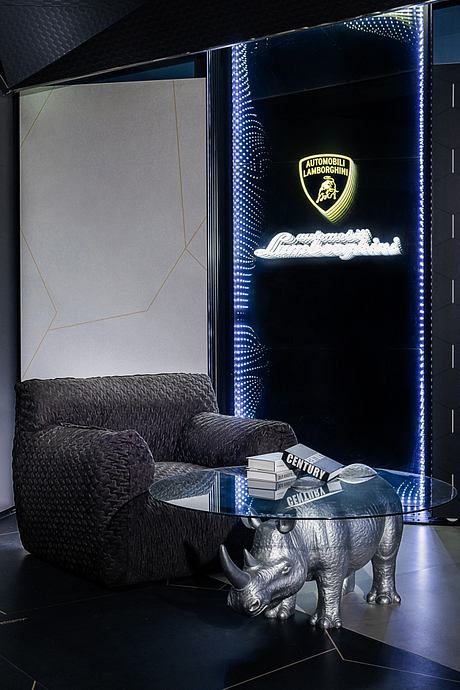
Lamborghini Rock Board‘s new flagship store in Beijing, designed by Li Mingfeng, showcases a futuristic style in a compact 50m² (538 ft²) space. This unique store exemplifies luxury within a small footprint, highlighting innovative design elements.

About Lamborghini Rock Board
Lamborghini Slate has opened a flagship store in Beijing, China. The store spans 50 square meters (538 square feet).
Initial Hesitation
At first, I refused the project because of its small size. However, I later decided to accept it.
Challenges and Solutions
We faced three major challenges.
First, the rectangular space measures 9 meters by 6 meters (30 feet by 20 feet). The south and east sides are mall passages, with the south being the main tourist passage. The north connects to another slate brand by the client. The space needed to attract customers and accommodate business meetings.
Second, the rigid, square space conflicted with Lamborghini’s high-end personality.
Third, the concept store’s experience mode contradicted traditional store display methods.
Design Adjustments
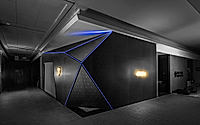
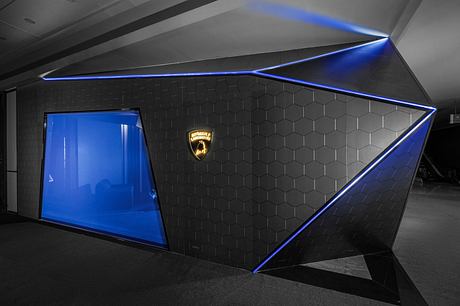
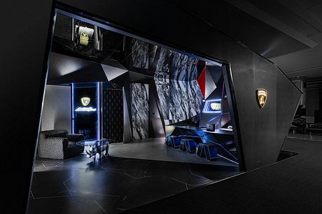
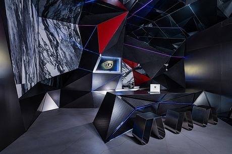
We placed the main entrance on the south wall. This large entrance gives customers a sweeping view of the entire store. To maximize the display function, we installed an electrically controlled translucent roller shutter at the entrance. This allows the store to be eye-catching and functional for business.
Focal Points
We focused on the east wall.
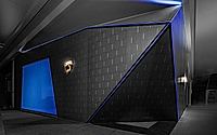
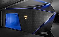
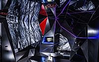
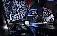
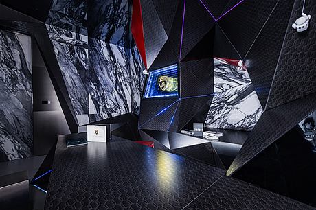
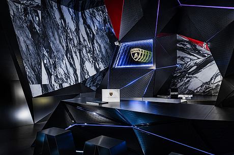
First, the Lamborghini wedge-shaped element highlights the brand’s characteristics.
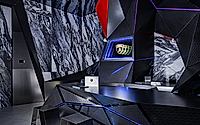
Second, the color-changing light strip between the triangles and the wall’s dynamic shape evoke Transformers, resonating with guests.
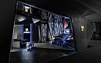
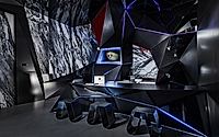
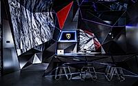
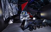
Third, the textured slate of the racing seat contrasts with the stainless steel material, enhancing the visual effect. This design naturally hides structural columns, increasing the sense of scale and spatial integrity.
North and West Wall Features
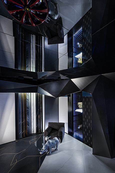
The north and west walls feature a product element exhibition area. This resolves functional and spatial contradictions and aims to create a memorable visual impact. A good business needs a memorable topic to thrive.
Photography courtesy of Li Mingfeng
- by Matt Watts