House K by Kart Projects Adds 50m2 to Existing Footprint
Kart Projects designed House K, a single-storey residence in Australia, in 2021. The project, just a 50-square-metre extension, aimed to maximise garden space on a small block. The design retained existing spaces while cleverly overlapping functions. Coffered ceiling volumes in the addition provide a sense of spaciousness and light.

Single-story extension maintains garden space
Kart Projects designed House K, a Melbourne home that prioritizes spaciousness and light through clever design strategies. Completed in 2021, the 50-square-meter extension aimed to preserve as much garden space as possible on a small block.
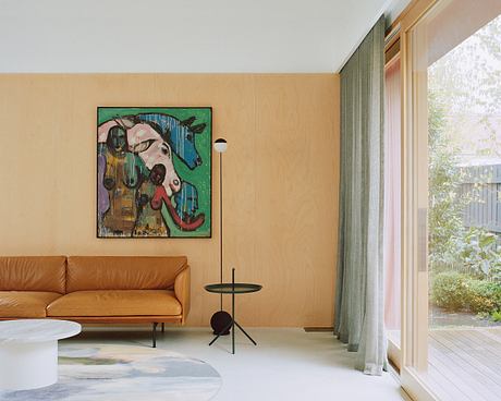
The project removed the old structure and added a compact extension of living spaces, increasing the total footprint by only 30 square meters. The approach focused on overlapping functions rather than creating a new room for each purpose, making effective use of the available space.
The ceiling volumes maximize space and light
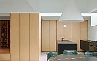
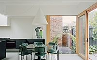
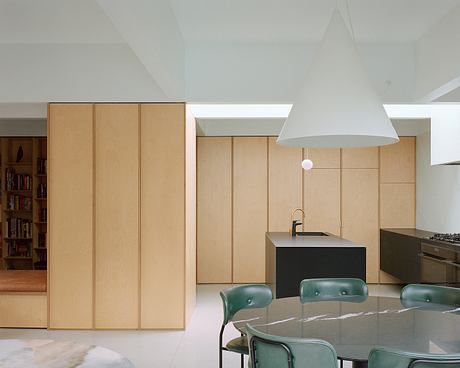
To maximize natural light, the new addition is set back from the northern boundary and features coffered ceiling volumes that reference the cellular plan of the existing plasterboard house. These volumes create loosely defined spaces, providing a sense of spaciousness and bringing natural light deeper into the house through an added skylight.
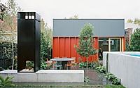
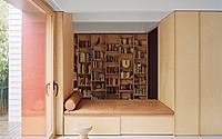
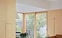
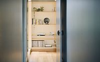
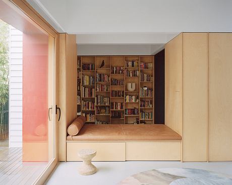
Inside, the design of the extension focuses on a storage volume that houses a retractable television and other technological elements, including a daybed that connects the studio to the living area. Outside, the design approach continues in the garden with overlapping areas for planting, swimming and gathering, with elements such as a long concrete bench and a custom steel outdoor fireplace.

Interior finishes define spaces with textures and colors
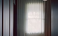
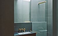
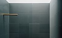
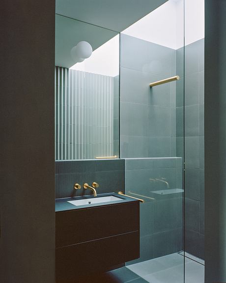
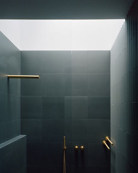
Materials and finishes play a key role in defining different areas of the house. The existing house is divided into two sections: a light-colored volume that houses the children’s rooms and a study, and a darker, wetter volume that contains the master bedroom, private bathroom, and the connecting hallway to the new extension.
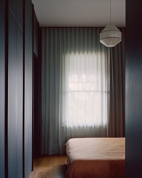
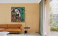
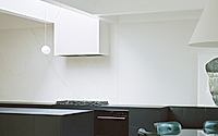
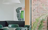
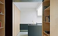
The new spaces were designed to be brighter and more streamlined, with terrazzo floors, plywood joinery and walls, and minimal black kitchen cabinets. Applying blocks of texture and color helps distinguish and define different elements or sections of the house.
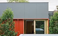
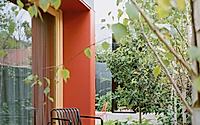
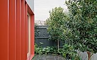
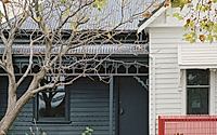
On the exterior, the new addition is distinguished from the old house by dark siding and deep red door flaps. These elements add depth and texture and protect the openings, creating a distinct and cohesive aesthetic.

Photography by Rory Gardiner
Visit Kart Projects
