Loft F5.04 by SMLXL Studio
Loft F5.04 is a clean apartment located in Prague, US, designed in 2016 by SMLXL Studio.


About Loft F5.04
Finding the Perfect Apartment
After a long search, we found an apartment with unique and unconventional features in central Prague. It proved to be the ideal choice. The developer agreed to deliver the apartment as a bare shell, meeting only the most basic standards. Fortunately, the owners contacted our studio early enough, giving us ample time to plan the renovation. As soon as they received the keys, we were ready to start making changes.
Initial Challenges and Design Vision
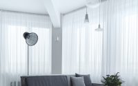
During our first visit, we encountered an unexpected issue—the windows. Despite promises to preserve the original industrial design, the developer had installed plastic windows. As a corner apartment with significant window space, this change significantly affected its character, despite the windows’ impressive size. Our goal was to restore the apartment’s industrial feel and minimize the impact of the window modification.
Transforming the Living Space
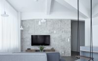
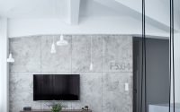
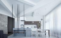
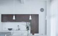
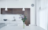
We maximized the openness of the main residential area to the entrance. The central column and the ribs extending from it became focal points, forming the building’s basic structure and creating a distinctive ceiling pattern. This structure influenced the apartment’s overall non-rectangular shape. We used two flooring materials—skim coat and wooden boards—tailored to each area’s function. The skim coat covered the entrance and kitchen, while wood adorned the hallways and main living area by the TV. We aligned the floor joints with the ceiling ribs, aiming for a clean and bright appearance with a dominant white color, only using exposed concrete as an accent behind the living room’s TV and on select furniture.
Central Kitchen Island as a Design Highlight
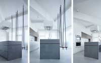
A concrete island became the centerpiece of the living space, featuring a narrow, wood and Corian board that doubled as a dining table. The repeated use of grey-stained wood, Corian, and concrete on other furniture pieces underscored the living area’s design coherence. The island not only anchored the living room but also the entire apartment, showcasing unique bar seating with suspended swings. These design choices became apparent right from the entrance, adding a dramatic flair to the space.
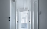
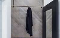
The use of black throughout the apartment accentuated various elements like the coat hanger in the entrance and the handles on fitted closets. The swings and rope curtains highlighted the unusually high ceilings, measuring 10.8 feet (3.3 meters).
Contrasting Themes in Private Spaces
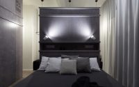
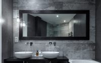
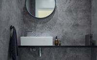
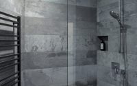
Navigating through the apartment, one notices its predominantly clean and bright interior. However, the bedroom and bathroom contrast sharply with darker materials suited for rest and relaxation.
The wardrobe and bedroom wall paneling, designed to mimic shipping containers, are made from lightly grey-stained plywood. This choice not only fulfills a functional purpose but also adds a unique aesthetic to the private quarters.
Photography by BoysPlayNice
Visit Boysplaynice Photography & Concept
- by Matt Watts