nasoRosso by tIPS Architects
Nasorosso is a beautiful restaurant located in Crema, Italy, designed in 2021 by tIPS Architects.


Description
The restaurant “Naso Rosso” in Crema is a culinary and cultural institution built and consolidated over time thanks to the quality of the cuisine, the attention to service, and the authenticity of the historic venue.
To transport all this to a new location located a short distance away but still beyond the edge of the historic city, in a markedly post-modern building, was truly complex.
We did not fall into the trap of scenographic rehousing meant as a massive move of tables, chairs, walls, pictures, and people from one place to another.
Certainly moving means disassembling and reassembling and temporarily reducing volumes into elements that are ordered and logistically organized by form, use, and position.
In the same way, we disassembled the contents of the Naso Rosso, to understand its identity by synthesizing the flavors, metabolizing the contrasts, and observing the walls painted too many times, characterized by the canvases painted by the historical manager.
The “new container” is a space of about 200 m2 located on the ground floor of a large building recognizable in the modern city fabric, a landmark with a distinctly post-modern language used mainly as a hotel.
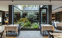
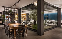
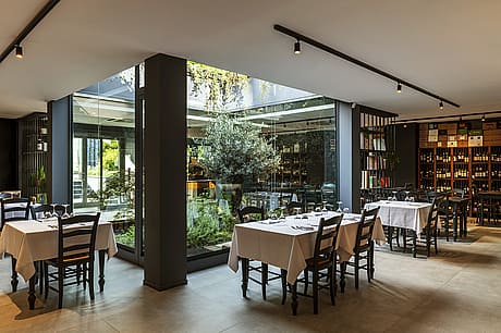
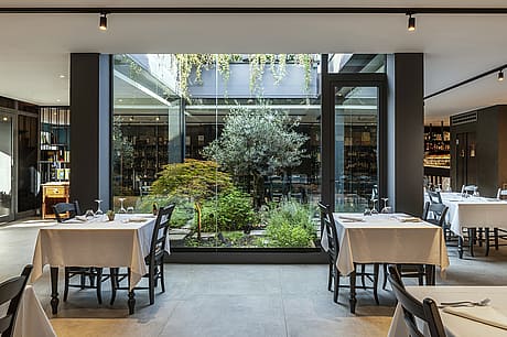
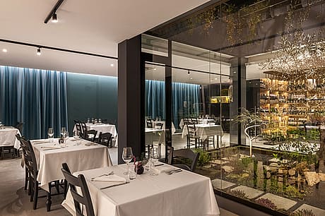
The width of the surface was interrupted by a central patio: an open-air light well delimited by four glass sides exactly in the middle of the room.
This human-scale shrine, framing the sky, conquered the project and became its fulcrum: everything else takes place around its brightness and for this reason, it is always visible.
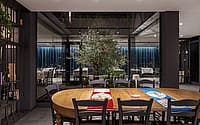
We treated it very delicately, characterized with an olive tree and cultivated with the spices used by the chef who collects them in the middle of the service.
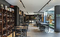
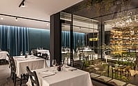
The patio involves people and at the same time organizes the space in different activities that coexist simultaneously with each other: on one side the historical wine shop “il Milllesimo”, on the other side the setting of the restaurant “Naso Rosso”; there are no walls or subdivisions but simply different treatments of the walls that act as a background, very light shelving and lighting scenarios.
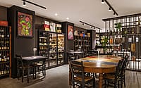
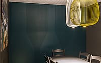
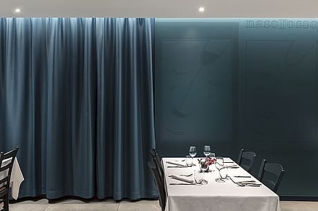
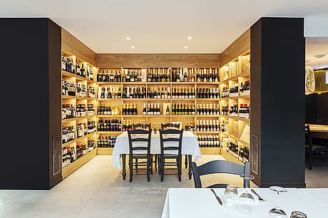
In this, latent and implicitly, the old restaurant lives again, or better its contents, told by parts that add up: so the wine bar is dark, almost dramatic, defined by walls covered in untreated but barely sanded black MDF with the iron and wooden wine bottles recovered from the cellars of the historic venue in the foreground, while the restaurant is more harmonious and welcoming, on the long wall a draped curtain alternates with a lacquered wood cladding with imprinted, dotted, the same subjects of the canvases painted by the historic manager; a contemporary homage that becomes a recognizable graphic pattern.
The link between the wine shop and the restaurant is the large wine cellar placed in continuity with the entrance-patio sequence; a large display of wines placed on natural oak shelves that describe the three sides of the room.
Photography courtesy of tIPS Architects
Visit tIPS Architects
- by Matt Watts