Rodrigues Sampaio Apartment Retains Original Lisbon Design
The Rodrigues Sampaio Apartment in Lisbon, renovated by Manuel Tojal | Architecture in 2023, retains much of its original layout. The redesign maintains the apartment’s character while introducing a sense of uniformity and connection between spaces using Lioz stone and terracotta elements.

When this project was comissioed to us, we immediately felt the enormous responsibility associated with the fact that the apartment was practically in its original state.
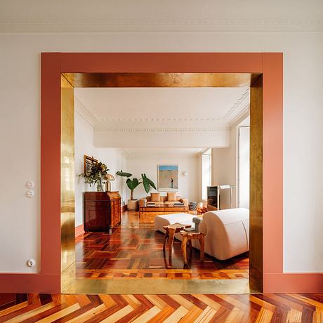
The apartment, with its typical typology and distribution of the time, had the kitchen and dining room on the back side and the social area facing the main street on the opposite side. All areas were served by an extensive corridor that allowed a transversal connection between the front and back of the apartment, where in the center a lobby illuminates the two bedrooms.
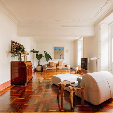
When faced with this renovation and taking into account that the program fit into the existing plan, we found it interesting to risk and maintain the apparent “schizophrenia” of the distribution of spaces from the original period, associated with an improvement in spatial and habitability conditions.
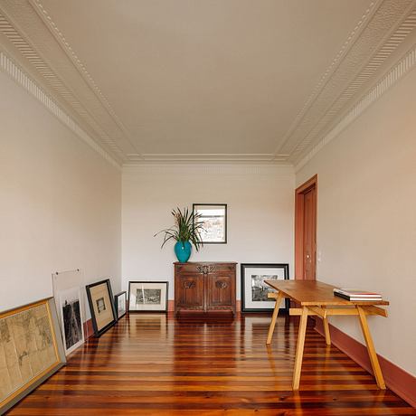
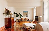
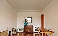
As a principle of intervention, it was decided to maintain the original character of the apartment, but with a sense of uniformity and connection between the spaces, reinforced by the fact that all spaces have different designs and types of flooring.
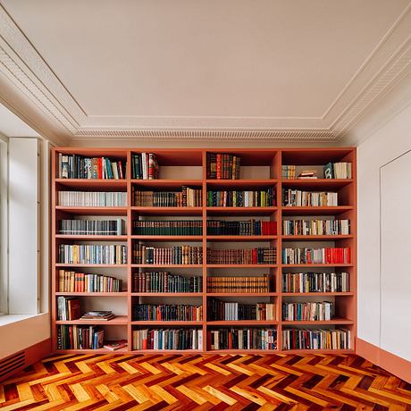
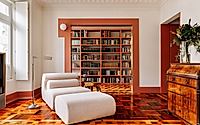
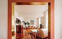
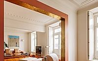
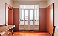
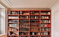
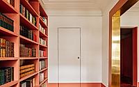
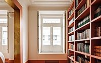
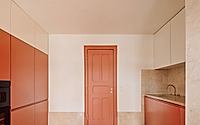
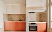
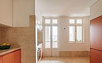
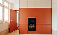
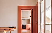
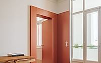
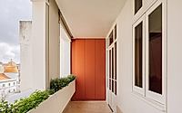
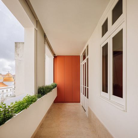
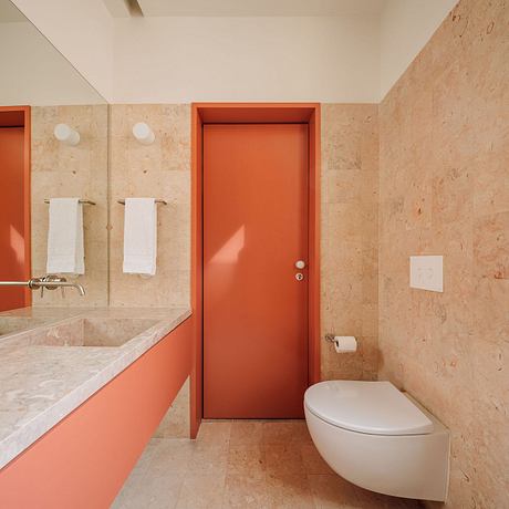
In this way, the various spaces that made up the social area were opened and assumed as one, with passageways or beams marking the existing spaces. The library area, despite being open to the living room, was framed in a gap, to take on the difference in the privacy of the space and also act as “a painting” for those in the living room. A W.C to support visitors was also introduced in the spatial reorganization of the apartment and the existing one was now integrated into the suite. The entrance hall has been taken over and through pivoting doors it can be entirely closed or opened. The kitchen remained one of the most exceptional spaces in the house, making a more direct connection to the dining room, also extending to the balcony and exterior.
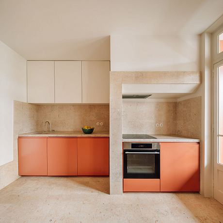
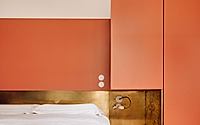
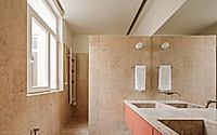
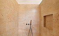
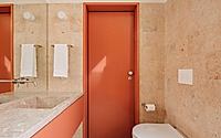
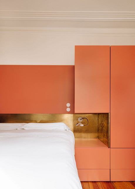
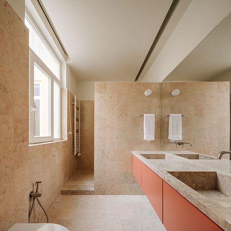
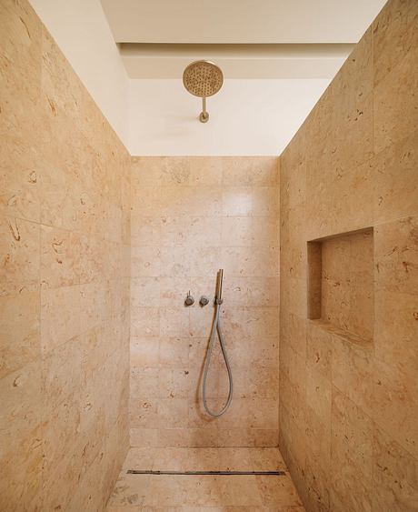
A single material (Lioz) and a single color (Terracotta) are responsible for standardizing the apartment and bringing a new identity without losing the essence of other times.
Photography by Francisco Nogueira
Visit Manuel Tojal | Architecture
