Futuristic Apartment by Rado Rick Designers
This amazing contemporary apartment designed by Radomír Ninjarík of Rado Rick Designers is situated in Bratislava, Slovakia.


Description by Rado Rick Designers
When a client describes their idea for the final layout of the interior and points out things they like, we don’t see these as strict boundaries. A designer’s aim is not to create exactly what the client says or how they describe it; it’s more about reading between the lines to figure out what it is they want to feel with the final result. The job of an architect or designer is to turn this message into a form of design, in a way that clients couldn’t have imagined themselves. That’s where the originality and added value come into play,” explains Radomír Minjarík. In the case of this young, busy couple, what they were looking for in this apartment in one of Bratislava’s most prestigious new buildings, was modernity and dynamism. These features are traits of their lifestyle that they wanted to project in the design of their home, where they would spend a large part of their lives.
For Rado Rick designers, this was an opportunity not only to create the fresh, clear space described by the owners, but also to fill the space with expressive futuristic shapes that, thanks to the simple use of white with touches of black, along with the small number of details, would fully take hold of the place. For that reason, the presence of HI-MACS® fits in perfectly with the modernity of a space where white is the dominant color, resulting in a visually broad ambiance with a futuristic air, which is at the same time warm and welcoming.
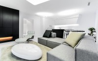
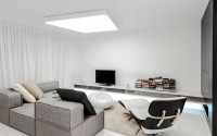
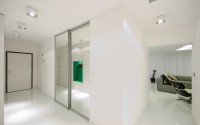
The loft is characterized by being spacious, with a great sensation of freedom of movement and brightness resulting from its white walls and the HI-MACS® acrylic stone, which is particularly evident in the kitchen.
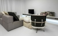
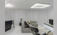
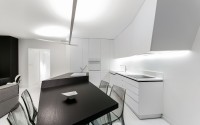
The owners were looking to have an open loft that would allow the free flow of energy. The first challenge for the designers was to get rid of the wall separating the kitchen from the living room. Now joined as one, the two rooms have one door and one window that give onto the joint terrace. These elements have been maintained and concealed by covering the entire wall with a translucent white curtain. All corners of the room are lit up softly and evenly with the huge amount of light that flows generously into the interior through the large windows and the two glass doors.
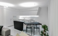
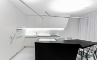
In the corner opposite the wall with the window, there is a futuristic kitchen that creates a perfect counterpoint, with its dynamic form, to the lines that flow serenely from the relaxation area.
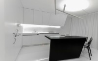
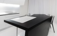
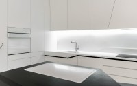
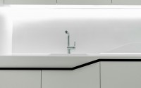
With clean, straight lines, the kitchen executed in HI-MACS® acrylic stone in the Alpine White shade is one of the most eye-catching spaces in this loft. It is made up of two main elements: the first is the large countertop with an integrated glass-ceramic cooktop, sink, and cupboards, while the second is the central island that both acts as a divider and has an extractable cutting board that is also made from HI-MACS®. All of this reduces the elements down to the essentials in order to gain functionality and be perfectly integrated within the minimalist style of the rest of the apartment.
The extraordinary qualities of HI-MACS® have made it the ideal material for responding to the needs that arose in designing this kitchen. The smooth, uniform appearance of the acrylic stone makes it easier to clean and ensures high resistance to sources of heat, knocks, and the regular use of household disinfectants. The kitchen is thus completely hygienic and particularly recommended for contact with food, in addition to standing out for its high durability. The thermoformable properties of the acrylic stone and its seamless joints have make it possible to create continuous, dynamic structures with rounded features.
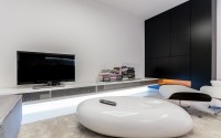
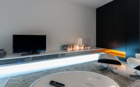
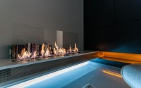
All the logic in this loft is completely preconceived, from integrating the functional details in the custom-made furniture to the biofuel chimney set into the floating television unit.
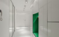
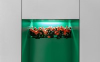
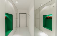
An identical approach to that of the foyer, where the hallway from the entrance that leads to the living room, was extended. The wall, which was originally shorter, is covered with brilliant white plates and has a built-in closet that is concealed. The only thing visitors notices when they enter the “white tunnel” is a green niche on their right that is full of flowers and holds a UV light.
If you design every detail exactly the way the client describes it to you according to how they are, they will surely be satisfied. Or maybe not. As a designer, my main aim, as I see it, is to win the owner over with a solution. Based on their dialogs, a good designer must be able to judge their clients’ tastes better than the clients themselves – and not only their tastes today, but also in 5 or 10 years. This also represents a risk, since by doing this you’re putting all your eggs in one basket,” explains the designer. And there is no doubt that in this case he has achieved it. He also concludes that he is more than convinced that once it has been some time since the house was built, both the wood and the acrylic stone will continue to please and will stay in perfect condition.
The whole design, which includes a careful selection of materials such as HI-MACS®, managed to create a very agreeable sensation of refuge and home.
Photography by Juraj Hatina
- by Matt Watts