Seventies Apartment by Studio DiDeA
Studio DiDeA renovated the Seventies Apartment located in Palermo, Italy, dating back to the seventies and overlooking Parco della Favorita. The owner – a couple wanted an efficient, contemporary home with generous storage spaces.

About Seventies Apartment
Redefining a Seventies Space for Modern Living
Guided by the clients’ wishes, architects have breathed new life into the apartment, creating a space that’s both brighter and more functional.
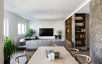
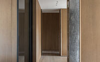
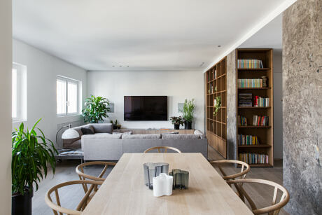
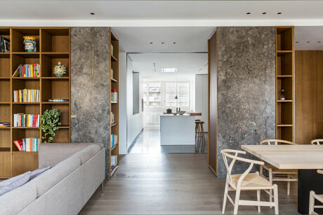
Gone is the dated seventies layout with its central corridor. Now, the revamped design features an airy living area at the front and a quiet sleeping area at the back, with services smartly integrated into wooden blocks.
A Seamless Fusion of Light and Space
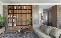
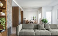
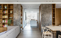
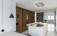
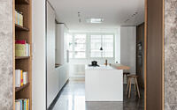
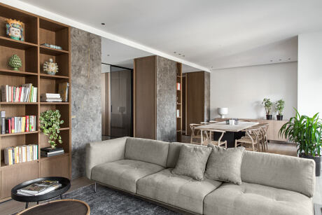
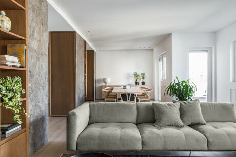
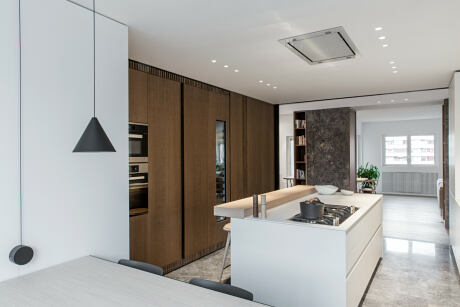
Upon entering, visitors step into an open expanse where the kitchen unfolds to the left, and the living and dining rooms to the right. The kitchen’s privacy is ensured by a smoked glass sliding door when needed.
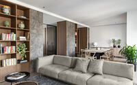
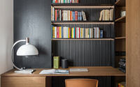
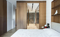
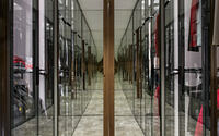
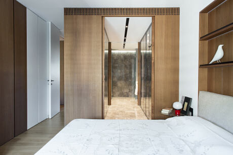
Wooden blocks house the essentials. The first, accommodating storage and a guest bath, nestles between the kitchen and study. Meanwhile, the second block, home to a walk-in closet and the main bathroom, acts as a buffer between the study and bedroom. A smoked mirrored glass door subtly separates the living and sleeping quarters.
Craftsmanship and Color: The Hallmarks of Home
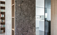
DiDeA’s custom furnishings, crafted by local artisans, fill the apartment. The decor’s beige and brown hues, the oak parquet (in living spaces and bedrooms), and the billiemi marble (in the kitchen and as accents) radiate warmth. Tobacco oak brings a rich depth to the bespoke furniture and paneling.
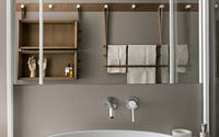
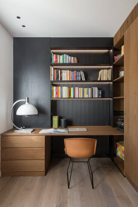
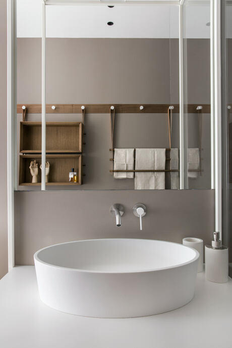
White elements in the kitchen and guest bath pop against this warm palette, as does the striking black studio wall. Neutral resins provide a simple, clean look in service spaces like the guest bath and laundry room.
The home’s true character shines in the attention to craftsmanship and detail—from the sliding door handles to the wall paneling in the bath, to the black slatted studio wall. These custom-designed features restore a sense of unity and identity to the space.
Photography courtesy of Studio DiDeA
Visit Studio DiDeA
- by Matt Watts