Redwood House by Studio Terpeluk
Redwood House is an inspiring two-story house located in San Francisco, California, redesigned in 2022 by Studio Terpeluk.

Description
Nestled among the California city’s neighborhood known for its streets lined with Victorian and Edwardian style homes, Studio Terpeluk www.studioterpeluk.com completes the renovation of a 1974 two-story house of an American creative couple on the gentle slopes of Noe Valley, a picturesque area in San Francisco surrounded by private gardens and lush vegetation.
The Redwood House was originally designed by prominent San Francisco architect Albert Lanier, who animated the city’s art scene (in particular that of Noe Valley) together with his wife, the prominent modernist sculptor Ruth Asawa. The owner’s request was to increase the volume of the house while maintaining its original DNA as defined by angular geometries, redwood interiors and exterior courtyards. With the addition of a new guest room suite, a home office, a wet bar, and a media room, the studio was able to increase the house’s size from 210 square meters to 299 square meters.
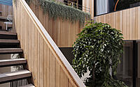
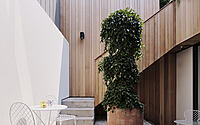
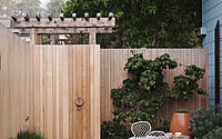
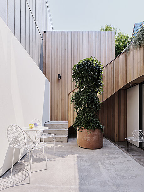
The house façades and cascading courtyards were reclad in irregular western red cedar planks to create a unique visual look able to embrace the whole structure. Studio Terpeluk surgically modified the house in an architecturally non-aggressive manner: living spaces were opened up to maximize views and the dialogue between indoor and outdoor.
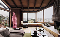
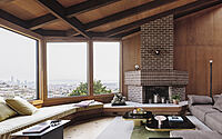
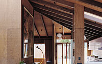
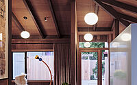
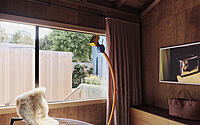
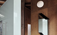
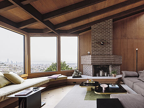
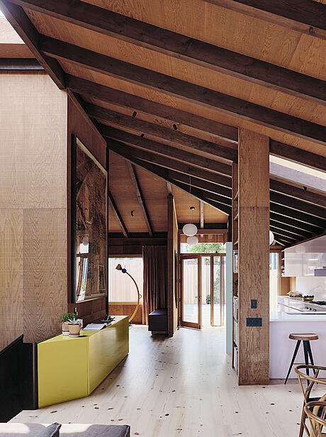
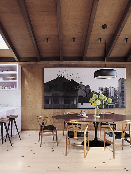
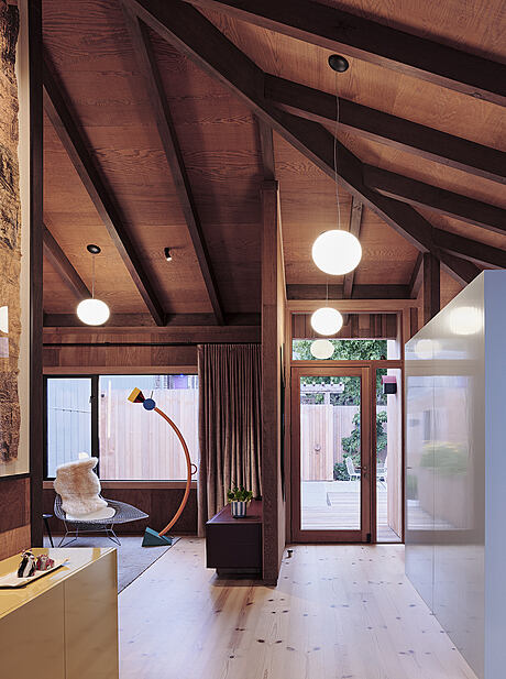
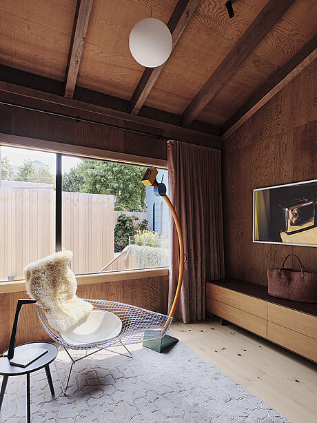
Stepping into the property from the street level, an intimate courtyard paved with precast concrete and redwood decking marks the main entrance to the house. The open-plan living upper level flooring is dark-knotted Douglas fir boards, fabricated from locally reclaimed San Francisco pier pilings. Redwood surfaces and structural elements complete the warm interior landscape: from the sloping roof beams to partition walls and built-in shelves.
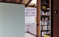
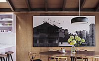
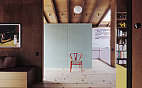
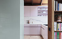
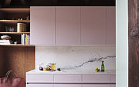
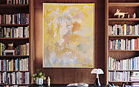
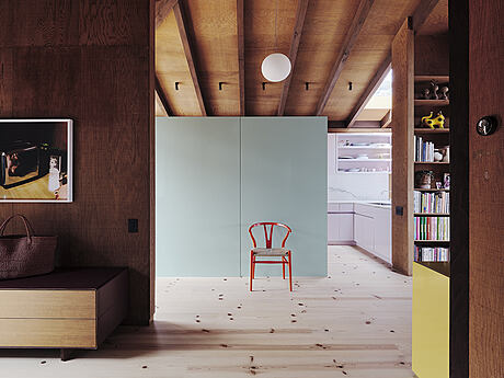
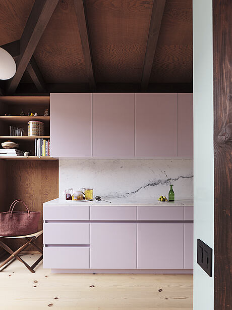
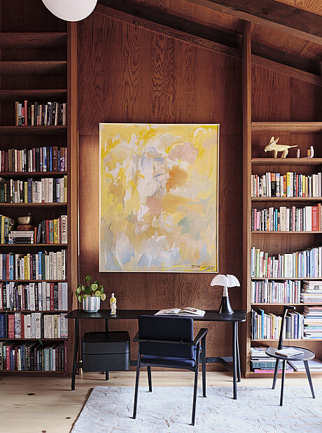
Upon entrance, to the left, a vapore gloss custom cabinet hides the kitchen space that opens towards the dining area and makes the organization of the spaces more fluid. To the right, looking towards the private courtyard, is the library where a writing desk is paired with walls of books reaching the ceiling.
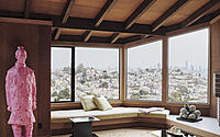
Marked by the pink sculpture of Chinese artist Wanxin Zhang, the floor plan is completed by the living room with expansive views over the city. The perimeter of the transparent facade is marked by a sitting area with padded cushions that extends up to a large dark brown brick fireplace.
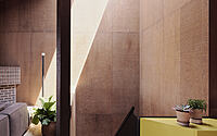
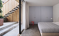
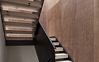
Behind the sofa, emphasized by the light falling from the glazed shaft, the sculptural blackened steel stair with vintage rough-sawn redwood plywood walls anchors the house, weaving together the three floors and their diverse spatial character.
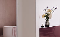
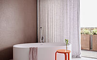
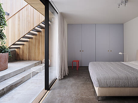
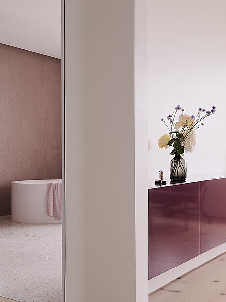
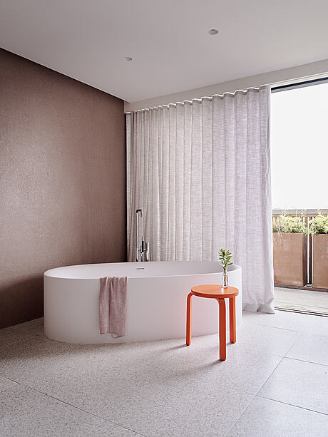
With lighter-hued floors, the middle level features, to the South, the guest suite with a private lounge area looking onto the patio with direct access from the entry courtyard. Looking towards the city is the primary bedroom and a large bathroom with pastel shades, from the light pink of the terrazzo tiles to the micro mosaic recycled plastic tiles in light indian red.
Brett Terpeluk, who founded Studio Terpeluk in 2008 as a continued exploration of the intersection of craft, design, and material expression; following his decade-long collaboration in Italy and California with architect Renzo Piano, affirms:
“Color was a recurring theme in the exquisite and eclectic art collection of the owners. This went perfectly hand in hand with my interest in mid-century Italian design and its bold use of color. We collaborated with our friend and designer Beatrice Santiccioli to enrich the project with a dedicated and bespoke color language.”
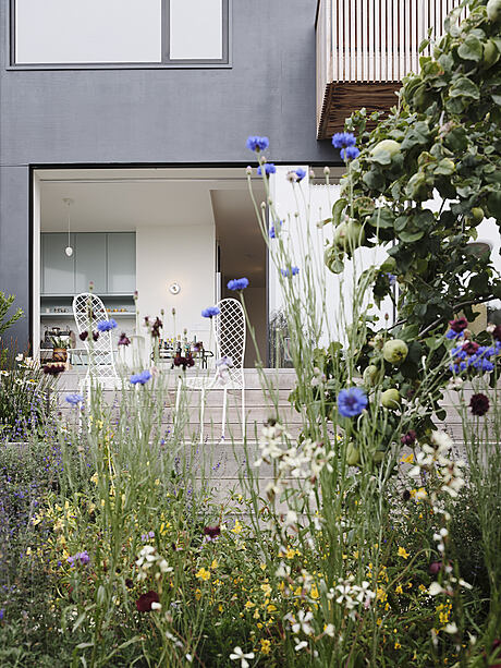
Lastly, at the lower level, a media room and a home office space with a kitchenette enjoy the abundant natural light that gently creeps through the rich and varied vegetation. By extending the concrete flooring and the indoor living towards the surrounding landscape, Studio Terpeluk preserved its connection with the neighborhood and maximized access to daylight.
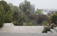
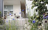
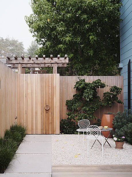
Italian landscape designer Monica Viarengo, architect Brett Terpeluk’s wife and long time consultant, designed the outdoor areas at the different levels with the aim of creating a green hideaway that shifts from curated to wild as you move through the property. The first two terraces of the back garden are planted with California natives and with blooming species that attract pollinators (Lupinus arboreus, Lupinus regalis ‘Gallery Yellow’, Mimulus aurantiacus, Eschscholzia californica). The floriferous Rosa banksiae “Lutea” enhances the slatted cedar fence with her climbing small yellow rosette. At the lower terrace we find a variety of pear espalier trees on the north side fence. Thymes (Thymus vulgaris, Thymus x citriodorus, Thymus fragrantissimus) create a scented understory to complement the fruit trees.
The colors of the planting scheme are natural and local – orange, yellow, blue – bringing into the house a glimpse of the vast Californian coastal landscape.
Free from decorative motives, light and materiality take precedence in this thoughtfully crafted house. The architectural approach is restrained and minimal but at the same time warm and inviting. Mixing the vintage redwood tonalities of the house with a contemporary language of its own, Studio Terpeluk’s intervention is respectful, unique and timeless.
Photography by Joe Fletcher
Visit Studio Terpeluk
- by Matt Watts