Wraparound House by Saw // Spiegel Aihara Workshop
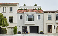
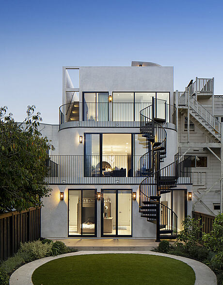
Wraparound House is a 2021 renovation and addition to a Spanish Revival house in San Francisco, California, by Spiegel Aihara Workshop.

Description
Spiegel Aihara Workshop (SAW), has designed Wraparound House, an expansive architectural renovation and landscape of a 1930s home in the Marina neighborhood, for a couple with three children. The family was looking for more space to accommodate indoor and outdoor activities for the kids, places to work and entertain, and views of the Bay. The project was also an opportunity to remediate and stabilize the land beneath the home, and for the architects, a conceptual reconsideration of the notion of groundedness through re-distributing the excavated ground vertically.
The originally three-bedroom Spanish Revival home was expanded both vertically and horizontally to encompass six bedrooms and 4,738 square feet of total interior space, including the garage. The work was born of the active homeowners’ desire for more space for their family, but also facilitated by the need to remediate and reclaim the contaminated earth below. The Marina neighborhood is known for its basis in landfill, but more recently apparent is the embedded contamination of the soil below, likely from residue released by the former PG&E North Beach Manufactured Gas Plant, which was operational from 1891 until it was damaged in the 1906 earthquake.
With excavation of the top 4-6 feet of soil necessary for remediation, the architects were also tasked with handling the instability from landfill, which produces differential settling. The site in particular is in a liquefaction zone, in which sand and silt would take on the characteristics of a liquid during an earthquake. In excavating the top layer of soil, it became feasible to lift the entire house, and to modernize the entire foundation with a relatively thick mat slab. This also enabled a tactical redistribution of load and shear bearing walls throughout the ground floor, opening up possibilities for unusual spatial configurations such as the three interlocking, interconnected kids bedrooms side-by-side within a 25-foot width.
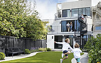
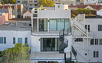
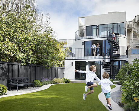
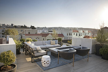
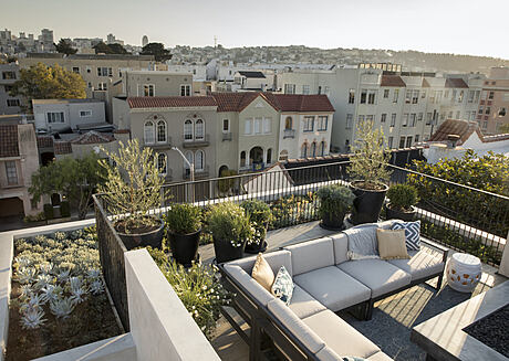
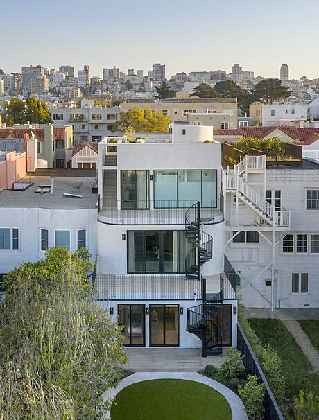
In the context of contested ground, the Wraparound House lifts the ground plane from an extended back yard, up through a series of terraces, connecting across four levels of shifting vantage points, and allowing for a continuous experience of the landscape from the remediated soil of the yard all the way up to the roof deck with panoramic views of the city and Bay. Says Dan Spiegel, architect and founding partner of SAW, “Rather than simply building upon the new ground, we saw the challenge as redistributing the ground vertically across the site, throughout the building. While many buildings have terraces, or balconies, or things like that, we set out to maintain a complete continuity of a new ground across the entire house, ensuring that every roof was not so much the top of something, but the bottom of something – a new ground.”
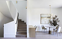
The central interior stair forms the core of the house when viewed in section, but an exterior stair also connects the levels via the outdoor terraces. Each level of the house has a different relationship to the outdoors – at the roof, the main focus was highlighting the distant views to the bay and the Golden Gate Bridge; the interconnected kids bedrooms enjoy direct access to
the yard for active play; at the Living Room, the rear yard was designed to be viewed from above as a verdant backdrop to outdoor dining; and at the primary suite, the glass walls are a major source of light for the bedroom, while providing privacy. Says Spiegel “It sort of works as a gradient: the spaces are more public, more outward looking at the top, and more private, more inward looking at the bottom. The rounded edges of the garden path play in the perpetual motion game too, forming a scooter/bike track; the rounded corners of the family room gradually guide you out to the terrace; the master bathroom is conceived of as a thickened window for the bedroom, balcony-like and perched over the bay. On most days, I’m just as likely to take the exterior stairs as the interior stairs to move between rooms. It doesn’t quite look like it, but it works a bit like a mobius strip in that way.”
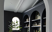
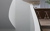
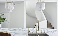
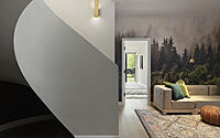
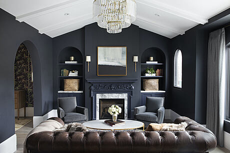
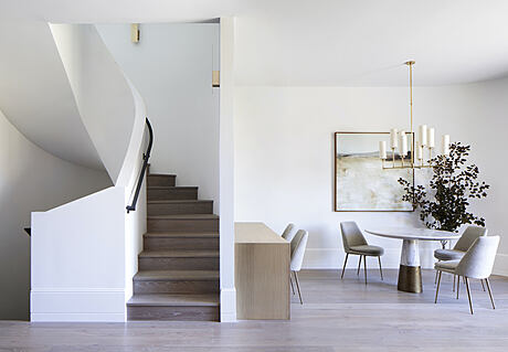
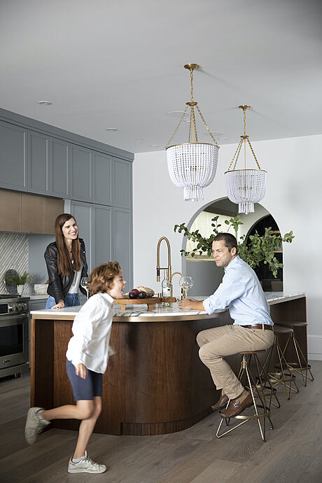
This roundness was drawn from the prevalence of arched doorways in the existing 1930s Spanish Revival-style house. During the design process, the representation of these curved arches were cut up and laid flat, so that the interior corners are smooth rounded surfaces that encircle the central, sculptural stair at the heart of the house. In form, the curving surfaces bend light softly, blur the separations between spaces, and define movement through the house. In fact, the name “Wraparound” comes from the impact of subtle variation in corner geometry on directional movement, in the same way a rounded corner on a hockey rink serves to help wrap around the back of the goal and control a puck to the other side.
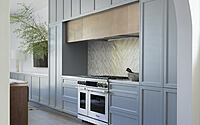
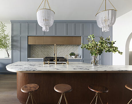
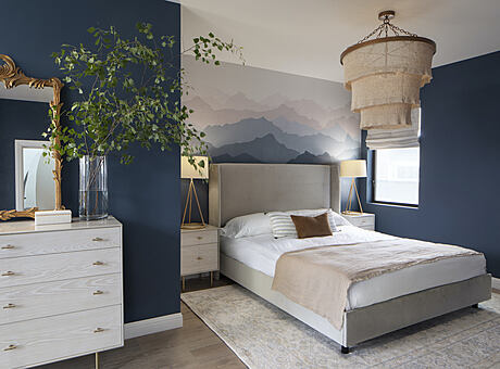
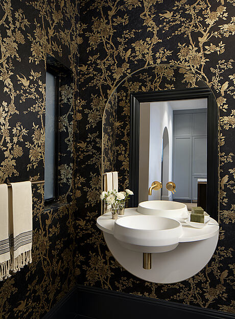
They also allow for the translation of material languages from the historic vernacular to the contemporary with stone, wood, metal, and surface patterning. Says Spiegel, “We asked ourselves: what are the limits of such a legible, recognizable form? When we cut the arch in the living room in half and began pulling the corners apart, the Spanish Revival arch became the Streamline Moderne wall. This was exciting to us, as we’d been contemplating the context and how to make a house from 1931 and an addition from 2020 (the future!) connect without solely relying on ornamental references. But it turns out, by experimenting with the 1931 arch forms, we re-discovered that 1930’s Marina architecture already had a vision for the future, which was the subsequent Streamline Moderne style. We wanted to embrace this link, and, of course, we found these forms to be beautiful.” The interior design was completed by Heidi Kim, of White Space Design.
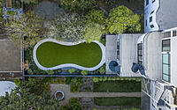
Due to soil remediation, SAW founding partner and landscape architect Megumi Aihara had to start from scratch with the landscape, since there was nothing that remained to work from. From a practical standpoint, it meant that new soils were brought in to support new planting over the rock fill that PG&E had placed in the ground. Artificial turf was used for the lawn since soils were not already in place, with the added benefit of excellent site drainage and a reduction in overall water use.
In the rear yard, Aihara worked from the knowledge that the garden would be experienced from multiple levels, and planned early on to create a stately backdrop of mature trees. “Before any other plants were decided upon, we handpicked two October Glory Red Maple trees for their dramatic fall foliage and elegant branching structure to anchor the back of the
long property. They were planted as soon as the ground floor was demolished and we could safely crate in the large trees through the open construction site. Then after the curves of the building began to take shape, we played upon the round arches in the garden as well with globe boxwoods and an hourglass pathway to soften what would have otherwise been a long rectangular lawn”, Aihara says.
The planting palette in the back garden creates a structured, yet loose backdrop to the house, highlighting contrasting textures with round sheared boxwoods set within soft billowy grasses. The flowers in soft purples and whites accent the wide mix of greens in the foliage ranging from gray-green to bright chartreuse to a deep forest green. The intensive green roof has varying soil depth from 6” to 10” across the sloped roof, allowing for a mix of smaller sedums and larger shrubs and succulents. The stunning white chalk Dudleya contrasts against the dark green foliage of the native California Lilac and the unassuming sedums double in size with yellow and pink blooms that attract pollinators throughout the summer.
Photography by Mikiko Kikuyama
Visit Spiegel Aihara Workshop
- by Matt Watts