Casa Cami: Blending Light and Traditional Chic Design
Casa Cami is a chic penthouse apartment redesigned by Paola Sola in Rome, Italy, offering an abundance of natural light and a blend of traditional and modern design elements.
Nestled in the Salario district, this 1920s building boasts stunning views of Rome’s rooftops and a unique fan-shaped floor plan.

About Casa Cami
A Light-Filled Penthouse in Rome’s Salario District
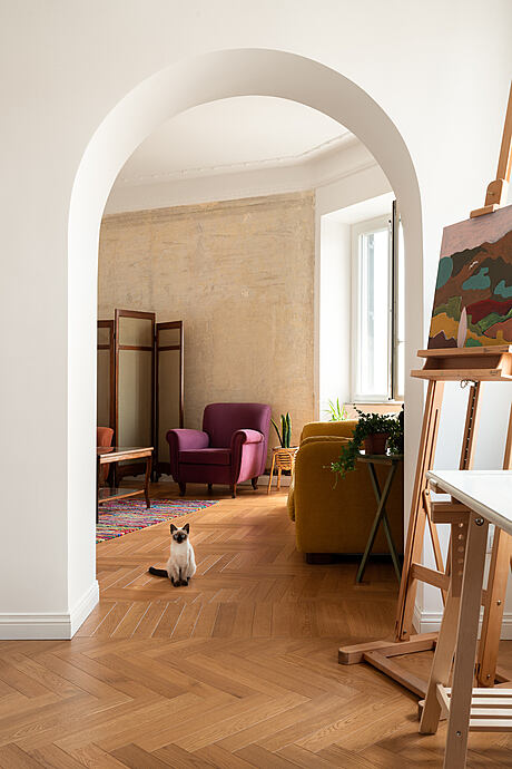
A young Neapolitan woman discovered her dream home in Rome – a penthouse-floor apartment with a fan-shaped floor plan, nestled in an elegant 1920s building in the Salario district. The south-facing living area and abundant natural light captivated her instantly.
Transforming the Space: Brightening the Kitchen and Creating a Study
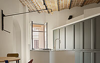
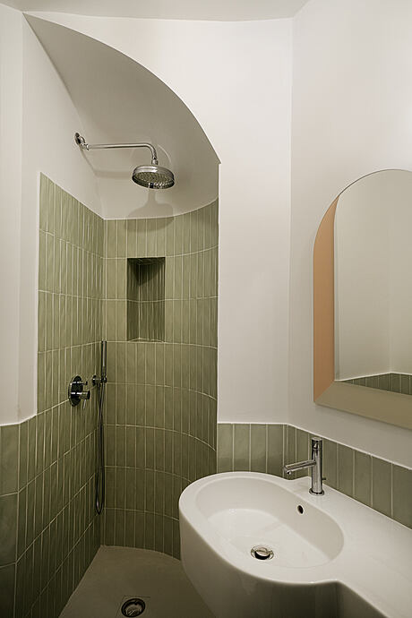
The primary goal of the commissioned project was to brighten the north-facing kitchen, which only had one window and was extremely dark. The original layout featured a kitchen and bathrooms at the center of the fan-shaped floor plan, separated from the rooms by a long corridor. The project also aimed to create a separate study, making it autonomous for services. A small guest bathroom, tucked out of sight in a triangular-shaped slice of space, was added in the entrance hall for the study’s use.
Preserving the Original Structure and Embracing Fluidity
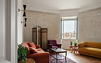
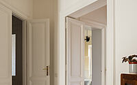
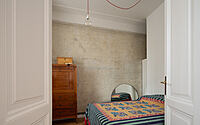
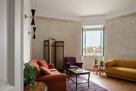
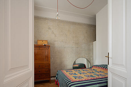
The client desired to maintain the apartment’s original structure and create a fluid promenade, with interconnected rooms. In the south-facing rooms, original elements like chalkstones, rosettes, radiators, arches, and doors were preserved. Only some walls were updated, with the removal of old wall hangings, exposing the original brick.
Revamping the Kitchen and Dining Area
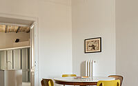
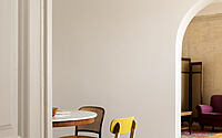
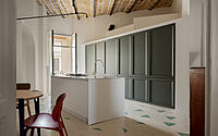
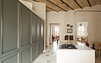
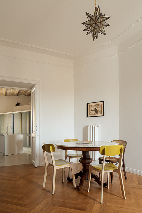
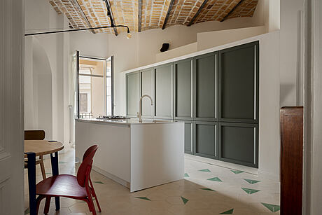
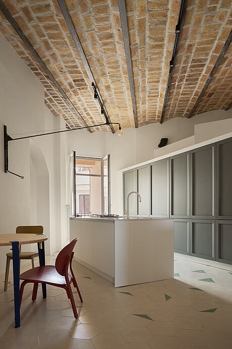
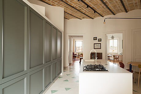
The renovation transformed the former hallway-kitchen-bathroom area by removing partitions and false ceilings, revealing the original brick vaulted ceiling. This open space now hosts the new kitchen-dining room, featuring a central island and storage wall by Veneta Cucina. The Potence swivel lamp by Vitra illuminates the island and table. The handcrafted table has adjustable iron feet, and the chairs are from Ikea and Calligaris.
A Harmonious Blend of White and Green
White dominates the color palette, with Yann’s handcrafted cementine floor covering the entire kitchen area and blending with the oak parquet in the living area. Green accents appear in the white cement tiles and the sage green wall in the kitchen.
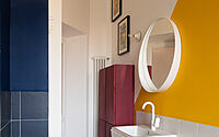
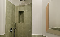
Adding Color to the Narrow Bathroom
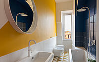
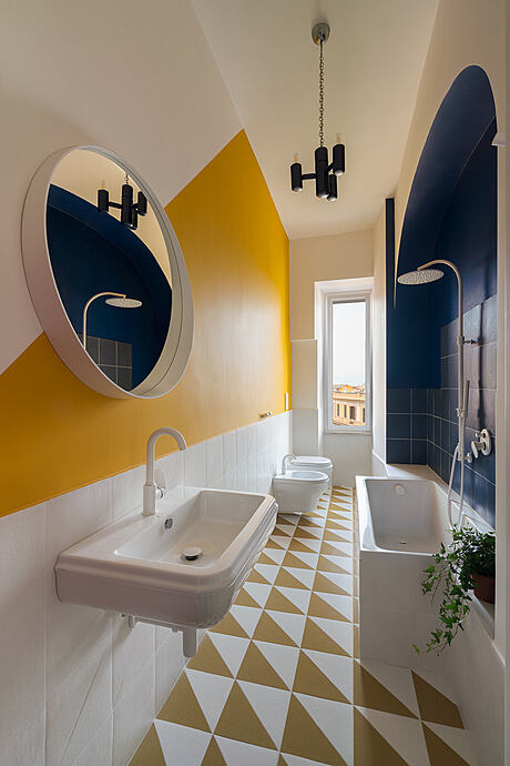
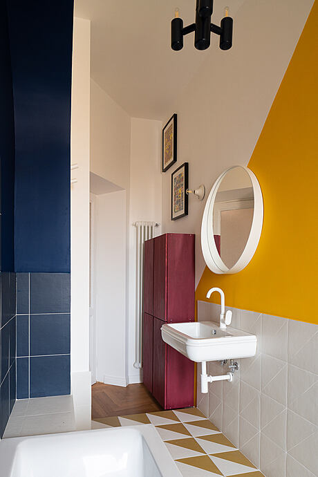
The long, narrow bathroom underwent a complete makeover, featuring colorful Pittorica tiles by Bardelli. Timeless Azzurra’s Charme line toilets and sinuous fittings complement the apartment’s era.
Fusing Family Furniture with Vintage Finds
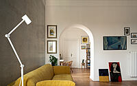
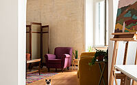
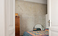
The apartment’s décor combines family furniture with colorful vintage items. In the rhomboid-shaped living room, a reupholstered vintage armchair and sofa sit alongside an ochre-colored Campeggi sofa bed. The bedroom features a central wall concealing a walk-in closet, with a vibrant Lisa Corti fabric on the bed.
Artistic Touches Throughout
Canvases, sketches, and an easel are scattered around the apartment, showcasing the young owner’s artistic flair.
Photography courtesy of Paola Sola
Visit Paola Sola
- by Matt Watts