Post-modernism in Warsaw’s Praga: A Fusion of History and Modern Design
Drenched in bold designs and strong textures, Paulina’s apartment, nestled in Warsaw’s historic Praga district, offers a post-modernist odyssey.
Curated by the renowned Mistovia studio, this vibrant space, redesigned in 2023, artfully blends vintage elements with contemporary Polish design, all set within an architectural gem that stands as a testament to socialist realism.

About Post-modernism in Warsaw’s Praga
A Vibrant Mélange: Paulina and Gustaw’s Praga Palace
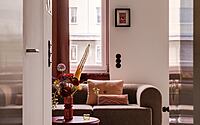
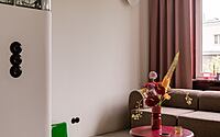
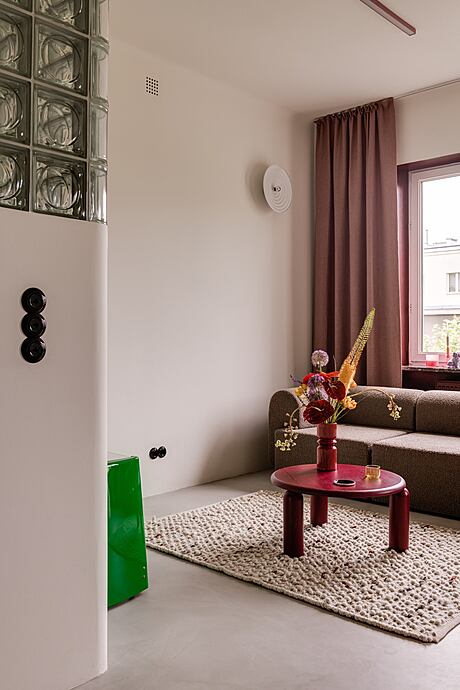
Warsaw’s Praga district boasts Paulina and Gustaw’s apartment—a dazzling mix of audacious designs, rich textures, and unconventional hues. Young Polish brand designs intermingle with vintage furniture, iconic design pieces, and custom elements. Architects from Mistovia studio in Katowice masterfully curated this ensemble.
A Collaborative Creation
Paulina, an art director in the creative industry, and her cherished dachshund, Gustaw, inhabit the space. Her keen awareness led her to Marcin’s designs from Mistovia, discovered on Instagram. After a meticulous search, she settled on his studio. Their collaboration thrived.
Marcin remarks, “Paulina’s detailed research fostered a partnership rooted in trust. Perhaps our initial meeting at Wozownia Bar influenced the interior.”
He adds, “Paulina eagerly embraced avant-garde concepts.”
Historic Praga: The Apartment’s Backdrop
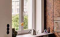
Located in Praga Północ, the 45-square-meter (484-square-foot) apartment is nestled in the Praga II estate, a post-war home birthed by architects Jerzy Gieysztor and Jerzy Kumelowski. This historic building, registered as a municipal monument, allows Paulina a verdant view from her kitchen and living room windows. Remarkably, the apartment’s transformation wrapped up in under five months, with minimal tweaks to its original blueprint.
Strategic Spatial Adjustments
Marcin notes, “We merged the kitchen with the living room. The bathroom retained its original position, and we combined the utility with the dressing room and bedroom.”
With a room height surpassing three meters (about 10 feet), the space feels both expansive and luminous.
Dream Design Details
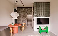
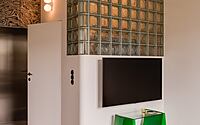
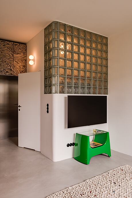
Paulina’s vision included a light grey microcement floor and the incorporation of stainless steel, veneer, and glass bricks. This dream, seamlessly executed, resulted in an aesthetic harmony.
Marcin elaborates, “The subdued backdrop paved the way for intricate geometric forms adorned with bold patterns.”
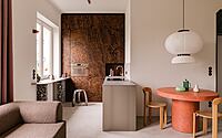
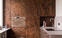
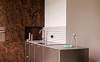
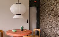
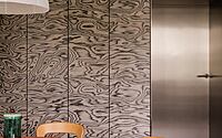
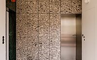
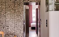
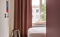
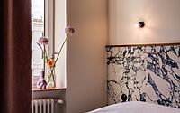
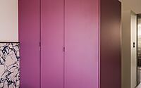
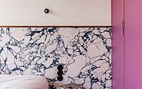
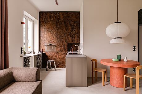
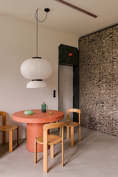
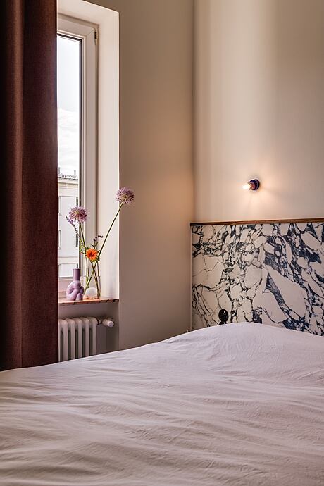
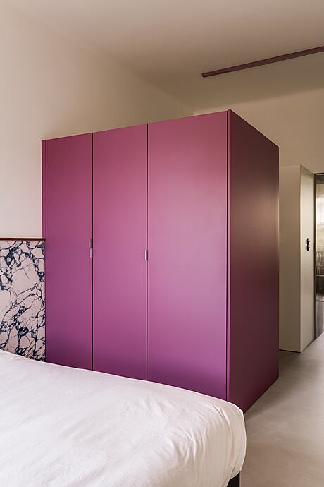
Dominant “cubes” define the apartment’s spaces. The kitchen showcases tall built-in furniture crafted from striking American walnut burl veneer. This natural artistry juxtaposes flawlessly against the brushed steel cabinetry and the crisp geometry of the white wall tiles. A Brazilian green marble-finished portal greets visitors, leading to a wardrobe veneered by Ettore Sottsass in 1985. The Memphis Group’s lively color palette shines through a pink terrazzo table and Bruno Rey’s vintage chairs. The bedroom, awash in purple and navy hues, features a spacious wardrobe and utility cube, discreetly veiled by white fixtures, ensuring a clear division between public and private spaces.
The Bathroom: A Symphony in Minimalism
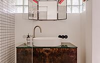
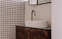
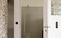
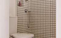
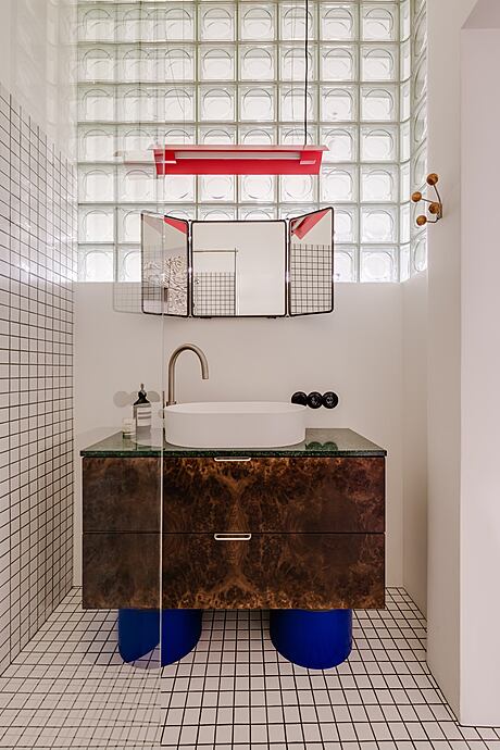
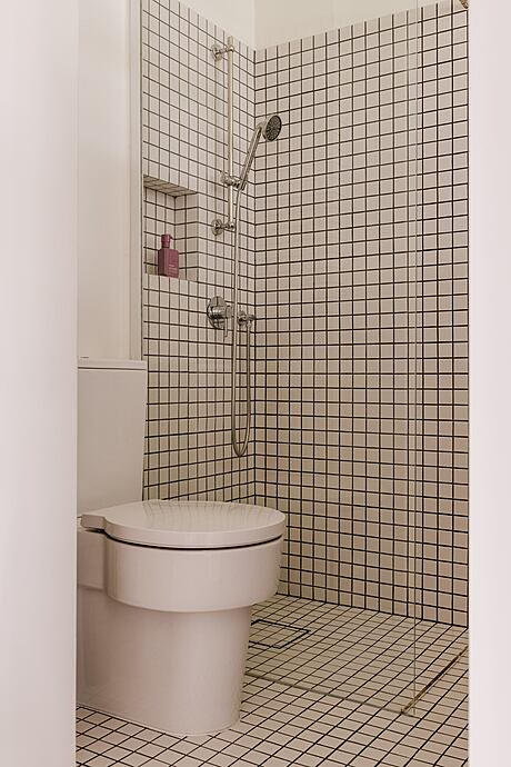
The compact bathroom blends functionality with style. A curved glass brick wall lets sunlight illuminate a once dim space. An eye-catching cobalt cabinet, designed by Mistovia, contrasts with raw pool tiles. Keen observers will recognize the veneer and green marble, previously spotted in the kitchen, creating continuity. A pink Lexavala lamp and three-dimensional mirror panels accentuate the room’s eclectic charm, underscoring the mantra: more is truly more!
Photography by ONI studio
Visit Mistovia
- by Matt Watts