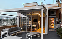
Casa76: Contemporary Spin on Rome’s Attic Apartments
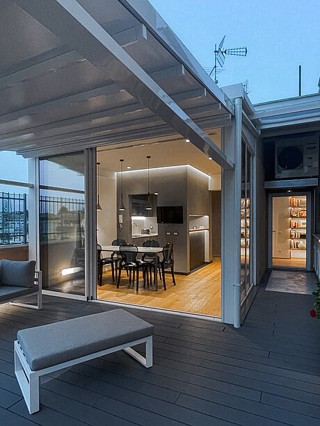
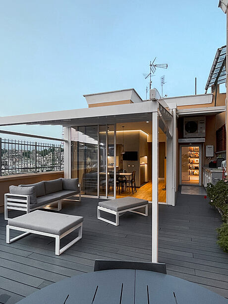
In Rome, designer Claudio Calcagni showcases Casa76, a reimagined attic apartment experience. Reflecting on architectural trends of the ’60s and ’70s, Casa76 combines a 140 sq. m (1,507 sq. ft) interior with a contemporary 50 sq. m (538 sq. ft) terrace.
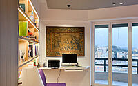
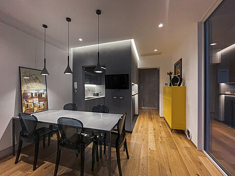
With every corner, it celebrates art, literature, and unique perspectives, all the while providing a broad 180-degree view of the city.

About Casa76
Many apartments built between the 1960s and ’70s often lacked optimal space organization, focusing primarily on speculative needs.
Terrace as a Social Hub
Originally, architects placed terraces at the end of these homes, mostly serving bedrooms. This design overlooked the terraces’ potential in enhancing both the apartment’s value and the occupants’ social life. The new aim was to integrate the terrace with the home’s communal area, extending the living space.
Spatial Organization
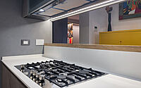
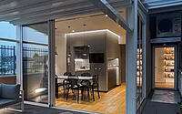
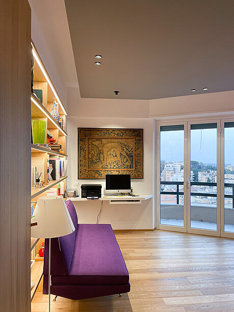
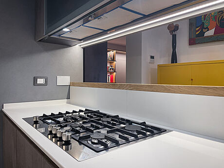
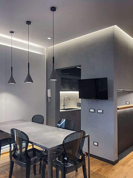
The interior, spanning 140 sq. m (1,507 sq. ft), features a spacious living area, a TV room, two bedrooms, two bathrooms, and a vast kitchen. A veranda overlooks a 50 sq. m terrace (538 sq. ft). Given the apartment’s horseshoe layout, a pathway circles the primary spaces, making them almost secondary.
Architectural Theme: A Journey
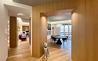
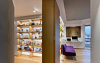
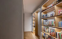
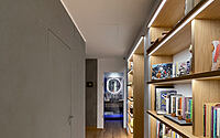
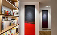
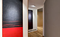
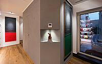
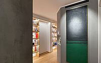
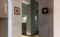
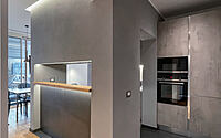
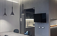
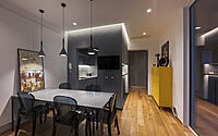
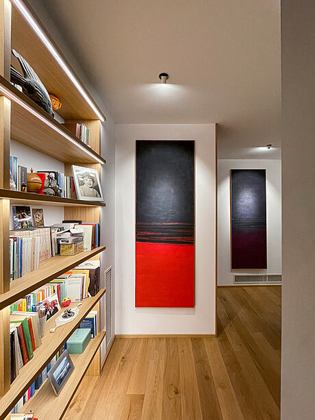
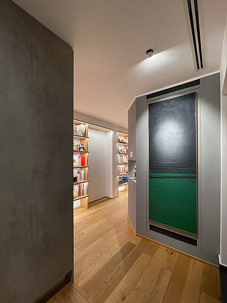
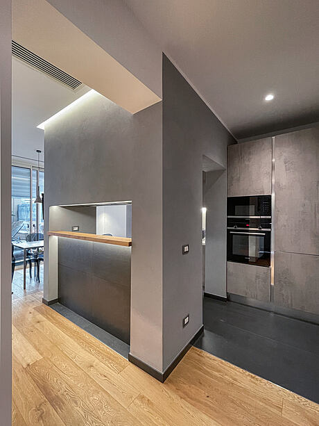
This functional reversal birthed the architectural theme: a journey through paintings, books, and unique items. As visitors traverse the home, they discover varied environments, unique spots, and perspective views. The entrance boasts a bulky portal framing a large black dining table, set against a breathtaking 180-degree view of Rome. A quick turn leads to a blind spot, marked by illuminated vertical paintings and a niche library lit by horizontal LED strips. The corridor’s opposite side subtly contrasts with a rough cement-colored wall treatment.
Kitchen to Terrace Transition
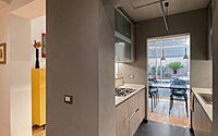
Another twist brings us to the kitchen-veranda, culminating in the expansive terrace. Moving from light to shadow, the alternation in heights, colors, and surface treatments elevates the corridor’s role. It stands distinct, connecting confined spaces.
Energy Efficiency
Significantly, the apartment achieves an A4 energy rating, thanks to internal thermal cladding, aluminum fixtures with a lowered profile, and a ducted heat pump powered by a 4.5 Kw/h (15,301 BTU/hr) photovoltaic system on the communal terrace roof.
Photography courtesy of Claudio Calcagni
Visit Claudio Calcagni
- by Matt Watts