Casa Viga: Artful Blend of Structure & Style in Belo Horizonte
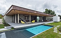
Explore the architectural marvel of Casa Viga in Belo Horizonte, Brazil, masterfully redesigned by Play Arquitetura. Born from an existing concrete structure, this house seamlessly blends its intimate and social areas, optimizing its unique sloped location.
With north-facing gardens and south-facing views, Casa Viga exemplifies innovative design, turning constraints into creative triumphs. The property also features a thoughtfully renovated guest apartment, adding to its charm and functionality.


About Casa Viga
Casa Viga: A Unique Beginning
Casa Viga, located in a Belo Horizonte condominium, started uniquely. An existing concrete structure (foundation, floor slabs, and pillars) already stood on the site. The clients aimed to repurpose this structure instead of continuing the original project. Thus, we embarked on crafting a new design from this existing base.
Designing Around Existing Elements
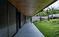
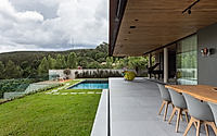
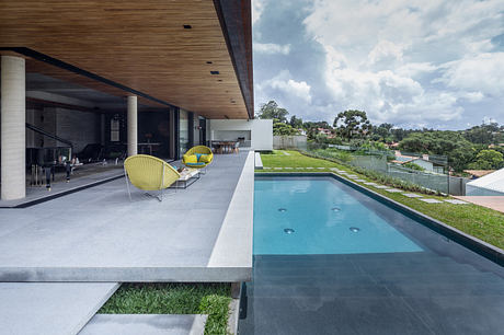
The house’s design revolved around two key elements. First, its central position on the sloped 2,000.00m² (21,527.82 ft²) plot. Second, the existing floors’ levels, including a lower level meant for a games room and two main levels with a height difference of 80cm (31.5 inches). Accordingly, we planned an intimate wing overlooking a 20m (65.6 ft) north-facing front garden and a social wing towards the 27m (88.6 ft) south-facing rear. The garage utilized the pre-existing lower level.
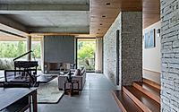
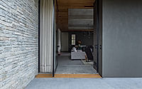
Furthermore, we enhanced the separation between the intimate and social areas. This separation stemmed from the minor gap between the floor slabs. The private wing sat at the highest level, while the social and service areas occupied the lower level. We strategically placed two house entrances—social and private (garage)—at opposite ends of the land. They were separated by two walls, emerging from the ground and expanding along the sloping terrain. The house’s structure formed two inverted triangles, one defined by the metal roof’s 15% slope, the other by the walls dividing the front garden from the entrances.
Interior Design and Guest Apartment
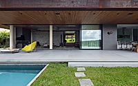
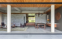
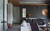
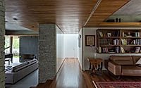
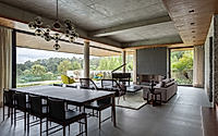
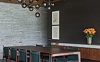
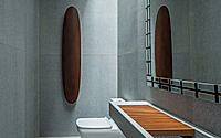
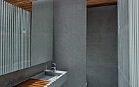
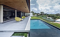
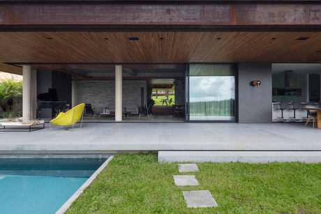
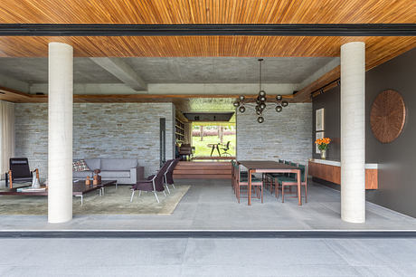
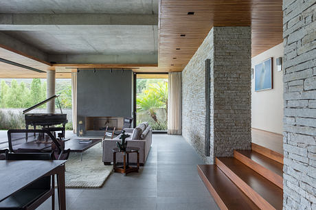
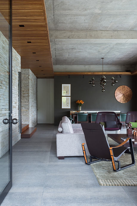
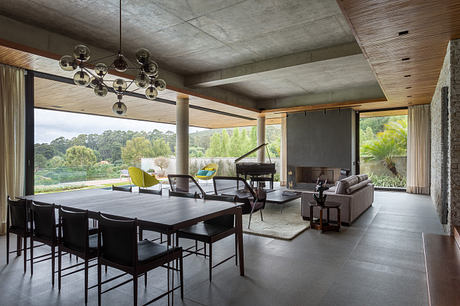
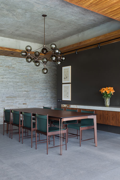
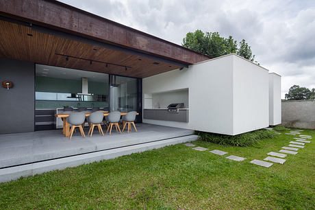
Inside, the house boasts spacious yet efficient areas. The social zone wraps around a large balcony featuring a barbecue area near the kitchen. In the intimate wing, the owner’s office has large sliding doors. When open, these doors visually connect the front and back gardens.
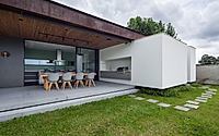
A small, dilapidated building at the plot’s rear presented another challenge. Rather than demolishing it, we transformed it into a guest apartment. Its position, near neighboring buildings and below the main house level, created a layered roof effect. We mimicked a small gabled house, using white metal tiles (like those on the main house) on both the roof and body. Unlike the main house with north-south openings, this annex features east-west glazed faces for enhanced privacy.
Photography courtesy of Play Arquitetura
Visit Play Arquitetura
- by Matt Watts