Home in Balashiha by Geometrium
Home in Balashiha, Moscow, Russia, is a contemporary apartment visualized by Geometrium.

About Home in Balashiha
This 66-square-meter (710-square-foot) apartment in Balashiha, Moscow, is designed for a young family. The main goal was to create a calm, modern interior with interesting details and decor. The decor should be easy to change to keep the interior fresh.
Design Concept and Style
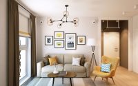
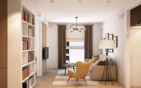
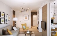
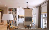
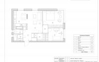
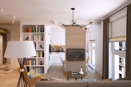
We chose a modern Scandinavian style with warm tones. The neutral color scheme features accents of yellow and blue. The apartment is divided into eight zones: entrance hall, living room, kitchen, bedroom, office, bathroom, toilet, and dressing room.
Entrance Hall
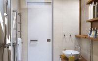
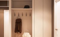
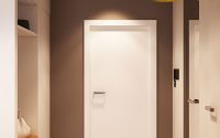
In the entrance hall, we placed a cupboard for bike storage, a bench for shoe removal, and hooks for jackets and coats. Hidden doors to the bathroom create a flat wall with a mirror. A concealed closet houses the washing machine and dryer.
Living Room
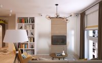
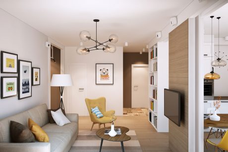
From the entrance hall, you enter the living room. A partition with a TV separates the living room and kitchen. Panoramic windows bring in plenty of light. We used neutral drapery with natural shades for the windows.
Kitchen
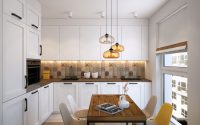
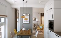
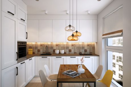
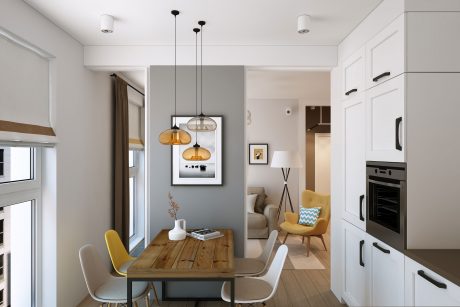
The kitchen design combines it with the living room, yet keeps it separate with partitions. We used white for the kitchen facade to expand the space. The facade has a textured finish, avoiding minimalism and austerity. The dining area features a wooden table with metal legs, creating a cozy contrast of materials. We did not use “Eames” chairs, despite their lasting popularity.
Bedroom
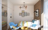
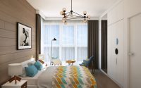
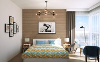
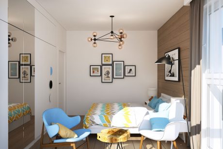
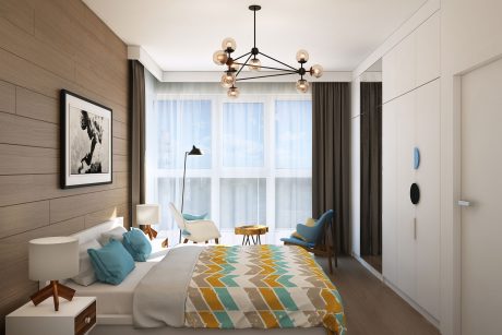
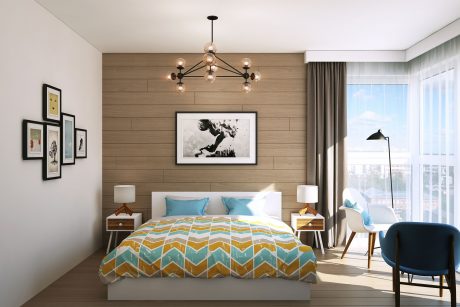
In the bedroom, we used the same colors as in the rest of the apartment. Blue is more prominent here for its calming effect. Extending the floor material to the walls widens the space. The direction of the boards stretches the bedroom. A built-in wardrobe in a niche frees up space, making it feel like a storage wall.
Office
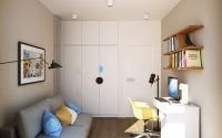
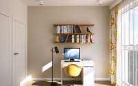
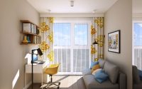
The office is designed for a young man and his desktop computer. The design allows for easy conversion into a children’s room. We used the same color scheme, with built-in cupboards in the corner to avoid free-standing objects.
Bathroom and Toilet
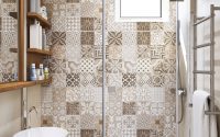
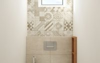
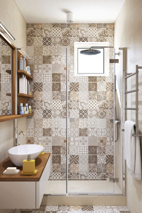
In the bathroom and toilet, we used similar tile collections. Neutral gray-beige tiles form the background, with ornamental tiles as accents. The combination of wood and white ties all the rooms together visually.
Visualizations courtesy of Geometrium
Visit Geometrium
- by Matt Watts