Penthouse by Josep Ruà Spatial
This original penthouse apartment located in Valencia, Spain, was designed in 2014 by Josep Ruà Spatial.

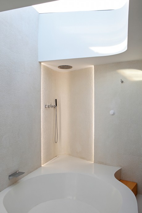
Description by Josep Ruà Spatial
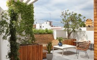
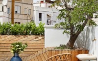
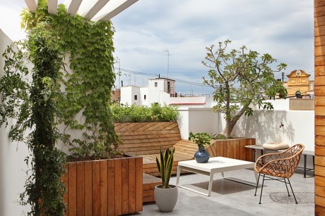
This former caretaker’s house was renovated ten years ago in order to build an open-concept layout and two terraces, one facing east and one west. The result was a box completely isolated from the outside and two detached terraces.
And so the main premises of the project were, first of all, creating a master bedroom with an en-suite bathroom. Secondly, it was important to establish a clear differentiation between the day and the night areas. And of course, there was a problem of storage to be solved; quite a challenge if we take into account the scarce 50 square meters of floor and 20 of terrace.
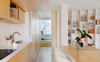
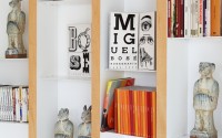
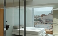
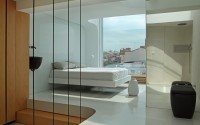
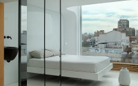
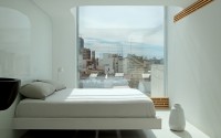
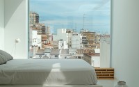
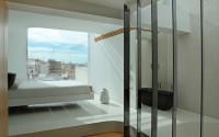
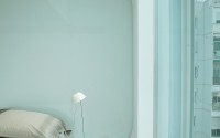
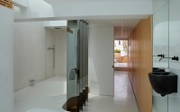
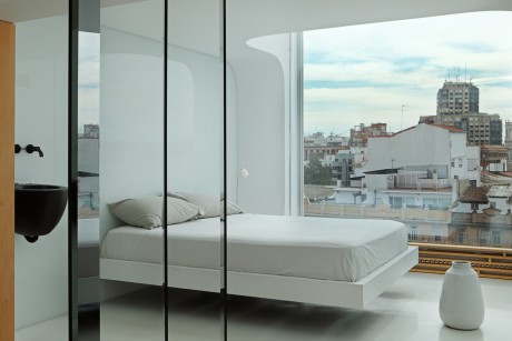
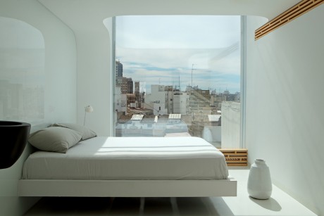
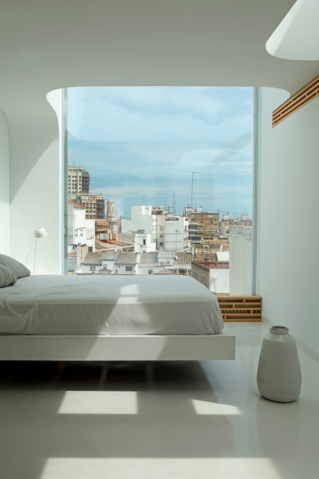
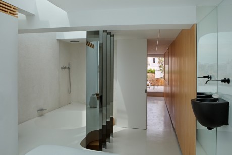
In order to do this, we proceeded to cover one of the terraces, keeping a preexisting slight elevation of two steps. The master bedroom was located then here. The floor was divided into two halves by a curved wall that, together with the bookcase, helped soften the severity of the space.
As the volumetric space was so small, it was necessary to integrate all the elements to get further visual cleanliness and harmony, as well as the possibility of free circulation.
As the space was so small, it required the integration of every element in order to get further visual cleanliness and harmony, as well as the possibility of free circulation. This was achieved by a volumetric solution based on mobile-immobile pieces of furniture, both inside and outside in the flat roof, thus giving one more twist to the concept of household equipment already introduced by Le Corbusier.
The aesthetic was clear from the beginning, since this was not my first project for Carmelo: it required naturalness, neutrality and brightness. Wood, stony colors and above all light, lots of light.
Living room – dining room – kitchen
This piece constitutes the core of the house.
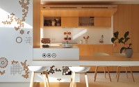
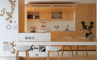
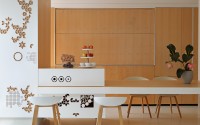
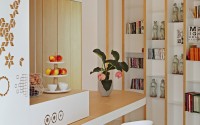
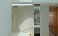
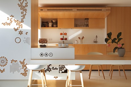
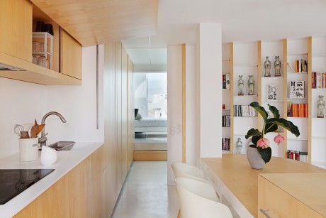
The kitchen remains hidden behind an automatic door, integrated into a closet which goes across the place lengthways, traversing the curved wall to become, in the end, the dressing room and thus interconnecting the night and the day area.
The one-piece countertop was acquired at VF Superficies Sólidas and it is made of Krion, a solid surface by Porcelanosa.
This disappearing kitchen gives the table a multipurpose function for it serves as both a dining table and a work station.
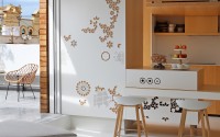
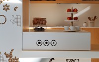
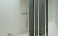
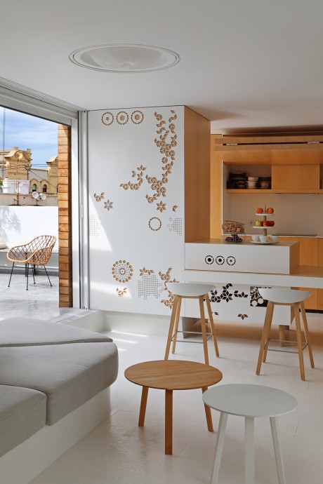
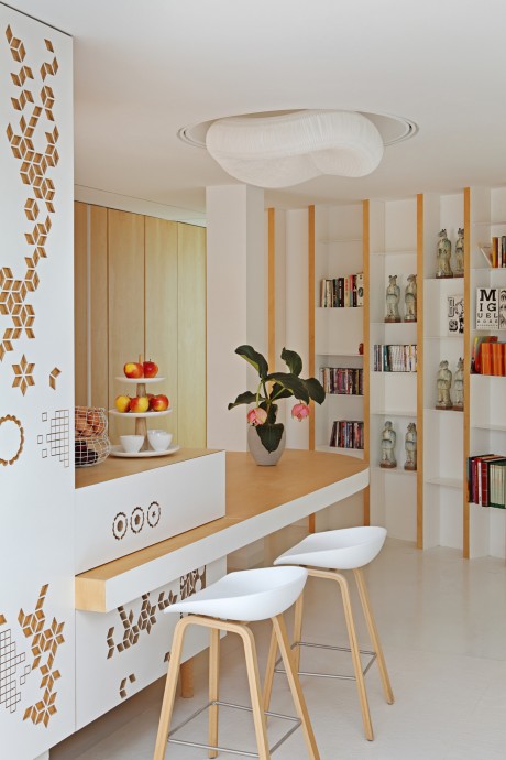
In front of us as we enter, we face the workbench and dining table, a design of my own, which also provides extra storage space. The air vent of the building was used to produce a sculptural volume, from where then cantilevered table originates. The front is again a closet door, imitating a latticework. The drawing is inspired both by nature and by the Dechirer piece, designed by Patricia Urquiola for Mutina.
This same pattern is repeated on the porcelain floor. It unfolds like a carpet from the workbench to dress the central space of the living-room.
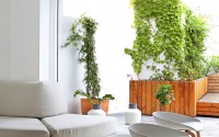
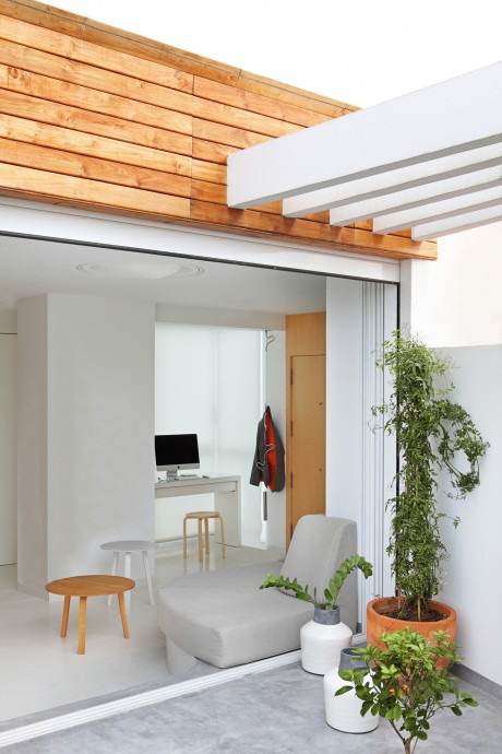
Locating a coach without breaking the integration of other elements or obstructing the flow of communication was a difficult task given its volume. Finally it was decided to take advantage of the unevenness of the floor and so the area where the sofa should be placed was heighten. This new platform was endowed with a curved contour, so as to create a visual flight towards the terrace and allow the integration with the living room.
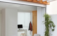
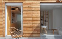
To potentiate this sensation of continuity, the picture window of the terrace was enlarged with doors disappearing behind the wall. Besides, the surface was covered with the same coating of gray micro concrete used in the terrace. Thus one environment penetrates into the other and vice versa. The possibility to customize the couch let us follow the same geometric pattern applied to the platform with the curve inviting to contemplate the outside. Thanks to all these elements, natural light, so important in this project, was granted a prominent presence.
On the other hand, artificial lighting tried to recreate atmospheres and grooves were performed on the ceiling to embed the different bulbs. In the central area, the rectilinear grooves become circular, defining a vault from where the Cloud lamp, designed by the Canadian firm Molodesign and acquired in Batavia (Madrid), hung.
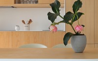
Bella Coffee low tables, AAC22 charis and AAS32 stools are all from the Danish company Hay. The egg cups and fruit dish are … Mercader de Indias. The pot … Mercader de Indias.
Photography by Asier Rua
- by Matt Watts