Gallery 6 One by Debaixo do Bloco
Step into the world of Gallery 6 One, a captivating concrete art gallery designed by Debaixo do Bloco Arquitetura. Located in Brasilia, Brazil, this 105 m² (1,130 sq ft) space boasts a unique and rustic design that emphasizes its authentic features.
Explore the gallery’s intriguing history, warm furnishings, and remarkable architectural elements inspired by the works of Niemeyer.

About Gallery 6 One
Uncovering Architectural Elements
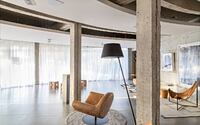
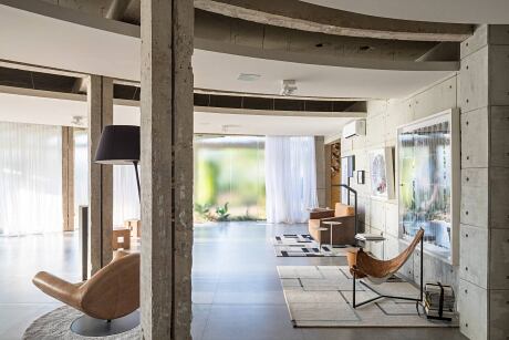
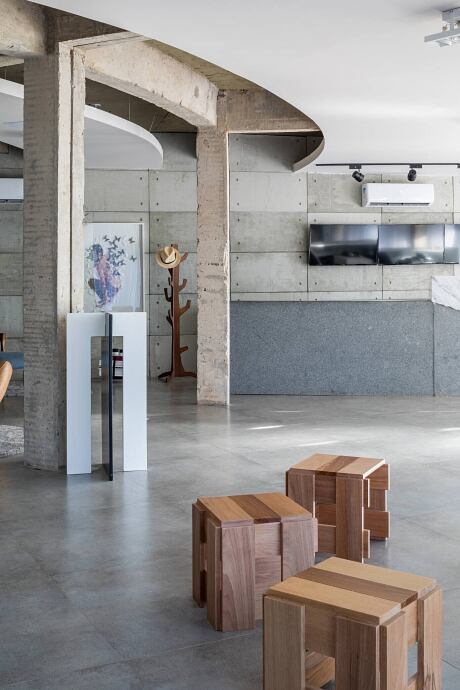
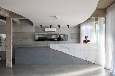
The architect’s initial approach was to remove the coatings from the environment, revealing an unusual structure, particularly in the shape of the beams that formed a circular sector drawing. Preserving and emphasizing this element in the project became a key aspect of the design.
Respecting the Building’s History
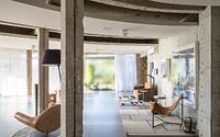
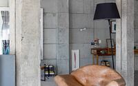
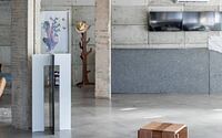
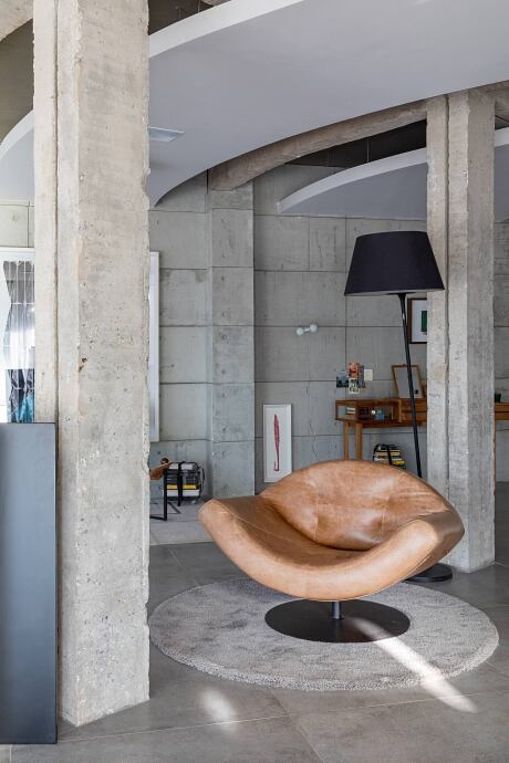
The beams and pillars were restored without compromising the building’s history, maintaining a rustic appearance. The exposed concrete and structures without finishing elements showcased the imperfections and authenticity of the space.
Innovative Slab Design
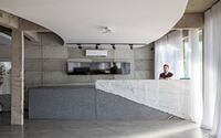
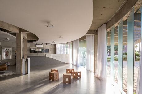
The unattached white lining of the slab followed the building’s skeletal design, creating a sense of movement reminiscent of the ramps at Niemeyer’s National Museum.
Neutral Palette for Versatility
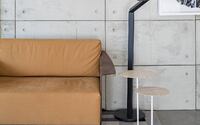
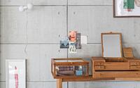
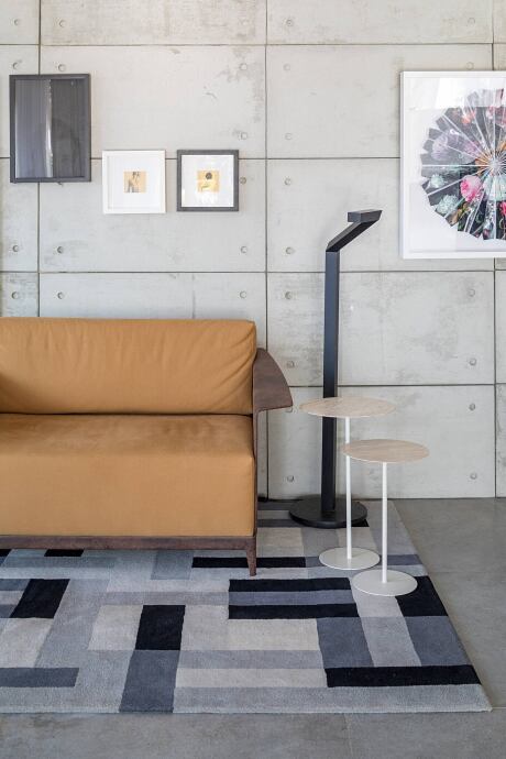
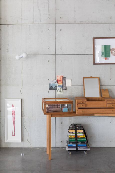
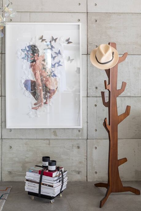
Cemented boards were applied to the walls, complementing the floor and concrete, to provide a neutral backdrop for displaying various objects with different colors and materials.
Embracing Imperfections in Workbench Materials
The main workbench was crafted from black sandstone, which was sanded and polished to remove its luster. A cracked Carrara marble slab was placed alongside it, accentuating the deliberate preservation and celebration of “defects” that gave the project its originality and personality.
Adding Warmth through Furniture Selection
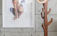
To balance the gray and white color scheme, furniture was intentionally chosen in caramel hues, natural leather, and wood, bringing warmth to the gallery and preventing the space from feeling cold.
Optimizing Space for Circulation and Events
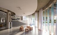
The spacious 105 m² (1,130 sq ft) area allowed for ample circulation while also providing space for events and product launches. This layout also offered the opportunity to view artworks from various angles and distances.
Integrating the Garden and Urban Landscape
Fabio Camargo’s garden design was complemented by textured glass, which created intriguing shadows and featured a regular dotted pattern on its surface. The material allowed natural light to enter without sacrificing privacy, creating a playful balance between visibility and concealment. The pivotal windows further enhanced the integration of landscaping and urbanism, enabling gallery visitors to observe and appreciate the subtle impact of street activity from within the space.
Photography by Haruo Mikami
- by Matt Watts