Seacombe Grove House by B.E Architecture
This minimalistic bright two-storey residence designed by B.E Architecture is located in Melbourne, Australia.


Description by B.E Architecture
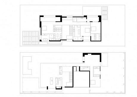
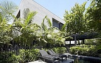
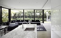
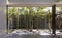
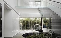
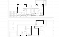
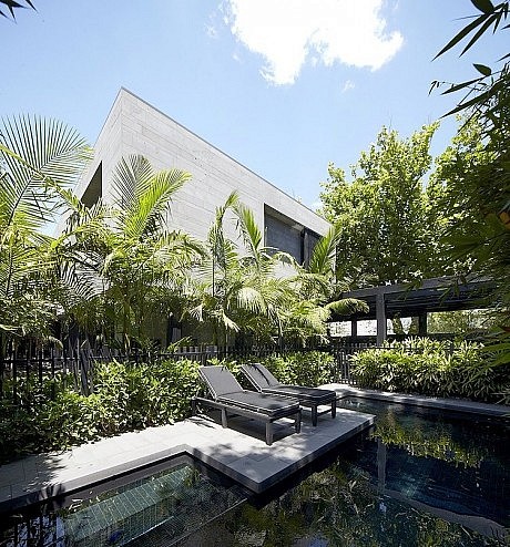
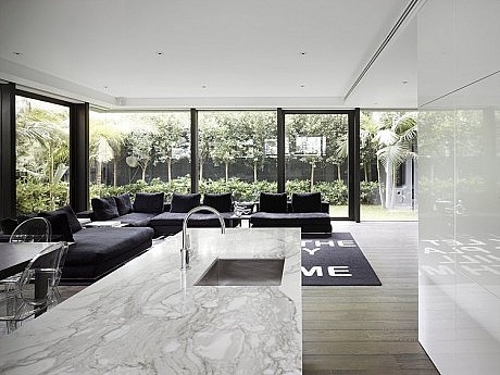
The siting response for this project was to have neither a front or back garden, but rather a continuous green outdoor space around the building. This space is visually and physically accessible from all lower level living rooms through continuous floor to ceiling glass. The whole of the ground floor is within a protected courtyard garden, contained by a continuous high fence, enabling the entire area (excepting pedestrian and car entry points) to be private and usable.
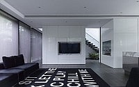
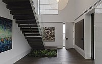
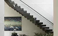
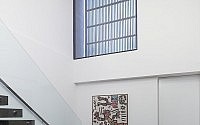
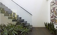
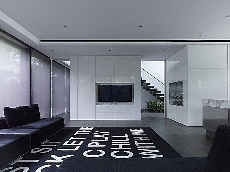
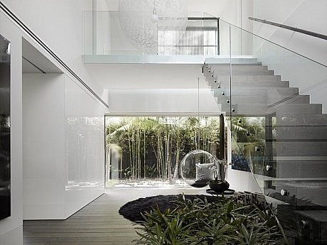
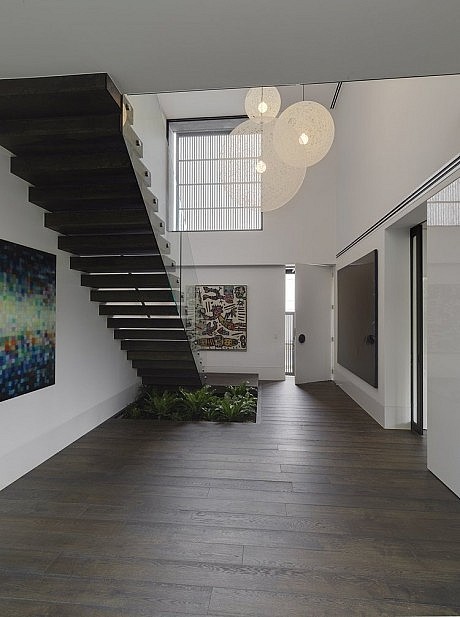
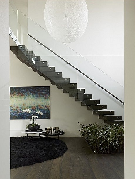
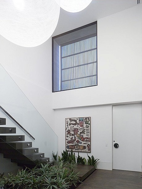
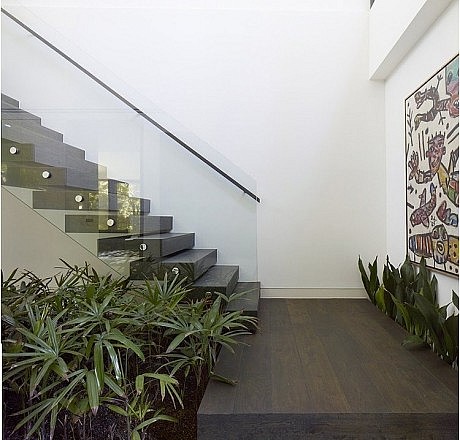
The ground floor living areas are separated into two distinct zones – day / summer areas facing north and west are integrated with the pool, garden and covered outdoor eating areas, while the night / winter areas face east and south. Separation between these zones is achieved by the placement of a two level void and stair. This element of vertical movement and effective slice in the plan is not revealed until entry into the dwelling. This element provides separation at the upper level between master bedroom and the children’s bedroom and laundry facilities.
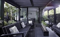
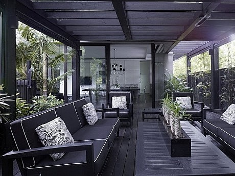
Large spotted gum pergolas that project out from under the upper level enhance usable outdoor areas. These pergolas of black of stained spotted gum have glazed roofs and operable walls, and also serve to ground the floating bluestone form above.
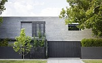
With the ground floor having continuous glazing, the upper level is contrasted with expressive stone walls with deep apertures that protect the occupant from the nearby major road. These apertures and associated upper level courtyards provide internal privacy to the dwelling.
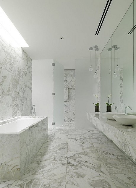
The selection of materials consciously addressed their ability to span the life of the building – natural and aged materials such as bluestone temper the “newness” of the project, and will temper its age in the future. The bluestone cladding is cut in 4 differing widths and a random stacked pattern is utilized to accentuate the horizontality of the building, while the black charred timber screens and fences contrast the stone in their vertical arrangement. The bluestone is employed as an antidote to the prevalence of acrylic render and its flat plasticity and immediacy. While being a material that is quarried, cut and textured and thus rich, it is also an amazing local material that gives a real, subtle texture and colour to the building, creating a patina that will age with grace.
