Interior SS by Didone Comacchio Architects
Designed by Didone Comacchio Architects, Interior SS is a modern single-family residence located in Nove, Italy.

About Interior SS
Revitalizing Interior SS: A Modern Makeover
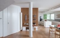
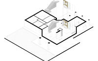
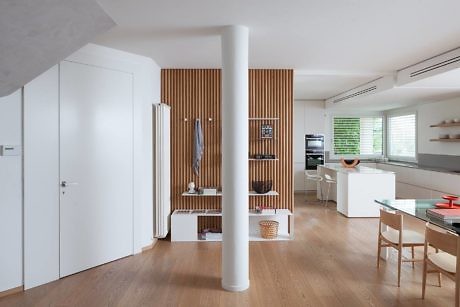
Interior SS embarks on a transformative journey. Its aim? To streamline and unify the ground floor of an existing house. This house, last refurbished in the late 1990s, had seen a mix of diverse, overlapping additions. Now, key structural elements like the staircase and central column, along with remnants of past renovations, define the space.
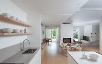
Nestled in a quaint residential district near Bassano del Grappa, at the base of the Pre-Alpi Venete (Venetian Prealps) and beside the Brenta River, the house exudes potential. The project’s vision? To forge a new identity. It seeks to create a ground floor that’s open, fluid, and bright. Here, architectural modifications, both additions and eliminations, cater to this new open-plan design. By using low-profile, wall-adjacent furniture, the design maximizes visual connections between indoors and outdoors. It replaces solid internal walls with glass surfaces, inviting controlled natural light from the external porch. This approach also preserves garden views.
Inside-Out: Blending Spaces
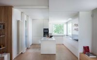
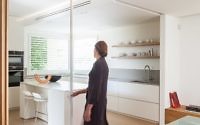
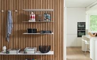
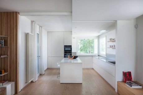
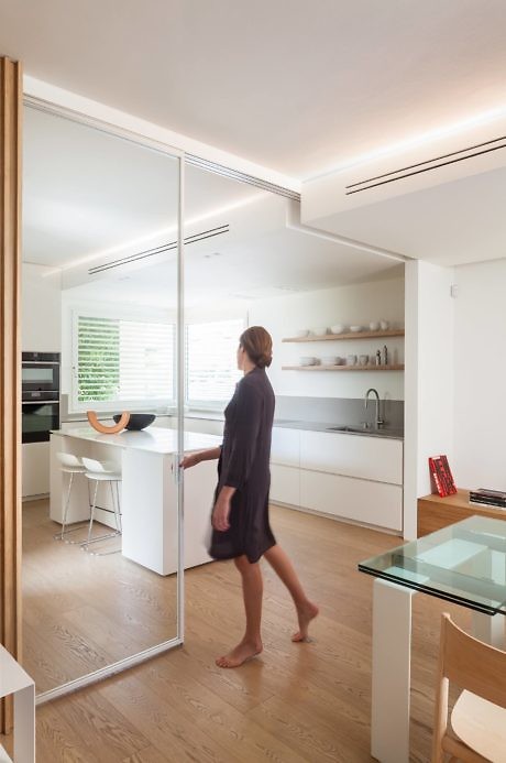
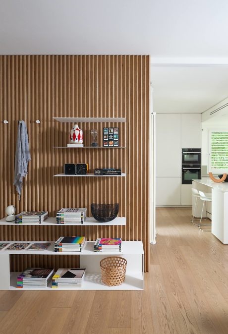
Internal space reorganization is pivotal. It involves demolishing the partition wall between the kitchen and living hall. This move significantly expands the kitchen’s surface area, adding a central island that doubles as a work and snack area. Glass operable walls offer flexibility. They separate the cooking zone when needed, while maintaining a visual link across different areas. When retracted, these partitions cleverly conceal behind a timber slat wall, accented with metal shelves in a white painted finish.
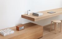
The dining area, anchored by a table, sits near the kitchen island, creating a seamless flow between cooking and dining spaces. A cozy office space follows, smartly utilizing the house’s elongated layout. Every piece of furniture is custom-made, balancing horizontal lines and maximizing storage.
Aesthetic Harmony: Material and Color
The project also streamlines varied finishes. It introduces a basic palette alternating oak wood with white elements, inspired by the existing timber floor. Hidden air conditioning and extra heating systems are integrated into a false ceiling. This feature smartly separates the service area from the living space. Light design is key. Cove lighting, supported by a new false ceiling, visually connects the service area across the ground floor. Spotlights are strategically placed in areas like the kitchen workspace.
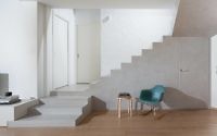
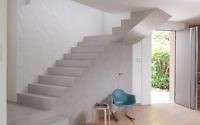
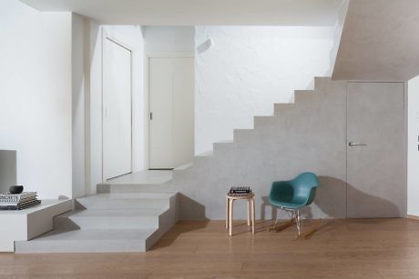
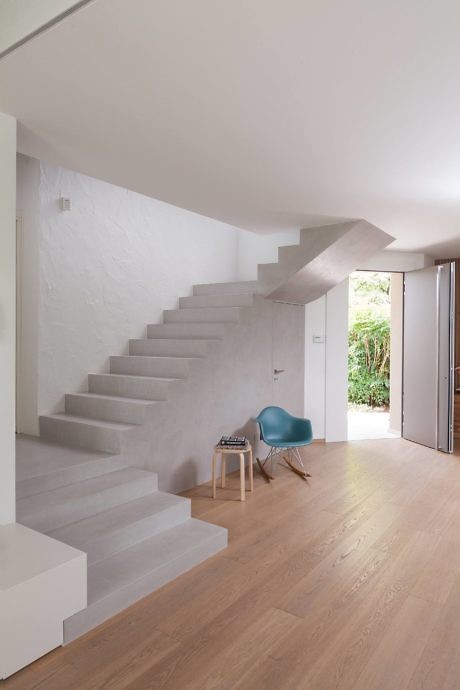
Finally, the existing staircase, with its strong presence and cherry wood cladding, stands as a focal point. Simplified to its basic form, stripped of ornamentation, and painted in neutral tones, it harmoniously blends with the home’s new identity.
Photography courtesy of Didone Comacchio Architects
Visit Didone Comacchio Architects
- by Matt Watts