Night + Day: Infusing Light and Modern Aesthetics into a Classic Craftsman Home
Step into Night + Day, a beautiful two-story house nestled in San Francisco’s desirable Noe Valley. This exquisite residence, masterfully redesigned by Edmonds + Lee Architects, marries contemporary aesthetics with charming original features. Initially envisioned as a kitchen expansion, the project blossomed into a full-scale transformation, creating a home that effortlessly fuses the past with the present. While maintaining its Craftsman charm, the architects have breathed new life into this property, crafting an airy, light-filled space that beautifully exemplifies their modernist approach.
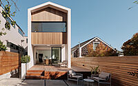
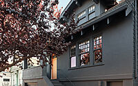
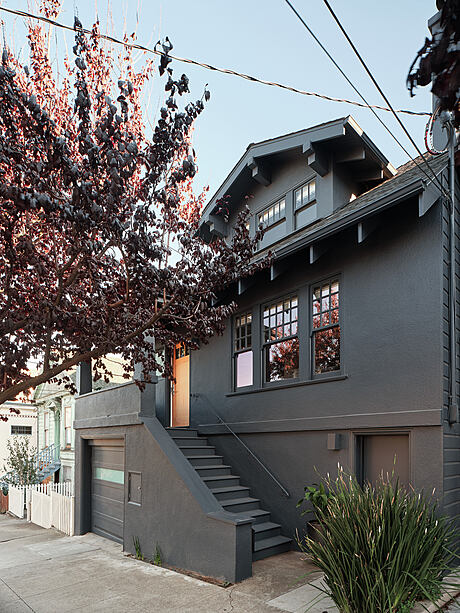
The house, known for its south-facing backyard and proximity to schools, blends in effortlessly with its surroundings with a subtle front facade. The real magic, however, lies at the back, where a stunning renovation awaits. With features like an expanded basement, open kitchen, and light-infused living spaces, this San Francisco gem is a standout in contemporary home design.

About Night + Day
Creating a London-style Oasis in Noe Valley
Located in the heart of Noe Valley, this Craftsman home, known for its desirable south-facing backyard and proximity to schools, underwent a comprehensive transformation by San Francisco-based Edmonds + Lee Architects. Drawing from their English client’s penchant for London-style renovations, they envisioned a project that respects the traditional street-facing facade, while dramatically opening up the rear into a contemporary, light-filled space.
Night + Day: Transcending a Simple Renovation into a Comprehensive Makeover
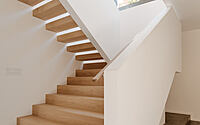
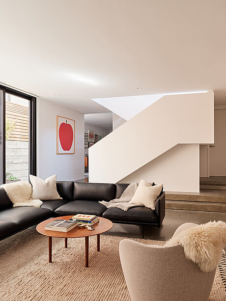
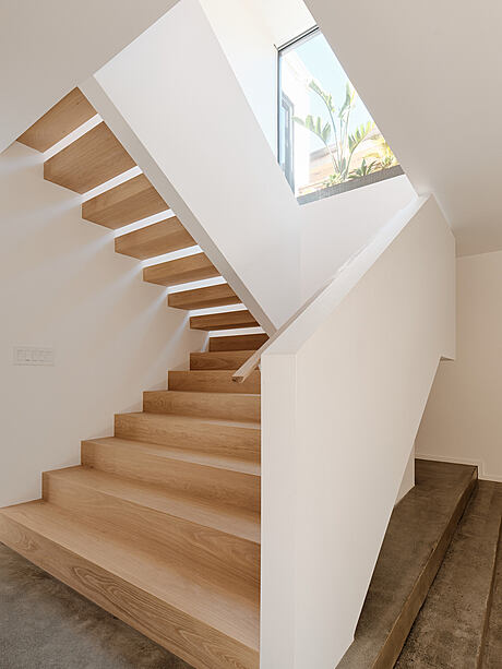
The original house was nothing more than a two-story bungalow, featuring a staircase connecting the first and second floors and a basement accessible only from the street. Robert Edmonds, partner at ELA, was initially hired for a modest kitchen expansion. However, the project’s scope evolved into a complete renovation, introducing a finished and expanded basement, an internal stair connection for convenient accessibility, and a modern, light-enhancing extruded back facade — a hallmark of Edmonds’s critically-acclaimed approach.
Preserving Original Detailing for Timeless Charm
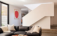
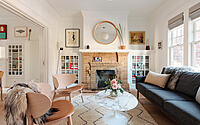
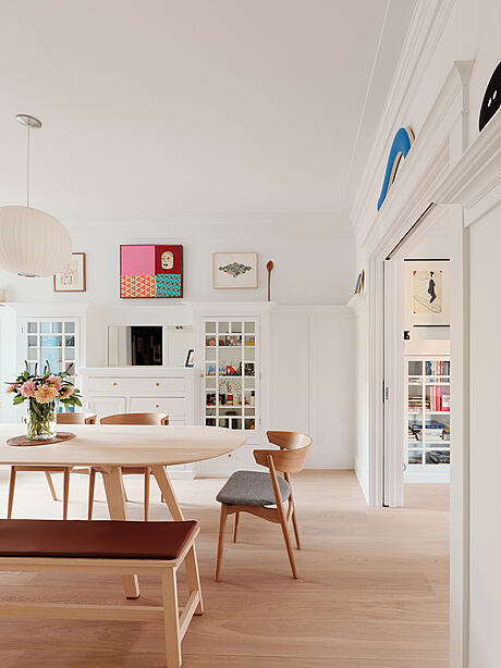
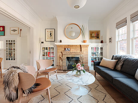
The clients desired to preserve much of the original detailing, infusing the house’s character with a sense of temporal journey from front to back. Emphasizing this narrative, Edmonds revived the front facade with a coat of black paint, returned the front door to its original honeyed wood tone, and refreshed the initial interior rooms with wide oak plank flooring and a new coat of paint. Existing built-ins add texture to the living room and original dining room, complemented by Edmonds’s modern additions — an open kitchen design, a robust staircase to the renovated basement, and a sleek exterior elevation.
Incorporating Natural Light and Expanding Space
The basement benefits from an influx of natural light via large windows set within a constructed well in the existing backyard. Framed by a concrete retaining wall and a meticulously planned fence, these windows bring a sense of warmth and openness to the concrete floors. Upstairs, Edmonds extended the house to accommodate a new owners’ suite, increasing the number of bedrooms to three — one each for the children and one for the parents.
Establishing the Kitchen as the Home’s Focal Point
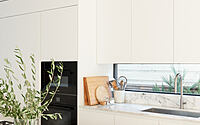
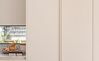
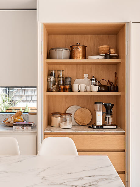
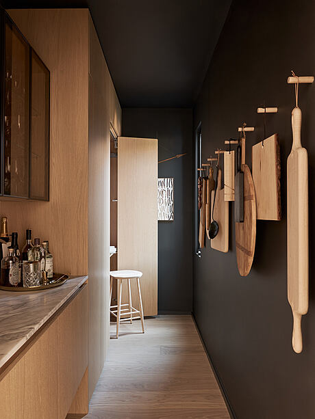
The kitchen, the heart and soul of this house, reflects the clients’ love for cooking and entertaining — a passion cultivated partially from the wife’s professional stint at Williams-Sonoma. This dynamic space opens up to the outdoors, as per the original and final brief. Viewed from the backyard, the house presents a stark contrast to its cozy street-side facade. Here, Edmonds demonstrates his playful and innovative approach with a rhythmic tactile interplay: a broad band of glass intersecting with thin vertical wood slats aging with the sun on the facade, and sturdy wood planks forming a shallow deck, facilitating a smooth indoor to outdoor transition.
Embracing Casual Elegance in Design
This project, while less ornate compared to most of the firm’s portfolio, known for its meticulous attention to light and space, echoes the comfort of a well-worn pair of jeans as per Edmonds. Straying from their usual formal approach, this design invites residents and guests to relax, kick up their feet, and enjoy the serenity of this beautifully rejuvenated home.
Photography courtesy of Edmonds + Lee Architects
Visit Edmonds + Lee Architects
- by Matt Watts