Stanford University in Florence: A Masterpiece in Palazzo Capponi alle Rovinate
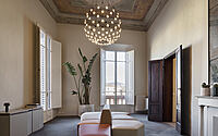
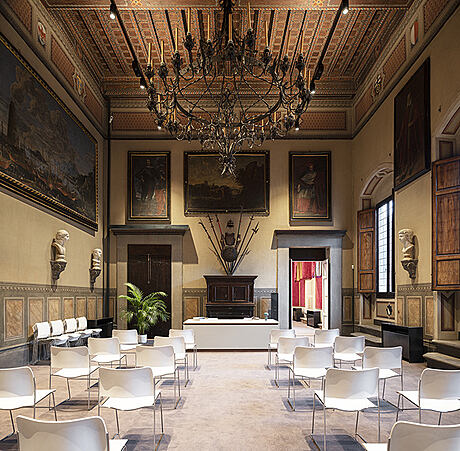
Immerse yourself in the traditional allure of Stanford University Headquarters, majestically poised on the main floor of Palazzo Capponi alle Rovinate in Florence, Italy, the epicenter of Renaissance art and culture. Crafted by the renowned Clorostudio Architetti, the University’s abode tells a tale of historic grandeur meeting modern versatility, with an architectural design that leaves you in awe.
Step into a world where history, architecture, and modern design intertwine, offering an enriching experience that is quintessentially Stanford University in Florence.


About Stanford University
Stanford University’s Renowned Headquarters
For the past decade, Stanford University’s headquarters has found its home on the main floor of the illustrious Palazzo Capponi alle Rovinate.
Innovative Expansion Project
The current expansion project puts flexibility and versatility at its heart, echoing the client’s explicit requests.
Breathtaking Interiors Meet Practical Design
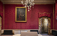
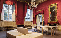
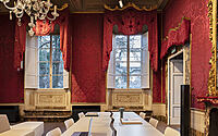
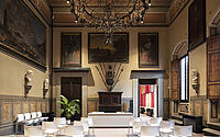
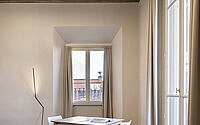
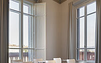
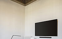
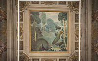
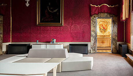
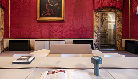
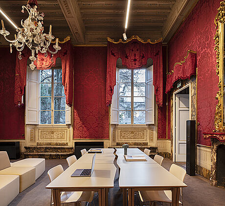
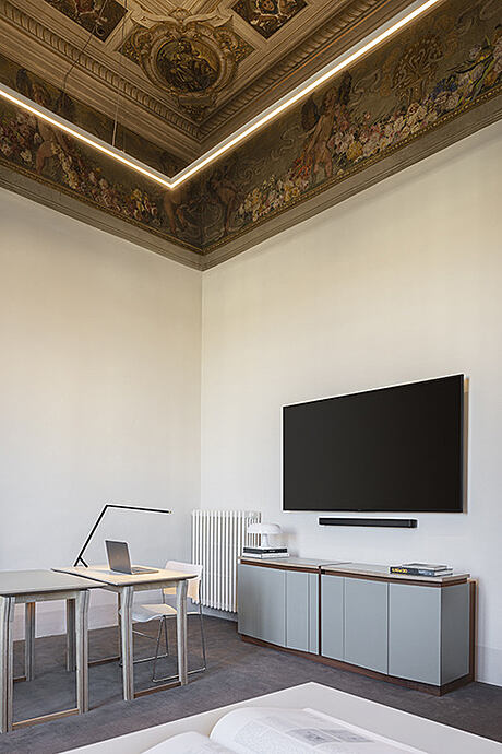
Against the backdrop of grand, adorned ceilings, the historic interior plays host to meticulously installed furniture and service equipment.
Furniture Designed for Flexibility
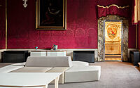
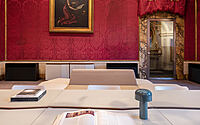
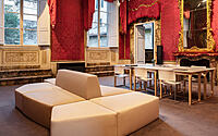
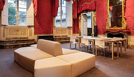
Designed with adaptability in mind, the furniture units can be assembled and arranged to meet changing teaching needs.
The Charm of Light Furniture
The appeal of the furniture is further enhanced by their lightness, reminiscent of school tables. Their fragmented edges effectively underscore the modularity and potential configurations.
Harmony of Colors
A carefully chosen palette of colors compliments the room decorations, which have been lovingly restored during the construction phase.
Three Colors and the Continuity Concept
Adhering to the three-color rule, the design ensures continuity between the existing and new locations. This design element also extends to the carpeting, which covers the entire surface area to preserve the palace’s historical floors.
The Concept of Modularity
The concept of modularity is effortlessly illustrated through the “fil rouge” – the fragmented edge – serving as a vivid representation of this core design principle.
Photography by Fabio Bascetta
Visit Clorostudio Architetti
- by Matt Watts