Home for a 3-member family in Heredia, Costa Rica.
Home designed by Jonsi Ellis-Calderón, architect, for a 3-member family in Heredia, Costa Rica. Year 2009.

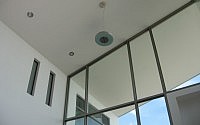
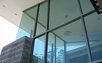
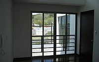
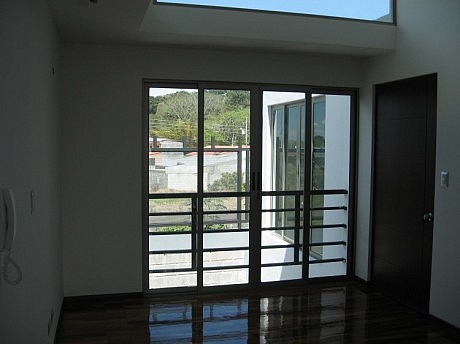
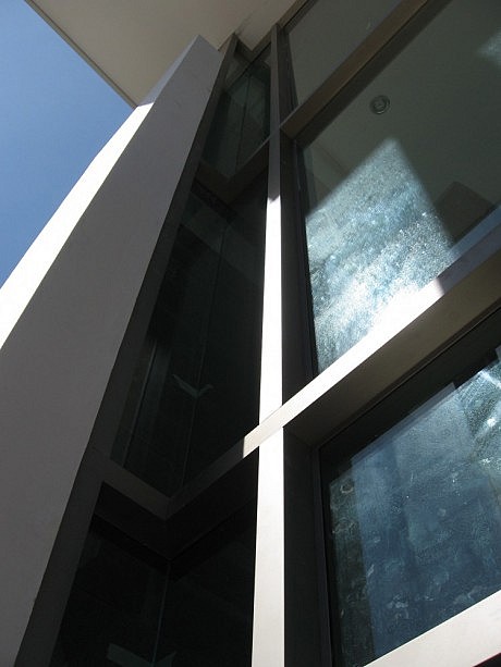
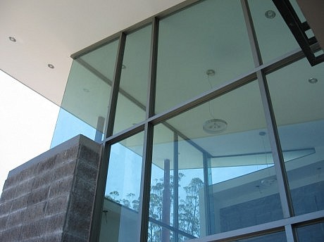
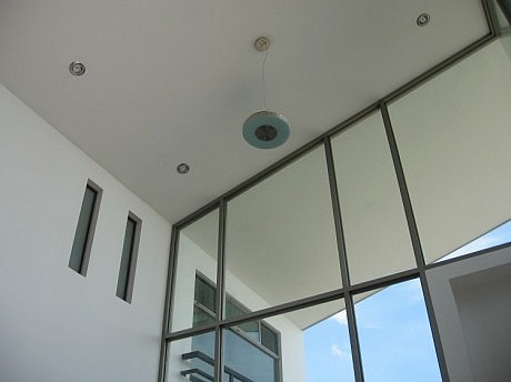
The piece of land where the project was designed and built is a narrow strip orientated East – West. The main goal was to provide a home for a 3-member family, a couple and a baby girl, within an urban environment in Heredia, Costa Rica. Since the house was to be built in an E-W orientation, taking advantage of the sunlight in the mornings and the afternoons was a must, in order to make the house as bright and clear as possible. This goal was achieved thru large windows in main/east elevation and back elevation; and discrete, non-invading, upper windows in north and south elevations, which are facing both next-door neighbors. Therefore, the interiors of the house become very bright and there is no need for artificial light during the day.
Description by Jonsi Ellis-Calderón
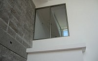
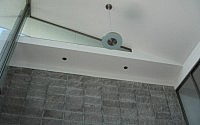
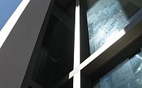
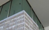
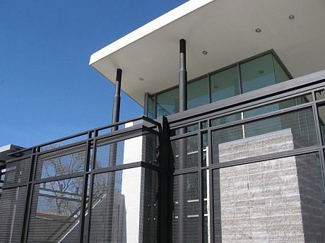
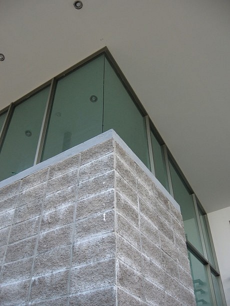
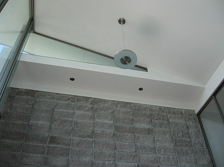
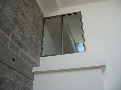
The house has trends of minimalism, with the use of green-tinted glass, concrete, gypsum, exposed blocks and iron mainly. The iron parts are painted all black, and the walls are painted all white, to reduce the need of artificial light during the day, saving energy and money in the long run.
Even though the project is located in the tropics, there is no need for air conditioning because of natural wind ventilation blowing across the house, thru the use of sliding windows in the back and front elevations.
This house in particular, provides a higher standard to the neighborhood. It is located in a middle class, semi-gated neighborhood, and because of its modern yet simple design, the surroundings have gained value, in terms of security and living standards.
This house, even though it might be considered a small construction project, features a few good ideas in terms of sustainability. First of all, the interior design of main spaces in the house was meant to take advantage of natural sun light, therefore, saving energy and money over the years.
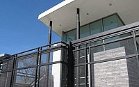
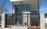
The smaller the land, the nicer the main elevation has to be. For this matter, the house’s main elevation fulfills expectations, making it clear that the use of natural light was important, along with a modern and classy design.
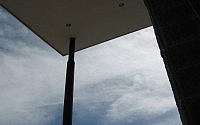
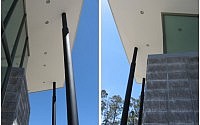
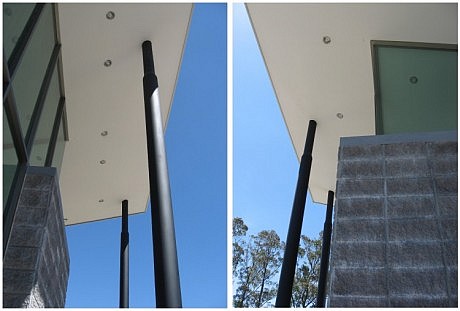
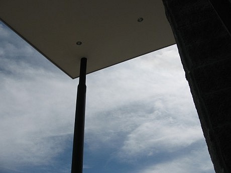
The front elevation also features three steel, round-shaped columns; they are a symbol of the three members of the family, conceptually represented. And this concept also means that these three family members support and hold the home. On one hand, physically they support the house; and on the other hand, spiritually, they support the family as a team.
The project is also well rated in terms of interior design. Even though internal space is minimalistic, rather than simple, it achieves different goals. First of all, public areas are located downstairs; and the main areas downstairs are living/dining room, kitchen, front/set-back garden and studio, and they all have what it takes to be warm and welcoming.
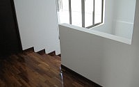
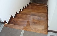
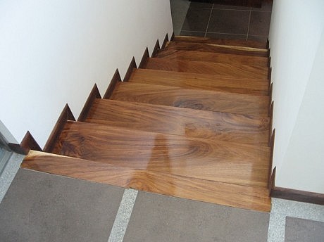
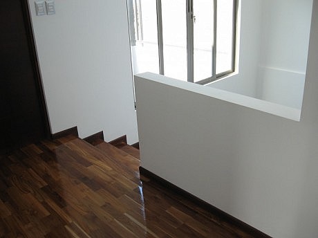
Private areas are located upstairs, three bedrooms and two bathrooms. Wooden floors, white painted walls and upper windows provide that feeling of shelter, simplicity and security in a basic and minimalistic space.
Visit http://jonsiellis.blogspot.com/
- by Matt Watts
